Revnue analysis
تفاصيل العمل

1. Revenue & Budget Variance Analysis Dashboard
Objective:
This Power BI dashboard analyzes revenue and budget variances, providing insights into expected vs. actual sales performance across different years, quarters, and product categories.
Steps Taken:
Data Preparation:
Imported the Budget and Actual dataset from an Excel file.
Cleaned and transformed the data using Power Query, ensuring consistency in column names and formats.
Data Modeling:
Created relationships between tables to enable efficient data analysis.
Defined calculated columns and measures using DAX for key metrics like Variance, Variance %, and Budget Goal.
Dashboard Development:
Designed a summary section displaying key financial metrics:
Expected Revenue
Actual Revenue
Variance & Variance %
Created a Budget Variance by Month area chart to visualize fluctuations in budget variance over time.
Developed a Sales by Month line chart to track trends and compare actual vs. expected sales.
Built a Product-wise Sales Comparison bar chart to analyze product performance.
Added a Quarterly Variance Table with color-coded variance % (green for positive, red for negative).
Used a heatmap-style variance percentage table to highlight major discrepancies.
Interactivity & Filters:
Implemented slicers for Year, Quarter, and Product to enable dynamic filtering.
Included a tooltip feature to display additional insights when hovering over visual elements.
Key Insights:
The overall variance was -0.42%, indicating a slight underperformance.
Some quarters showed positive variance, while others exhibited significant negative deviations.
Product sales distribution highlighted areas of improvement and potential growth opportunities.
Tools & Technologies Used:
Power BI (Data Cleaning, DAX, Visualization)
Excel (Data Source)
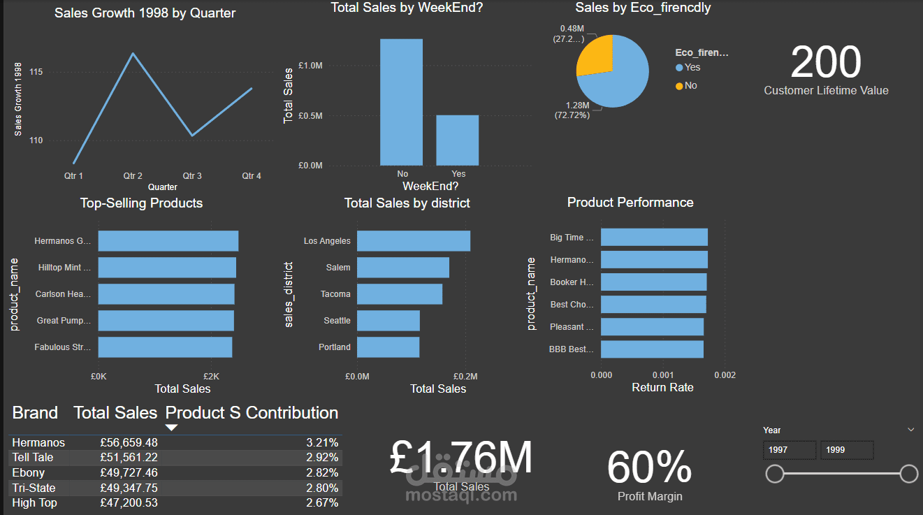
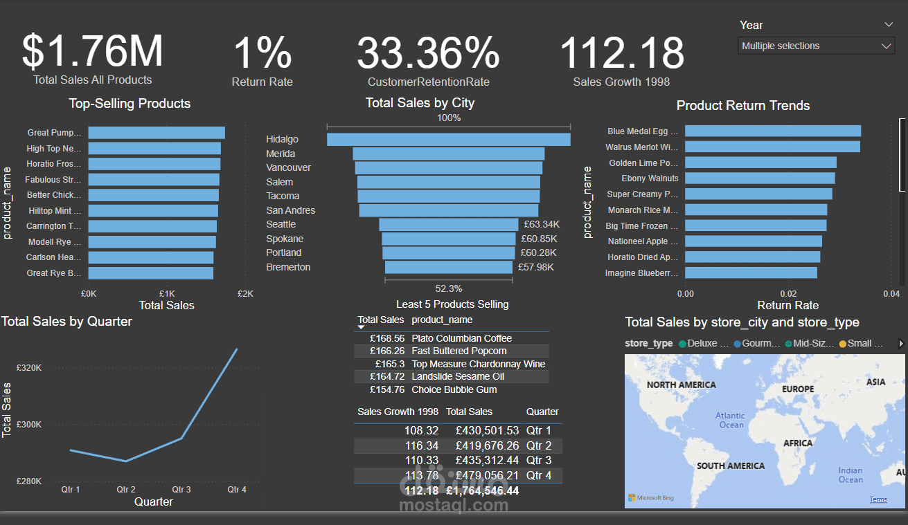
2. Sales Performance Dashboard (1997-1998)
Objective:
This Power BI dashboard provides a comprehensive analysis of sales performance across different regions, products, and time periods, helping businesses track sales trends, customer retention, and product returns.
Steps Taken:
Data Preparation:
Imported datasets (Customers, Products, Regions, Returns, Stores, Transactions 1997 & 1998) from CSV files.
Merged multiple transaction datasets to create a consolidated sales dataset.
Cleaned data using Power Query, ensuring proper date formats, category mappings, and missing value handling.
Data Modeling:
Established relationships between different tables (Customers, Products, Transactions, Returns, etc.).
Created calculated measures using DAX for key metrics:
Total Sales
Return Rate
Customer Retention Rate
Sales Growth Percentage
Dashboard Development:
Designed an interactive KPI section displaying:
Total Sales (£1.76M)
Return Rate (1%)
Customer Retention Rate (33.36%)
Created a Top-Selling Products bar chart to identify best-performing products.
Developed a Sales by City funnel chart to visualize regional sales distribution.
Implemented a Product Return Trends bar chart to highlight products with the highest return rates.
Added a Total Sales by Quarter line chart to track seasonal trends.
Integrated a geospatial map (Microsoft Bing Maps) to show store locations and total sales by city.
Interactivity & Filters:
Added a year filter (1997-1999) to analyze sales trends over time.
Implemented a store type and city slicer for granular insights into different locations.
Used drill-through functionality to explore product performance in-depth.
Key Insights:
Sales Growth (112.18%) indicates strong performance, with Q4 being the most profitable period.
Customer retention (33.36%) suggests a need for improved engagement strategies.
Certain products have higher return rates, highlighting potential quality or customer satisfaction issues.
Tools & Technologies Used:
Power BI (Data Modeling, DAX, Visualization)
CSV Files (Data Source)