E-commerce customer churn analysis
تفاصيل العمل
Project Process & Methodology
1. Data Acquisition and Initial Assessment
The first step was receiving and reviewing the raw customer dataset. Before touching any formulas or charts, I conducted an initial audit of the data — checking for missing values, inconsistent entries, duplicate records, and structural issues. With 64,374 customer records spanning variables including tenure, subscription tier, contract type, support call frequency, payment delay, gender, age, and churn status, it was essential to establish data integrity before any analysis could be trusted.
2. Data Cleaning and Preparation
Once the structure was understood, I cleaned the dataset directly in Excel. This involved standardising categorical fields (ensuring "Left" and "Stayed" were consistently coded across all rows), verifying numerical columns for outliers, and organising the data into a clean, structured table format that Excel's aggregation functions could work with reliably. No analysis is better than the data feeding it, so this stage received significant attention.
3. Defining the Analytical Questions
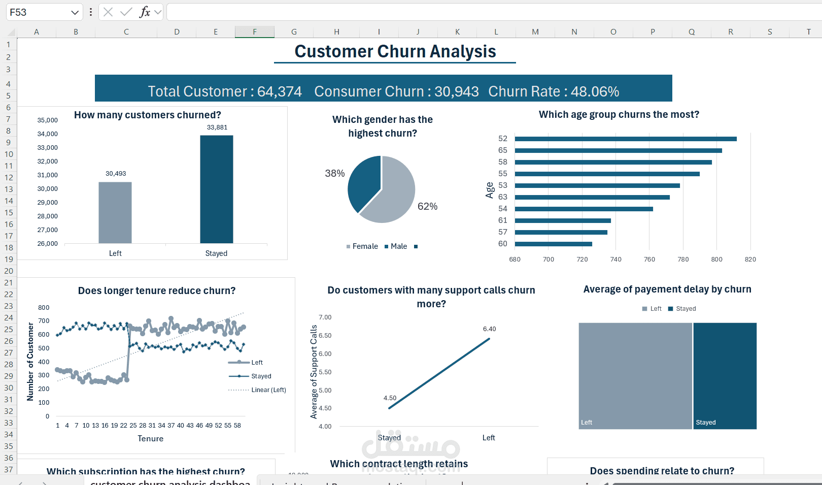
Rather than jumping straight into charts, I identified seven core business questions the dashboard needed to answer — questions that a decision-maker would actually ask when trying to understand and reduce churn. This question-first approach shaped every subsequent design decision, ensuring the output was built around business value rather than data availability.
4. Building the Aggregations
For each analytical question, I used Excel functions — including AVERAGEIF, COUNTIF, SUMIF, and pivot tables — to aggregate the raw data into the summary figures each chart would visualize. For example, calculating the average number of support calls separately for churned and retained customers, breaking down churn count by age band, and summarizing contract type distribution across both groups.