Clothing sales report with Excel & power bi
تفاصيل العمل
Sales Analysis Project | From Excel to Interactive Dashboard Insights
I’m excited to share a recent Sales Data Analysis project I completed using Excel and Power BI, starting from raw data all the way to actionable business insights
Data Preparation Phase
The project started with structuring and cleaning raw data:
Data cleaning and handling missing values
Removing duplicates and organizing datasets (Products / Sales / Customers)
Using Excel functions such as:
VLOOKUP / XLOOKUP
IF Statements
Pivot Tables
Basic aggregation functions
Data Analysis Phase
After preparing the data, I focused on analyzing:
Total Sales performance
Profit analysis
Best & worst performing products
Customer behavior and contribution
Product performance comparison across categories
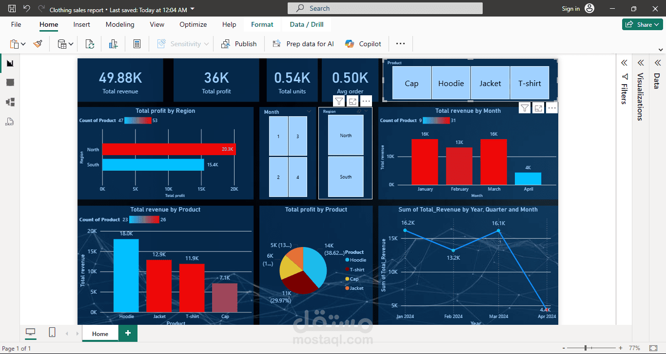
Dashboard Development
An interactive dashboard was built to visualize:
Top & Bottom performing products
Sales vs Profit analysis
Customer contribution analysis
Product performance trends
Key Insights
A small percentage of products generate the majority of profit (Pareto Principle)
Some high-selling products have low profitability due to pricing strategy
Certain products underperform and require review or elimination
Focusing on key products can significantly increase overall profitability without increasing sales volume
Business Recommendations
Focus on high-profit products (Hero Products)
Re-evaluate pricing strategy for low-margin items
Create product bundles to increase order value
Reduce or clear slow-moving inventory
Target high-value customers with tailored offers
Conclusion
This project highlights how data analysis goes beyond numbers — it transforms raw data into clear business decisions that drive profitability and efficiency.
I’m continuously improving my skills in Data Analysis & Business Intelligence using Excel and Power BI, and open to feedback or opportunities.