Sales Performance Dashboard
تفاصيل العمل

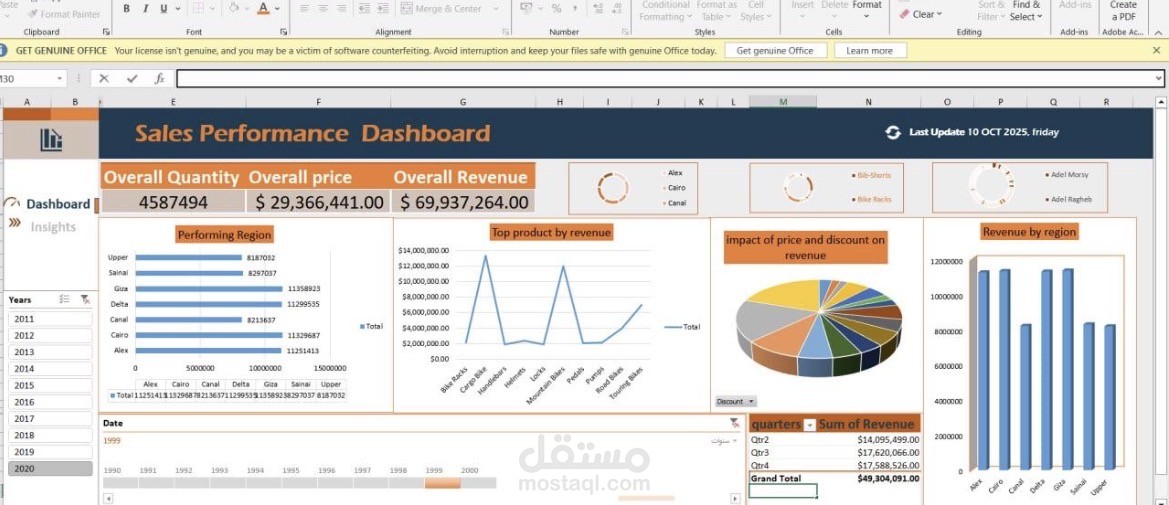
Dashboard created in Microsoft Excel. It is designed to provide a comprehensive and intuitive overview of sales data. Here is a breakdown of the dashboard's components:
1. Key Performance Indicators (KPIs)
Located at the top, these cards highlight the core metrics of the business:
• Overall Quantity: 4,587,494 units sold.
• Overall Price: $29,366,441.00.
• Overall Revenue: $69,937,264.00.
2. Filters and Controls
• Year Slicer: A side panel allowing the user to filter data by specific years (2011–2020).
• Timeline: A visual timeline at the bottom to adjust the date range.
• Mini-Charts/Slicers: Located in the top right, these small circular charts act as filters to drill down data by specific regions, products, or sales representatives.
3. Visualizations
• Performing Region (Horizontal Bar Chart): Shows the distribution of volume/sales across different geographical areas (e.g., Cairo, Delta, Canal, Giza, Upper, etc.).
• Top Product by Revenue (Line Chart): Illustrates revenue trends across various products (e.g., Bike Racks, Handlebars, Helmets, etc.), highlighting which items generate the most income.
• Impact of Price and Discount on Revenue (Pie Chart): Represents the revenue structure, helping to visualize the breakdown of income in relation to pricing and discount strategies.
• Revenue by Region (Column Chart): Provides a quick visual comparison of how much revenue each region contributes to the total.
4. Data Summary Table
• Quarterly Breakdown: A table in the bottom right corner displays the sum of revenue categorized by quarters (Qtr2, Qtr3, Qtr4), ending with a Grand Total of $49,304,091.00.
Summary:
This dashboard is an effective management tool that helps decision-makers track sales performance, identify the most profitable regions and products, and analyze trends over time to make data-driven business decisions.