Customer &Sales Analysis Dashboard
تفاصيل العمل

interactive Dashboard in Microsoft Excel designed to analyze sales and customer data for a fashion store.
This dashboard serves as a Business Intelligence (BI) tool, helping the business owner make data-driven decisions to optimize inventory and marketing strategies.
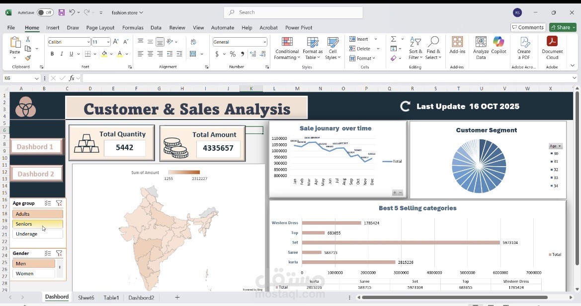
1. Key Performance Indicators (KPIs)
• Total Quantity: Displays the total number of items sold (e.g., 5,442).
• Total Amount: Displays the total financial value of the sales (e.g., 4,335,657).
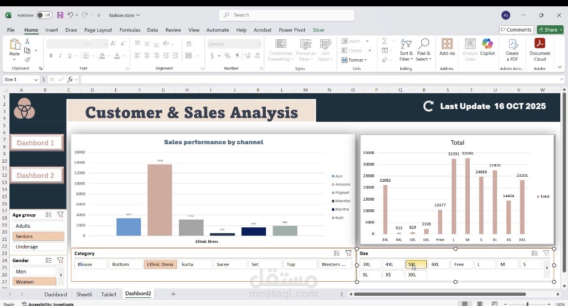
2. Visual Analytics
• Sales Performance by Channel: A bar chart showing sales performance across different sales platforms.
• Total Sales by Size: A bar chart visualizing sales volume for each garment size (from 3XL to XXL).
• Sale Journey Over Time: A line chart showing the trend of sales throughout the months of the year (January to December).
• Customer Segment: A pie chart illustrating customer distribution.
• Best 5 Selling Categories: A horizontal bar chart identifying the top-performing product categories (e.g., Western Dress, Top, Set, Saree, Kurta).
• Geographic Analysis: A map visualization showing sales distribution across regions (specifically highlighting India).
3. Interactive Filters (Slicers)
The dashboard includes Slicers that allow the user to dynamically filter data to view specific insights based on:
• Age Group: (Adults, Seniors, Underage).
• Gender: (Men, Women).
• Category: (Blouse, Bottom, Ethnic Dress, Kurta, Saree, Set, Top, Western, etc.).
• Size: (3XL, 4XL, 5XL, 6XL, Free, L, M, S, XL, XS, XXL).
In summary: This is a professional Excel dashboard that enables the user to understand which products are in highest demand, who the target customers are, and during which times of the year sales peak