Business performance dashboard
تفاصيل العمل

Business Performance Dashboard built using Microsoft Excel. It serves as an interactive data visualization tool designed to help stakeholders monitor key performance indicators (KPIs) through multiple lenses.
Here is a breakdown of how it functions and its core components:
1. Purpose of the Dashboard
The dashboard is designed to provide actionable insights into various aspects of business performance, including revenue, profitability, temporal trends, and demographic/geographic distributions.
2. Key Functional Components
The dashboard relies on interactive elements to allow the user to manipulate and filter the data dynamically:
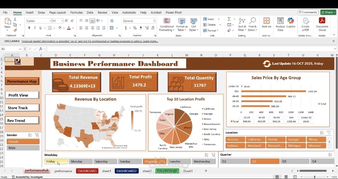
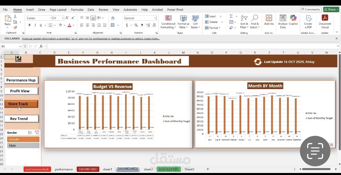
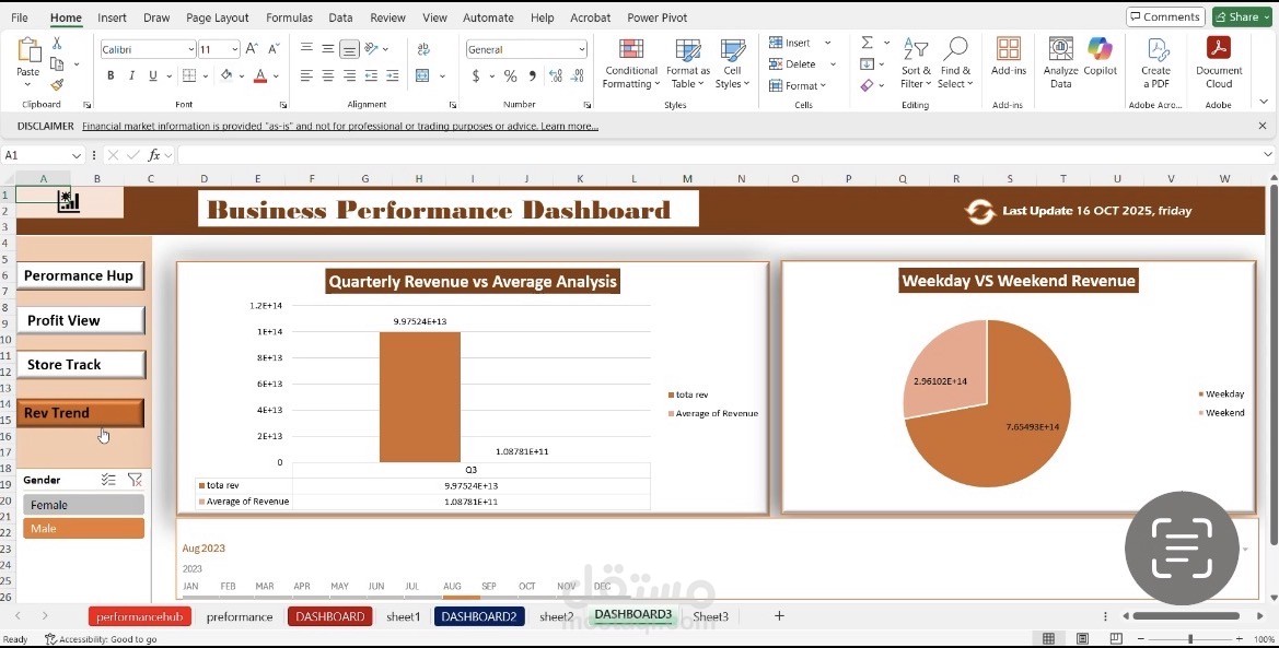
• Navigation Menu: Located on the left, it allows users to switch between different view modes (Performance Hub, Profit View, Store Track, and Rev Trend).
• Slicers (Interactive Filters): Found at the bottom and sides of the dashboard, these allow users to filter data instantaneously by:
• Gender: (Male/Female).
• Days of the Week: (Friday through Wednesday).
• Quarters: (Q1, Q2, Q3, Q4).
• Location: Selection of US states.
3. Data Analysis Modules
The dashboard uses various chart types to represent data effectively:
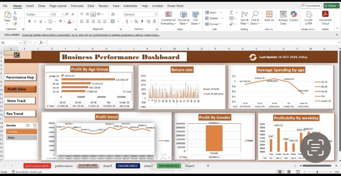
• KPI Cards: Display high-level metrics such as Total Revenue, Total Profit, and Total Quantity.
• Geographic Analysis: A heat map of the United States visualizes revenue distribution by state.
• Demographic Analysis: Bar charts display sales and profit metrics categorized by age groups and gender.
• Trend Analysis: Line and bar charts track profitability and revenue trends over months, quarters, or specific fiscal periods.
• Comparative Analysis: Visualizes performance differences, such as Budget vs. Revenue or Weekday vs. Weekend performance.
4. Technical Implementation
• Platform: Microsoft Excel.
• Core Logic: The dashboard is powered by Pivot Tables and Pivot Charts.
• Interactivity: The buttons and filters are Slicers, which are linked to the underlying Pivot Tables to ensure the visuals update dynamically when the user selects different criteria.
In summary: This is an interactive, multi-view business intelligence dashboard that converts raw data into visual insights, allowing for quick, data-driven decision-making through a user-friendly interface.