Sales Dashboard
تفاصيل العمل
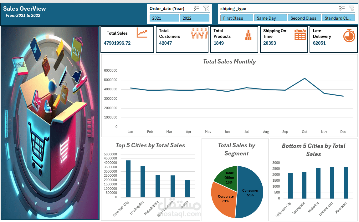
This project presents an interactive Sales Dashboard designed to analyze sales performance for the period 2021–2022. The dashboard provides clear insights into sales trends, customer behavior, and shipping performance to support better business decision-making.
The dataset was cleaned, transformed, and prepared using Power Query, then analyzed and visualized using Excel and DAX through dynamic charts and KPIs. The dashboard also includes filters that allow users to explore the data by year and shipping type.
Key Insights & Visualizations
Total Monthly Sales:
Shows sales trends across months to identify growth patterns and seasonal fluctuations.
Top 5 Cities by Total Sales:
Highlights the highest-performing cities contributing to overall revenue.
Bottom 5 Cities by Total Sales:
Identifies underperforming cities that may require strategic improvements.
Sales by Segment:
Displays the distribution of sales across different customer segments (Consumer, Corporate, Home Office).
Shipping Performance:
Analyzes shipping efficiency, including on-time deliveries and late shipments.
Tools Used
Microsoft Excel
Power Query
DAX
Project Value
This dashboard helps businesses monitor sales performance, identify key trends, and evaluate operational efficiency. It provides actionable insights that support data-driven decision-making and improve overall business performance.