Sales Performance Dashboard | Power BI Project
تفاصيل العمل
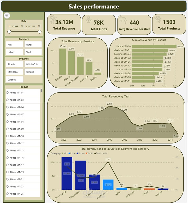

I built this interactive Sales Performance Dashboard using Power BI to transform raw sales data into meaningful business insights.
? The dataset originally started as an Excel sheet containing sales data for more than 75K units.
Using Power BI, the data was cleaned, modeled, and visualized to help answer key business questions.
? Key Insights from the Dashboard:
• Total Revenue: 34.12M generated from product sales
• Total Units Sold: 78K units
• Average Revenue per Unit: 440
• Total Products: 1503 products in the catalog
? What the dashboard shows:
• Revenue by Province
Helps identify the regions generating the highest sales so the company can focus on expanding distribution in those markets.
• Revenue by Product
Highlights the top-performing products, allowing the business to increase production or create more variations of high-demand items.
• Revenue by Year
Shows the yearly sales trend and helps identify the best-performing years.
This allows businesses to analyze what factors or events contributed to higher sales during those periods.
• Revenue & Units by Segment and Category
This visualization compares different market segments and categories, helping understand which segment drives both sales and product demand.
? The goal of this dashboard is to support data-driven decisions in production planning, market expansion, and product strategy.
? Tools Used:
Power BI | Data Modeling | Data Visualization | Excel