English Premier League Top 3 Analysis (Last 10 Seasons)
تفاصيل العمل
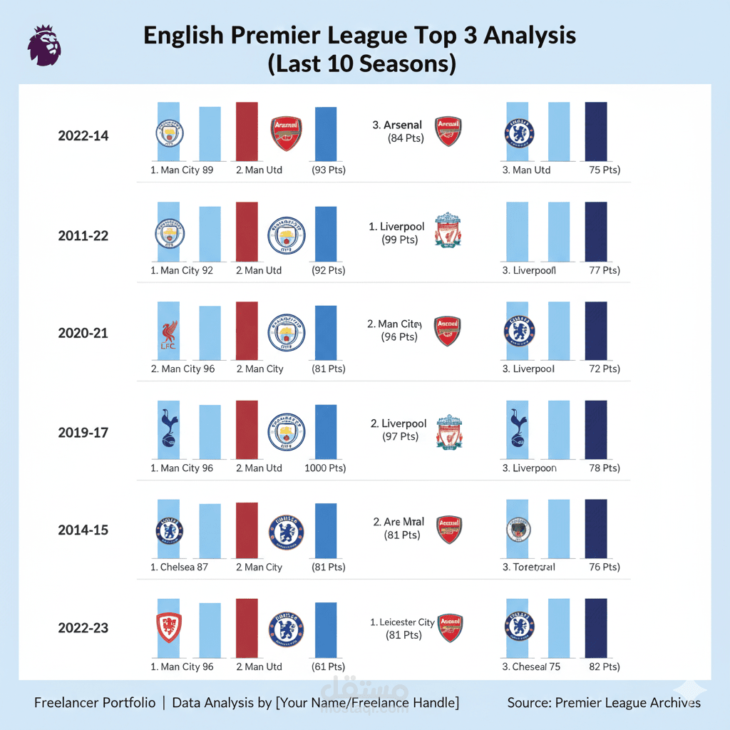
In this slide, we are looking at a data visualization focused on the English Premier League's top three finishers over various historical seasons. The goal of this infographic is to compare point totals and club consistency using a clean, structured layout."
Key Features of the Infographic:
Hierarchical Layout: The data is organized chronologically on the left axis, allowing for a season-by-season comparison of team standings.
Visual Indicators: We have utilized club crests for immediate brand recognition, paired with bar charts that visually represent the 'points gap' between the top three positions.
Color Coding: A professional color palette of blues and reds is used to maintain a sports-centric aesthetic while ensuring the typography remains legible.
Data Points: Each section highlights the specific points earned (e.g., 99 Pts, 92 Pts), providing a quick reference for the level of competition in that specific year.