HR Strategic Performance & Workforce Analysis
تفاصيل العمل

Executive Summary
A dynamic Excel dashboard built to diagnose a critical 11% drop in employee performance across key Egyptian branches (Cairo, Alexandria, Tanta). This analysis empowered HR leadership with actionable insights into salary disparities, experience gaps, and department-level trends, culminating in a tool for proactive talent management.
? Project Objectives
Diagnose Performance Decline: Identify root causes of the 11% overall performance decrease between 2020 and 2021.
Analyze Geographic & Departmental Variances: Compare metrics across three cities and all functional departments.
Audit Compensation Equity: Uncover and visualize salary gaps for similar roles and experience levels.
Build an HR Toolkit: Create an interactive, user-friendly dashboard with employee search functionality for daily HR operations.
?️ Tools & Technologies
Microsoft Excel (Advanced): PivotTables, PivotCharts, Slicers, Timeline
Data Modeling: Custom columns, XLOOKUP/VLOOKUP
Dashboarding: Form Controls (Buttons), Cell Linking, Bookmark Navigation
Data Analysis: Conditional Formatting, Advanced Formulas
? Data & Process
The analysis followed a structured ETL and storytelling process:
1. Data Preparation & Cleaning
Removed duplicate entries and empty columns to ensure data integrity.
Created key calculated columns:
Years of Experience: (Based on joining date).
Age: Calculated from birth date.
Performance Delta: 2021 Performance - 2020 Performance (revealing the -11% trend).
2. Core Analysis & Modeling
Built a suite of PivotTables as the analytical engine, segmented into two streams:
Location Analysis: Comparing Cairo, Alexandria, and Tanta.
Department Analysis: Drilling into trends across Finance, Sales, IT, HR, etc.
Established data relationships to ensure single-source truth for dashboards.
3. Interactive Dashboard Development
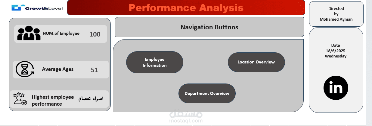
Page 1: Navigation & High-Level KPIs
Central hub with Employee Count, Average Age, and Highest Performance metrics.
Navigation buttons (using Form Controls & Bookmarks) to seamlessly switch between views.
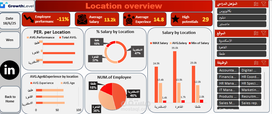
Page 2: Location Overview
Key Visuals:
% Salary by Location (Donut Chart)
Salary by Location (Bar Chart showing Min, Avg, Max)
Avg. Age & Experience by Location (Combo Chart)
Performance per Location (Metric Card)
Primary Insight: Identified significant salary compression and a mismatch between experience and compensation in specific cities.
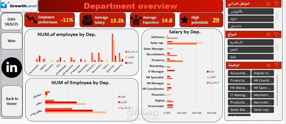
Page 3: Department Overview
Key Visuals:
Number of Employees by Department (Treemap/Bar Chart)
Performance by Department (Line Chart)
Primary Insight: Pinpointed departments with the steepest performance declines and those resisting the trend.
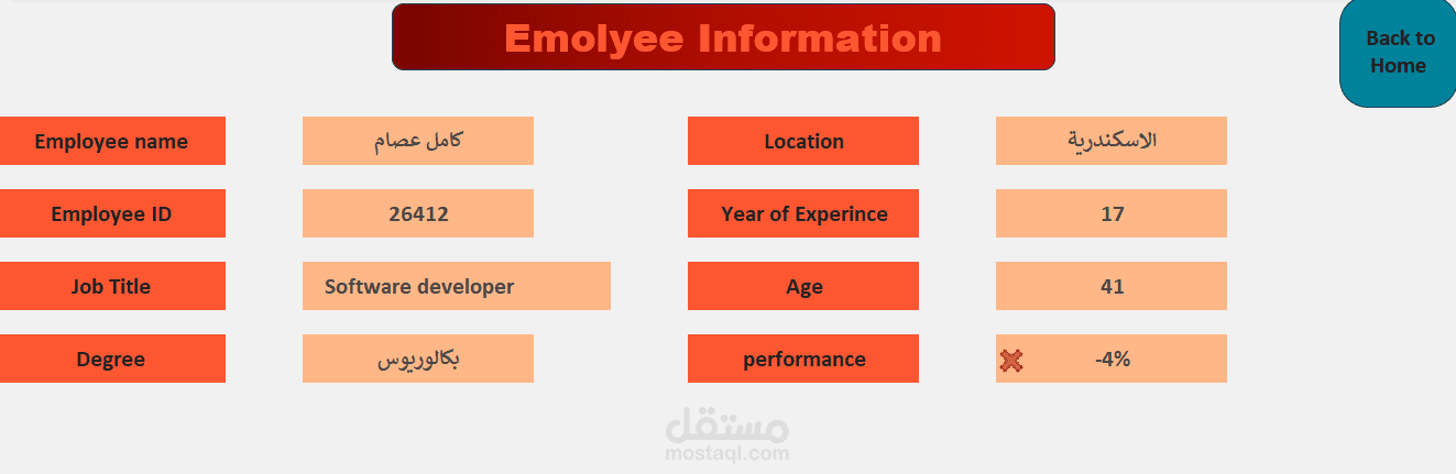
Page 4: Employee Search Tool
Built a searchable index using VLOOKUP/XLOOKUP.
HR staff can search by Employee Name or ID to instantly pull up a profile card with all relevant details (Experience, Age, Performance Trend, Location, Degree).