Sales Performance Dashboard Project – 2025
تفاصيل العمل
I’m excited to share my latest interactive dashboard for analyzing sales performance, fully built using Microsoft Excel and leveraging its powerful data analysis and visualization tools.
Key Goals & Results
The goal of this project was to provide a comprehensive and real-time view of sales performance, focusing on:
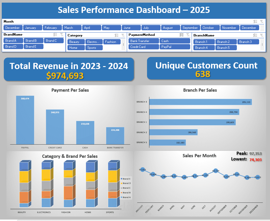
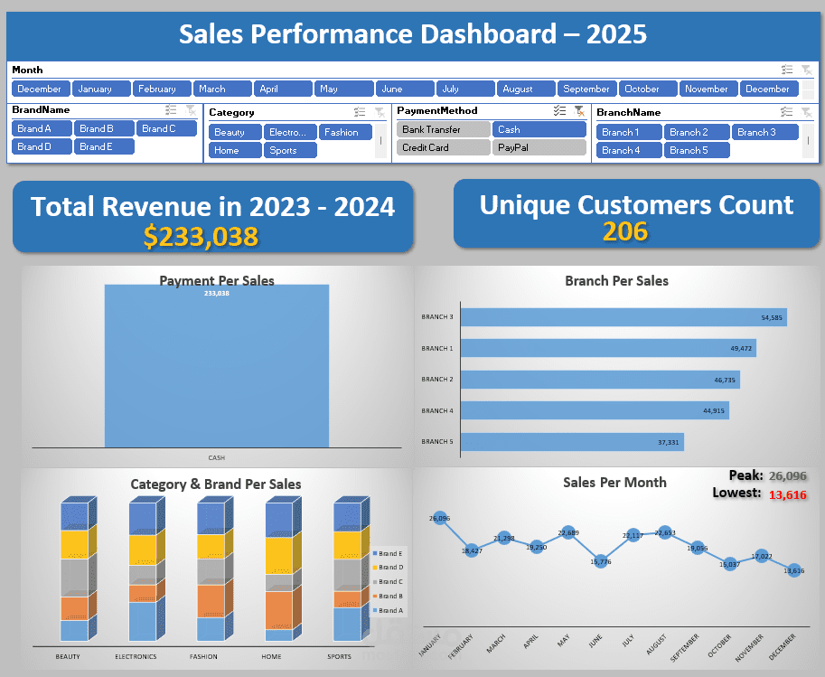
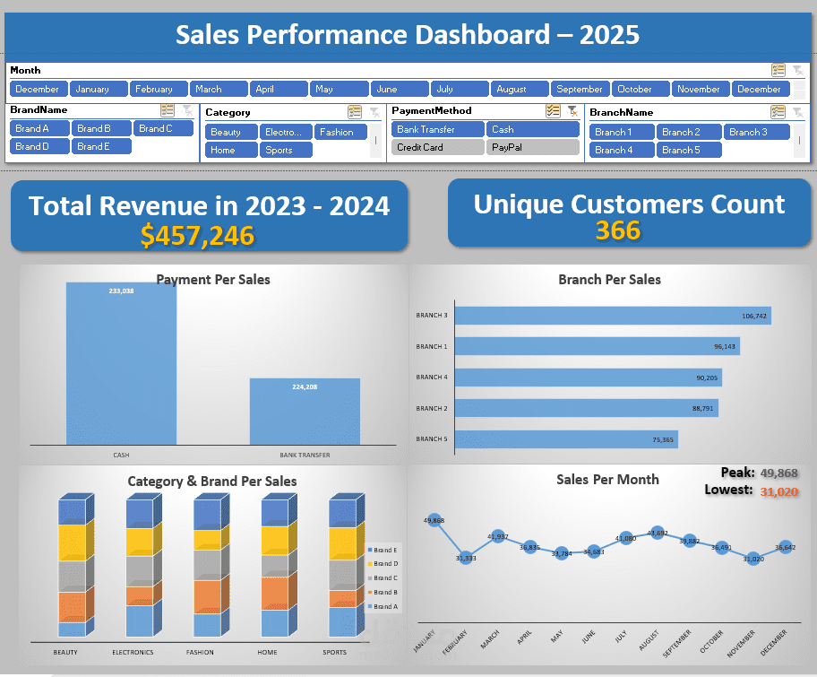
Total Revenue: $974,693
Unique Customers: 638
The dashboard helps track trends and identify high and low-performing areas through:
Monthly Sales Performance: Peak revenue ($97,353) and lowest revenue ($74,303).
Revenue by Payment Method: Analysis of payment types such as PayPal, Credit Card, Cash, and Bank Transfer.
Branch Performance Comparison: Evaluate each branch’s contribution to overall sales.
Category & Brand Analysis: Understand how each product category and brand contributes to total sales.
️ Tools & Methodology
This dashboard was built on a solid foundation of data modeling and analytics using advanced Excel tools:
Power Query: For data cleaning, transformation, and ensuring data quality.
Power Pivot: For building a relational data model and creating dynamic KPIs and DAX measures.
Pivot Tables & Charts: To summarize complex data and visualize it clearly with interactive slicers for easy filtering.