Sales analysis dashboard
تفاصيل العمل
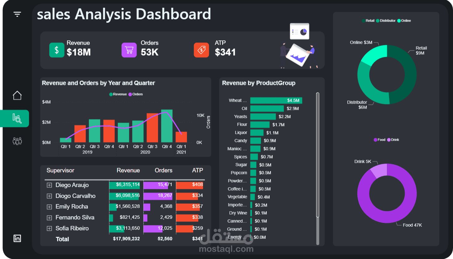
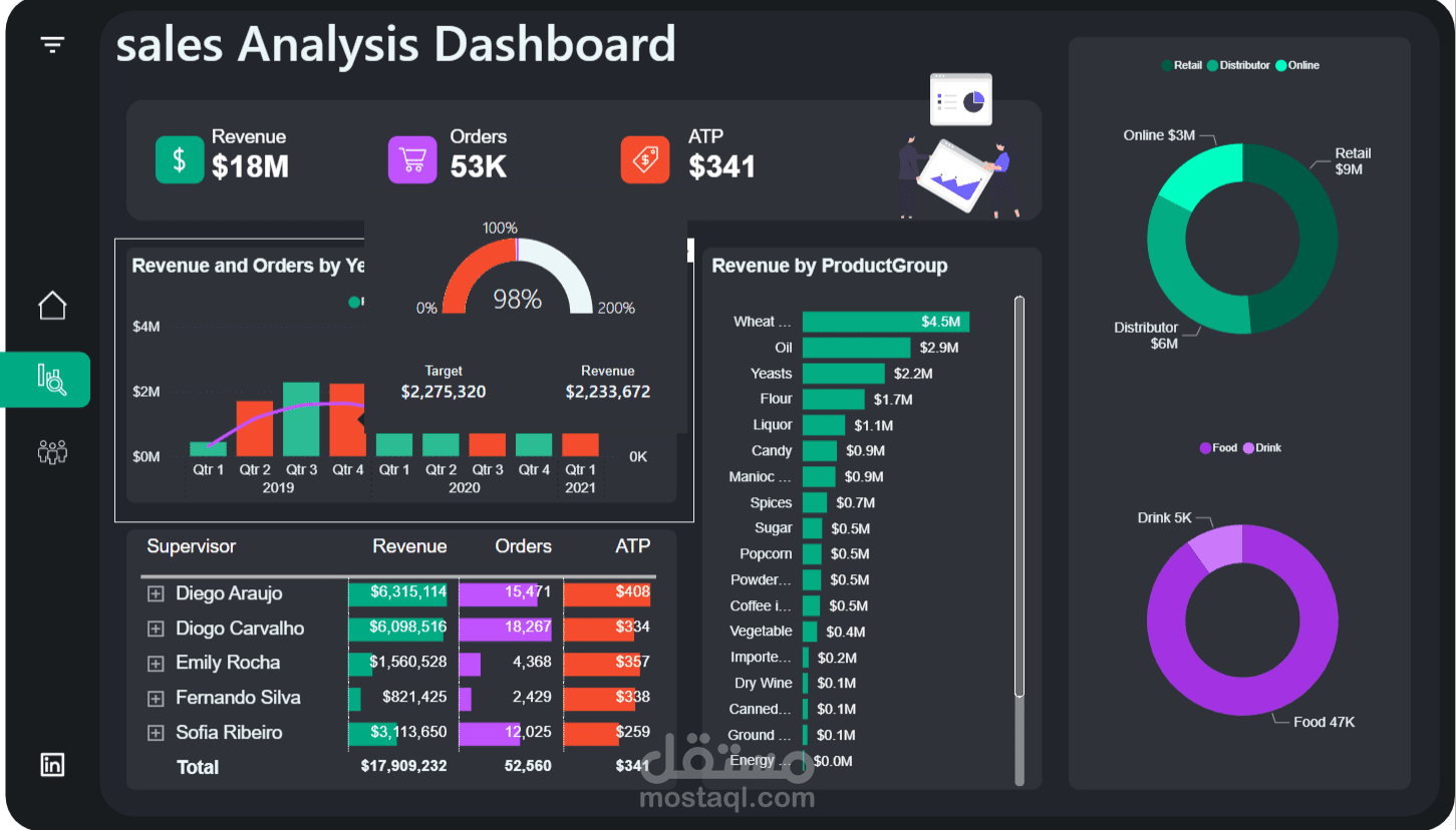

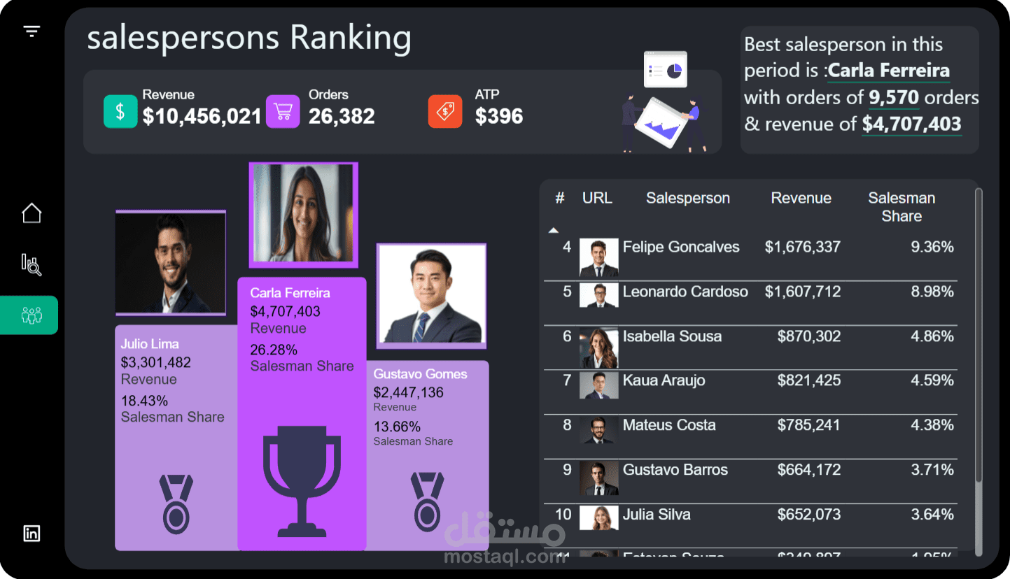
As a data enthusiast, I dove into a rich dataset to uncover key insights into our sales performance. The results? Total revenue soared to $18M, with 53K orders and an average transaction price (ATP) of $341. Qtr4 2021 stood out with peak revenue, while supervisors like Diego Araujo ($6,315,114) and Diogo Carvalho ($6,098,516) led the team.
Breaking it down by product group:
Wheat: $4.5M
Yeast: $2.2M
Flour: $1.2M
Liquor: $1M
Candy: $0.9M
And more, down to Energy at $0M
On the channel side, Retail dominated with $9M, followed by Distributor at $6M and Online at $3M. Category-wise, Food hit $47K and Drink $5K. These visuals track trends over 2019-2021, showing growth patterns ideal for strategic decisions!
How I Built It (Simplified):
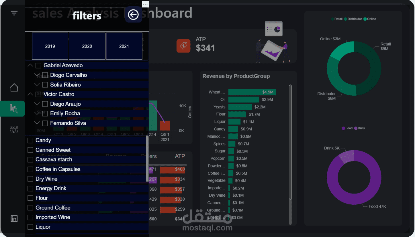
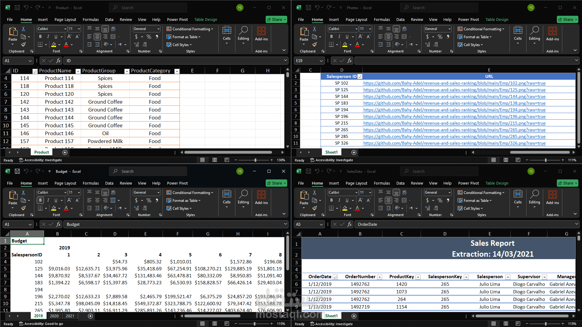
Data Prep in Power Query: Started with raw data import, then handled preprocessing and cleaning. A key step was normalizing the data to ensure consistency (e.g., standardizing formats for dates and categories) and denormalizing for reporting efficiency.
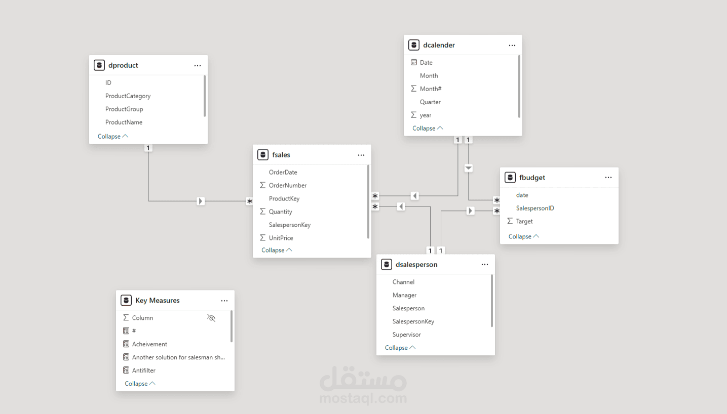
Data Modeling: In Power BI, I created relationships between tables (e.g., linking sales to product and supervisor tables via IDs) for seamless analysis.
Dashboard Creation: Used Power BI’s interface to build interactive visuals, including bar charts for yearly trends and pie charts for breakdowns.
Key Measures and KPIs Explained:
Revenue: Sum of all sales amounts to track total income.
Orders: Total count of transactions for volume insights.
ATP: Average revenue per order, calculated as Revenue / Orders.
Other KPIs like top supervisors use DAX to highlight leaders.