coffe sales
تفاصيل العمل
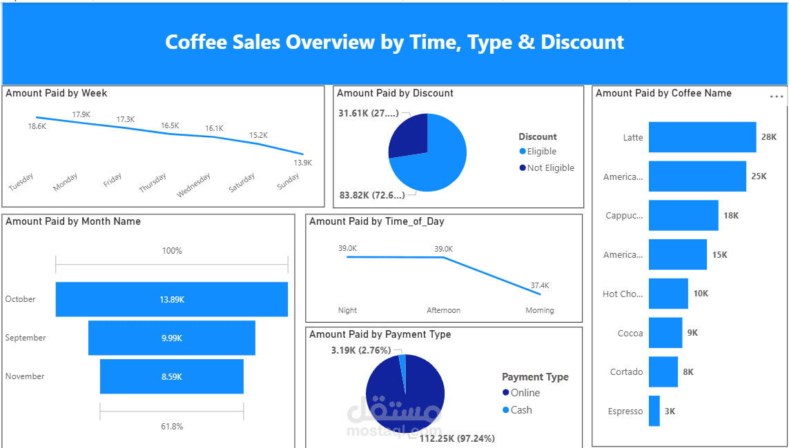
I created an interactive dashboard that gives a full overview of coffee sales based on time, product type, discounts, and payment methods. The goal was to make the data easy to understand and highlight sales trends clearly.
I cleaned and prepared the dataset, then designed visuals showing:
Sales by day of the week, month, and time of day
Comparison of payment types (cash vs. online)
Revenue split between discounted and non-discounted purchases
Top-selling coffee types like Latte, Americano, and Cappuccino
This dashboard helps identify which products perform best, when customers buy most often, and how discounts and payment preferences affect total sales. It’s clean, easy to read, and great for tracking business performance at a glance