Proud to share a complete end-to-end Workforce Analytics project I
تفاصيل العمل

Proud to share a complete end-to-end Workforce Analytics project I built using Power BI, covering everything from raw data cleanup to an interactive, decision-ready dashboard.
Objective:
Create an interactive dashboard to analyze employee performance, satisfaction, and identify root causes of attrition to help HR and leadership make data-driven decisions.
Dataset Overview:
Multiple source files containing employee demographics, job details (department, salary, job role), performance ratings, satisfaction levels, and hire/leave dates.
Approach & Tools:
? Power Query — ETL: import, clean, standardize, and handle missing values.
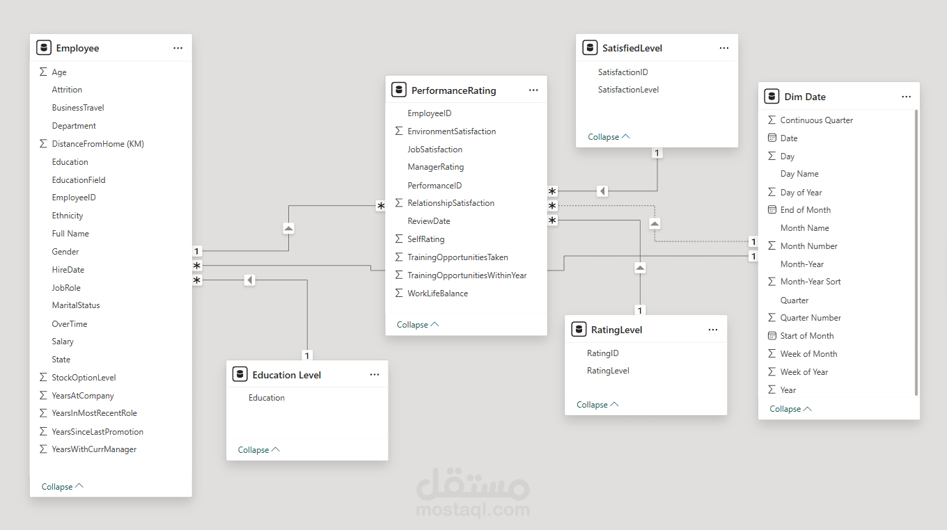
Data Modeling — designed a Star Schema linking fact tables with DimDate, DimEducation, DimRating.
? DAX — implemented ~10 core measures and complex calculations (Attrition Rate, Avg Performance, Median Salary, High Performers Count).
Figma — designed the dashboard background and mockups for a polished UI.
Power BI Visuals — built a 2-page interactive dashboard (Attrition Insights & Performance Profile) with slicers and navigation buttons.
Key Challenges & Solutions:
Missing / invalid DimDate file → solution: created a dynamic Date table with M-code in Power Query for accurate time intelligence.
Inconsistent Gender values (1,0,Male,Female) → solution: normalized using conditional columns in Power Query.
Incorrect DAX logic due to model issues → solution: reviewed and fixed the model and measures (e.g., High Performers Count, Avg Performance).
Avg Salary distorted by outliers → solution: added Median Salary as a robust metric alongside the mean.
Final Dashboard Design:
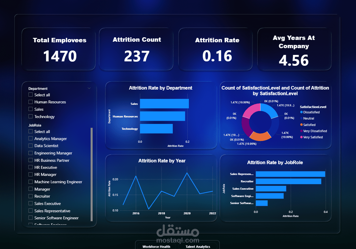
Page 1 — Attrition Insights: KPIs (Total Employees, Attrition Count/Rate, Avg Tenure), charts (Attrition by Dept/JobRole, trend), and interactive map.
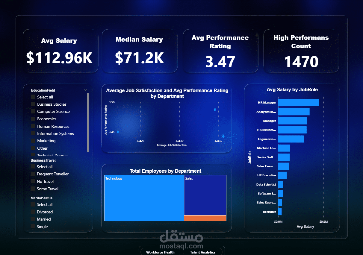
Page 2 — Performance Profile: KPIs (Avg Salary, Median Salary, Avg Performance), charts (Satisfaction vs Performance, Avg Salary by JobRole), distribution visuals.
Interactive navigation buttons + slicers for fast exploration.
Outcome:
A reliable, user-friendly dashboard that turns complex HR data into actionable insights — enabling faster, better decisions.