Sales Performance Dashboard using Excel
تفاصيل العمل
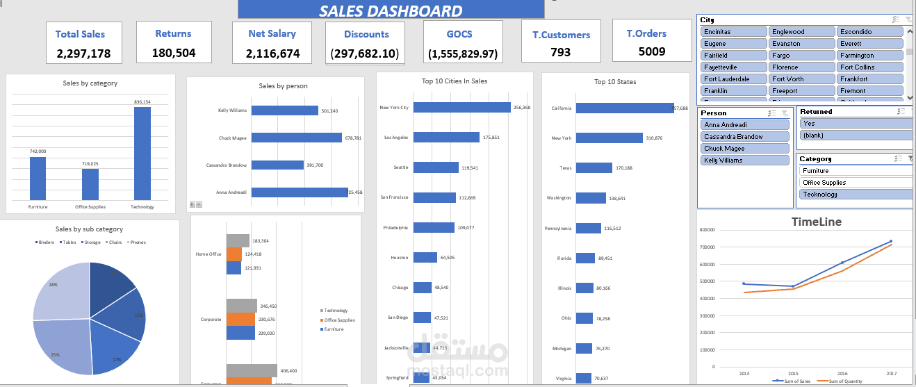
This project presents a Sales Analysis Dashboard built entirely in Microsoft Excel using advanced data analysis tools such as Pivot Tables, Pivot Charts, and Slicers.
Project Features:
Analyzed total sales, returns, discounts, and profits.
Created dynamic visualizations showing Top Cities, States, and Salespersons.
Implemented interactive filters for Category, City, and Person to allow user-driven insights.
Designed time-series charts to track sales performance trends across multiple years.
Key Insights:
The Technology category achieved the highest sales performance.
California and New York were the top-performing regions.
Clear upward trend in sales and quantity over time.
Tools Used:
Microsoft Excel (Pivot Tables, Charts, Slicers, and Conditional Formatting)
This dashboard showcases my ability to use Excel for professional data analysis, visualization, and reporting.