section for choses
تفاصيل العمل
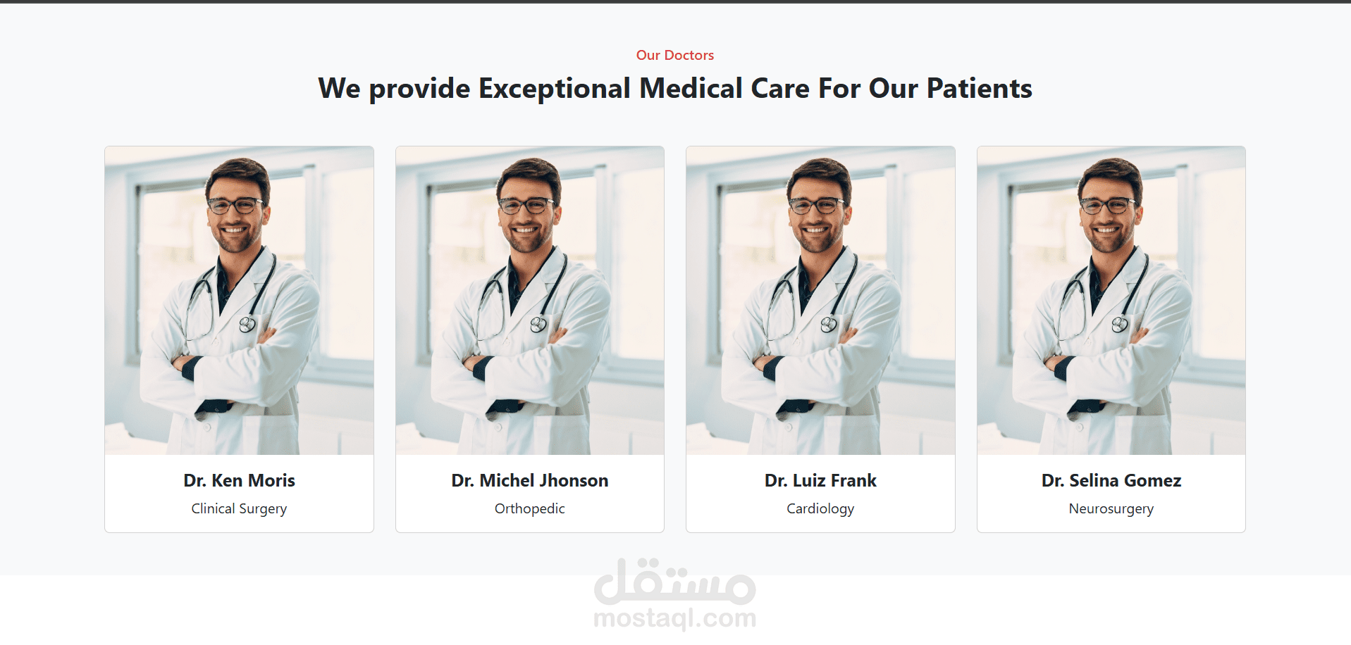
it was a section for many dotors you can chose from them i used
1. HTML5
Purpose: Structure and semantic layout.
Usage in Image:
<section> or <div> containers to wrap the whole doctor section.
<h2> for the heading “We provide Exceptional Medical Care For Our Patients”.
<img> tags for doctor images.
<p> or <span> for roles (e.g., “Neurosurgery”).
2. CSS3 (or SCSS/SASS)
Purpose: Styling and layout.
Usage in Image:
Flexbox or CSS Grid to create the responsive 4-column layout.
Border-radius, box-shadow, and padding to create card-like components.
Typography (bold for names, light for titles).
Hover effects may be applied to cards (not visible in static image, but common in such designs).
Use of color for headings (e.g., “Our Doctors” in red).
3. JavaScript (Optional)
Purpose: Interactivity.
Possible Use:
Carousel/slideshow (if the doctors are scrollable).
Modals/popups for more details about each doctor.
Fetching dynamic content via APIs.
4. Frameworks or Libraries (optional but likely):
React, Vue, or Angular: The component-based structure suggests this section could be a reusable DoctorCard component used in a grid.
Tailwind CSS / Bootstrap: If utility-first styling is used, it might be powered by Tailwind CSS (e.g., flex, shadow-lg, text-center, etc.)
Next.js or Nuxt.js: If SEO and server-side rendering is needed.