داش بورد
تفاصيل العمل

I started a sales data analysis journey with the goal of extracting clear insights to support decision-making.
The first step was reading and understanding the data, where we identified several text inconsistencies in the fields, such as:
•Accessories was written with 3 S’s → corrected to 2 S’s.
•Door to Door was written with 3 O’s → restored to the correct form.
•Standardized terms like Key Account, Retail, Consumer, and Upper that appeared in multiple formats.
After cleaning, we added new columns:
•Final Sales = Sales after deducting discounts.
•Sales Category to classify customers into: Low, Medium, High.
•Additional columns for Day Name and Month Name for analysis purposes.
All cleaning and transformation were done using Power Query.
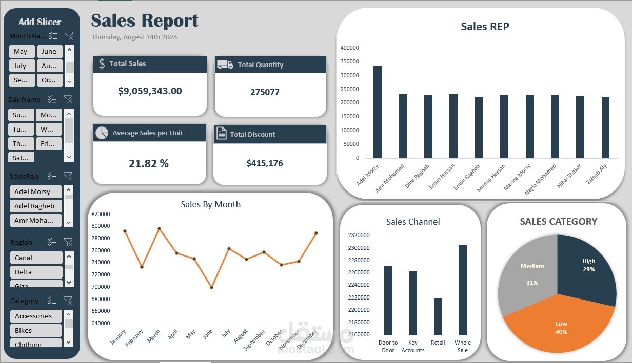
Then we designed an interactive Dashboard showing:
•Total Sales: 9,059,343
•Total Quantity: 275,077
•Average Sales Per Unit: 21.82%
•Total Discount: 415,176
Key Insights:
•Top sales months: January, March, December.
•Top sales day: Tuesday.
•Customer distribution: Low (40%), Medium (31%), High (29%).
•Top selling locations: Alexandria and Sinai.
Category-Level Analysis:
1.Accessories: Strong sales in March, July, September – Saturdays lead – Low category dominant – Top city: Canal.
2.Bikes: Peak sales in January – Tuesdays lead – Medium category on top – Alexandria & Sinai lead in sales.
3.Clothes: Peaks in March, July, September – Saturdays lead – Low category dominant – Giza top in sales.
4.Components: High in March, July, September – Fridays lead – Low category dominant – Sinai & Canal lead in sales.
Outcome: A clear vision that enables precise marketing decisions and optimizes sales performance in the most active periods and locations.