Titanic survivors dashboard
تفاصيل العمل
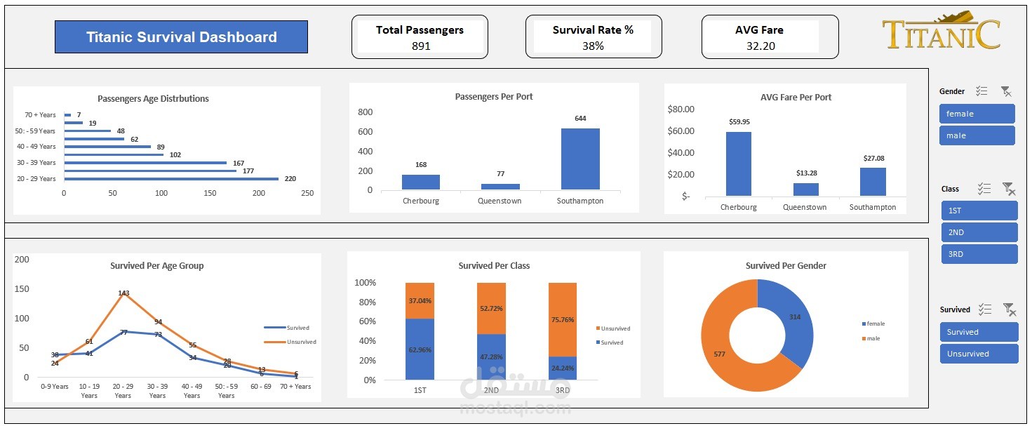
تساعد هذه اللوحة التفاعلية على استكشاف بيانات ركاب السفينة تيتانيك ومعرفة العوامل التي أثّرت على نسب النجاة بشكل واضح وسهل.
بدأتُ العمل بتنظيف البيانات باستخدام Power Query، حيث قمتُ باستبدال القيم غير الصحيحة وإضافة أعمدة جديدة للحصول على رؤى أوضح من البيانات.
بعد ذلك، بدأت في تصميم اللوحة التحليلية، والتي تتضمن:
فلاتر تفاعلية: يمكن تصفية البيانات حسب الجنس أو الدرجة (الأولى – الثانية – الثالثة) لمعرفة نسب النجاة لكل فئة.
تحليل العمر والجنس: يوضح كيف أثّر العمر والجنس في فرص النجاة.
مقارنة حسب الدرجة: يمكن مقارنة نسب النجاة بين درجات السفر الثلاث لمعرفة تأثير الحالة الاجتماعية والطبقية في فرص النجاة.
استكشاف سهل للبيانات: يمكن بنقرات بسيطة تحليل توزيع الركاب ومعرفة متوسط الأجرة وغيرها من التفاصيل.