data analysis using power bi and excel
تفاصيل العمل

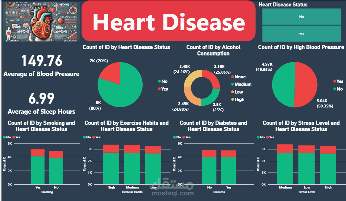
Overview of the Dashboard
The dashboard is designed to visualize the prevalence of heart disease and its correlation with several lifestyle and physiological factors. It features a clear, dark-themed interface with prominent red and green indicators for heart disease status (Yes/No), making it easy to interpret key metrics at a glance. The primary goal of this dashboard appears to be to identify patterns and risk factors associated with heart disease, which can be invaluable for public health initiatives, clinical decision-making, and individual health awareness.
Key Metrics and Visualizations
Heart Disease Status Distribution
The dashboard prominently displays the overall distribution of heart disease status among the surveyed population. A pie chart illustrates that approximately 80% of the individuals do not have heart disease, while 20% do. This foundational metric sets the context for all subsequent analyses.