Data Science Salary Dashboard
تفاصيل العمل
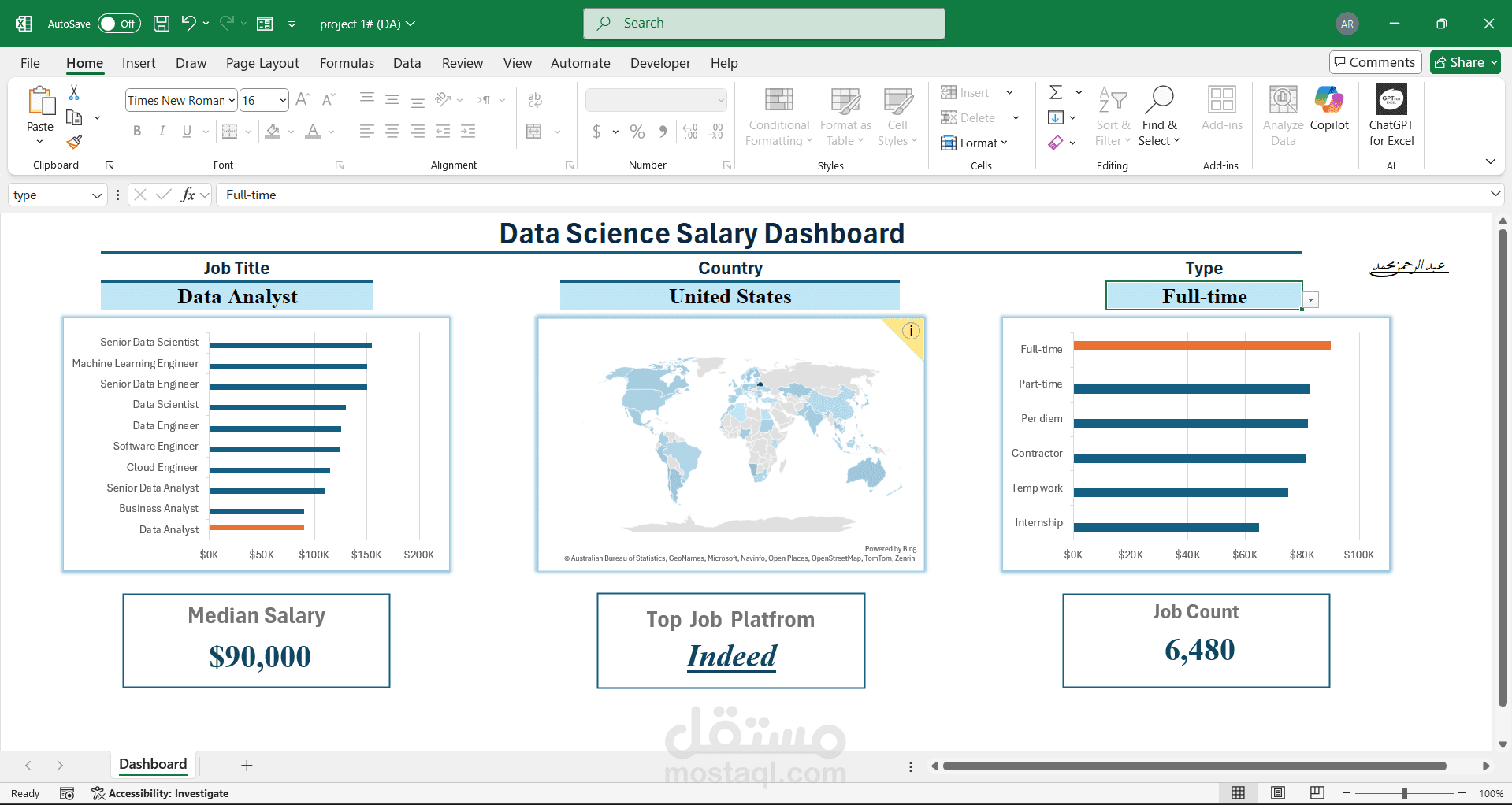
I have developed a professional interactive Excel dashboard based on a large dataset of more than 32,600 rows (columns A → P). The project aims to provide detailed insights into salary trends in the data science field, while offering dynamic filtering and professional visualization.
- Data Structure
The project consists of 7 organized sheets, including:
A main database (32,600+ rows).
Supporting sheets for calculations, validations, and visualization.
The data includes:
Job Title
Country
Employment Type (Full-time, Part-time, Contract, etc.)
Salary Data
Job Platform (applied through)
- Dashboard Features
1️⃣ Median Salary Analysis
Calculates the Median Salary based on three dynamic conditions:
Job Title
Country
Employment Type
Implemented with Data Validation drop-down menus for easy selection.
2️⃣ Top Job Platforms
Identifies the Top Platforms used for job applications.
Filtered dynamically by the same three conditions.
Visualized with clear ranking charts.
3️⃣ Job Count Analysis
Displays the number of job postings under selected criteria.
Acts as an indicator of demand by role and location.
- Interactivity & Usability
Data Validation Filters: Job Title, Country, Employment Type.
Fully interactive dashboard with automatic updates when criteria change.
User-friendly layout with KPIs and charts.
- Technical Skills Applied
Excel: Pivot Tables, Advanced Formulas, Median Calculations, SUMPRODUCT, Data Validation.
Data Cleaning & Processing for a large dataset (32,600+ records).
Dashboard Design: KPI cards, professional charts, clean layout.
- Dashboard Title
Data Science Salary Dashboard
________________________________________________________________
This project demonstrates my ability to work with large datasets, apply advanced Excel techniques, and design interactive dashboards that provide valuable insights in a professional and visually appealing way.