Sales Dashboard
تفاصيل العمل
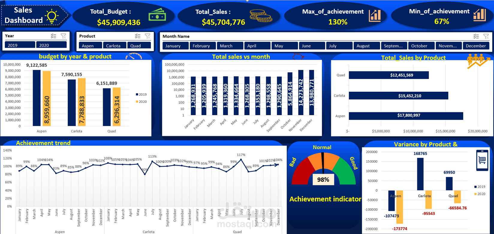
Ever thought about turning complex data into a clear dashboard that helps make decisions faster?
I created a completely new Excel Dashboard to compare and analyze Budget 2019, Revenue 2019, and Budget 2020 across all products.
This Dashboard stands out with:
Pivot Charts for each year, showing each product’s performance clearly and making year-to-year comparisons easy.
Slicers to fully control the display by product, month, or year, allowing quick and flexible data exploration.
Merging multiple Charts into a single view and adding Text Boxes to highlight key observations and insights, making the dashboard clearer and easier for managers and decision-makers to understand.
The result: a user-friendly, practical dashboard that helps anyone quickly grasp differences in budgets and revenues and make informed decisions.