Sales Dashboard
تفاصيل العمل
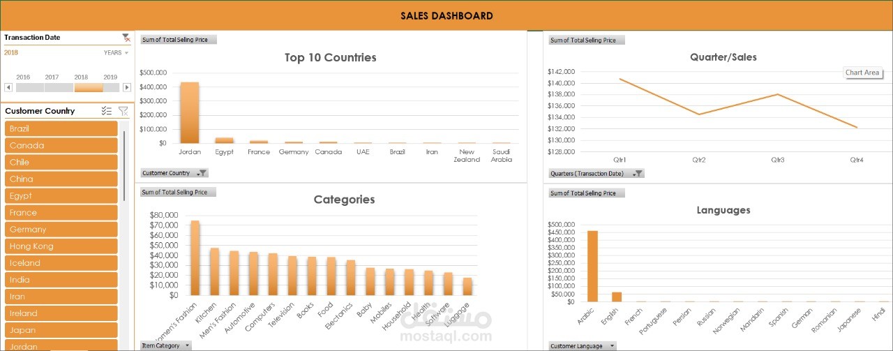
This was my first dashboard project, where I transformed raw sales data into a clear and interactive tool for analysis. The dashboard tracks sales performance over time, highlights top-performing products and regions, and provides quick insights into overall business performance. My goal was not only to visualize numbers but to create a dynamic, user-friendly tool that tells the story behind the data.
What I Used:
Pivot Tables & Pivot Charts → for analyzing sales trends and performance
Slicers & Timelines → to make filtering smooth and interactive
KPI Cards → to display key metrics like Total Sales, Profit, and Top Country
Conditional Formatting → to highlight important results at a glance
Clean Dashboard Design → for professional, easy-to-read insights