بناء لوحة بيانات احترافية ومميزة
تفاصيل العمل
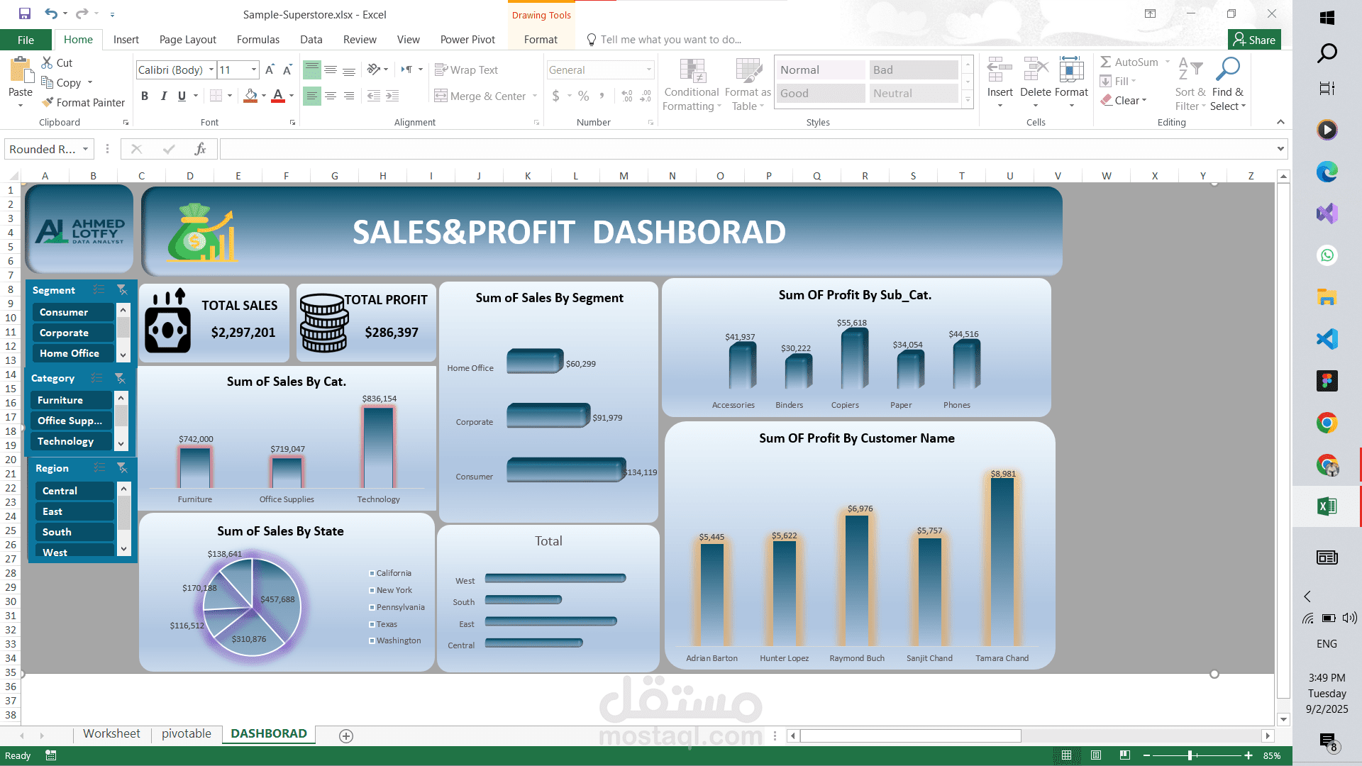
قمت بتحليل بيانات Sample Superstore من خلال إنشاء تقارير ولوحات تفاعلية توضح:
اتجاهات المبيعات والأرباح حسب الفئات والمناطق.
️ مقارنة الأداء بين المنتجات والقطاعات المختلفة.
تحليل جغرافي يوضح أكثر المناطق ربحية.
تصميم Dashboard تفاعلي يساعد متخذي القرار في تحديد نقاط القوة والضعف.
النتيجة: لوحة مؤشرات احترافية تسهّل فهم البيانات واتخاذ قرارات مبنية على معلومات دقيقة.
-----------------------------------------------------------------------
I analyzed Sample Superstore data professionally using advanced Excel tools. The process included cleaning and preparing the dataset with Power Query, followed by building detailed reports and interactive dashboards that highlight:
Sales and profit trends across categories, regions, and different time periods.
️ Performance comparison between products and segments to identify the most and least profitable items.
Geographic analysis to showcase the most profitable markets and regions.
An interactive dashboard that clearly presents key performance indicators (KPIs), making it easier for decision-makers to interpret insights.
Result: A comprehensive performance dashboard that empowers decision-makers, provides a full view of business performance, and highlights opportunities and challenges facing the store