HR Attrition Dashboard – Excel Project
تفاصيل العمل
HR Attrition Dashboard – Excel Project
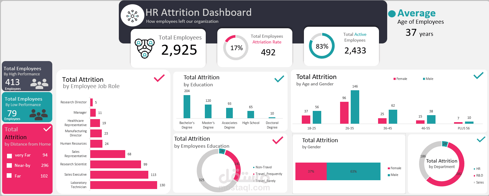
This interactive HR Attrition Dashboard was designed to analyze and visualize employee attrition trends within an organization. Using Excel’s advanced data visualization tools, I transformed raw HR data into a clear, dynamic report to support strategic decision-making.
Key Insights & Features:
Total Workforce Overview: Displays total employees (2,925), active employees (2,433), and attrition rate (17%).
Employee Profile: Shows the average age of employees (37 years) and performance-based segmentation (high vs. low performers).
Attrition Analysis by Dimensions:
Job Role – Identifies roles with the highest turnover (e.g., Laboratory Technician, Sales Executive).
Education Level – Highlights attrition by degree type (highest among Bachelor’s degree holders).
Age & Gender – Reveals trends across age brackets and gender distribution.
Distance from Home – Analyzes how commute distance impacts attrition.
Department & Travel Frequency – Assesses how departmental roles and travel requirements relate to turnover.
Visual Design: Used Excel charts, conditional formatting, and shapes for a clean, professional layout. Color coding enhances readability and quick insight extraction.
Impact:
This dashboard enables HR teams to quickly identify high-risk groups, understand key attrition drivers, and take targeted actions to improve retention strategies.