Bank Customers Analysis – Excel Data Visualization
تفاصيل العمل
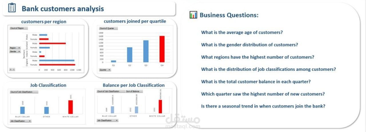
In this project, I analyzed a bank’s customer data and answered key business questions using Excel dashboards and visualizations. I created interactive charts to explore:
Customer distribution by region and gender.
Seasonal trends of customers joining per quarter.
Job classifications and how they relate to account balances.
Insights into which quarter had the highest number of new customers.
These visualizations make it easy for decision-makers to quickly spot trends, compare categories, and understand customer behavior at a glance. The dashboard highlights not just numbers, but patterns that support strategic planning and customer-focused decisions.