bank dashboard
تفاصيل العمل

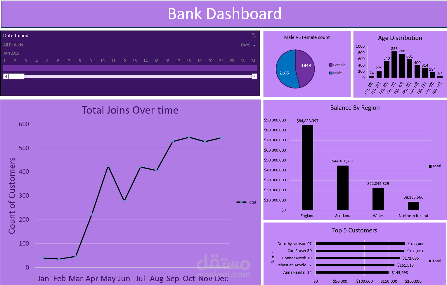
My First Excel Dashboard – Bank Analytics
Excited to share my first data visualization project using Excel!
This interactive dashboard reveals key insights such as:
️ Customer trends over time
️ Age & gender segmentation
️ Regional balance distribution
️ Top-performing customers
? What can the bank do with this?
Target the 30–40 age group for new accounts
Focus on high-value regions like England
Retain top customers with personalized service
Improve reach in low-performing regions
Customize offerings by gender and age
This project taught me how to turn raw data into real business decisions using Pivot Tables, Charts, and Slicers.