Sales Dashboard
تفاصيل العمل
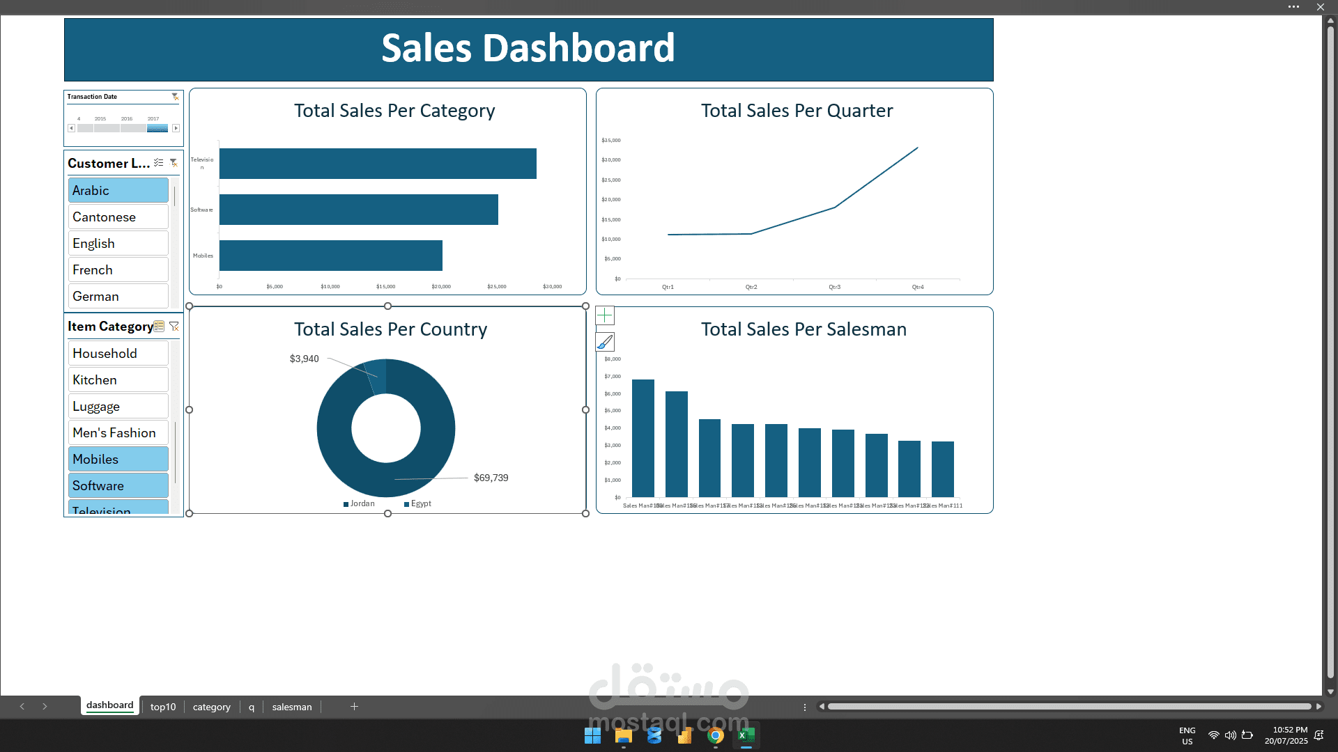
a project where I combined three essential pillars of data-driven reporting:
1. Data Visualization:
I created interactive and intuitive visuals, from bar and line charts to pie graphs, making key metrics like total sales per category, country, and salesman easy to digest at a glance.
2. Business Insight:
This dashboard goes beyond visuals — it reveals trends in quarterly sales, highlights top-performing categories, and identifies which regions and salespeople drive the most revenue.
️ 3. Technical Execution:
Built it by using Excel, I utilized slicers, filters, and dynamic elements to make the dashboard flexible and user-friendly for various business questions.