Trade Data Analysis – From Excel Sheets to Interactive Power BI Dashboards
تفاصيل العمل

Trade Data Analysis – From Excel Sheets to Interactive Power BI Dashboards
Project Highlight: Building a Trade Data Dashboard in Power BI
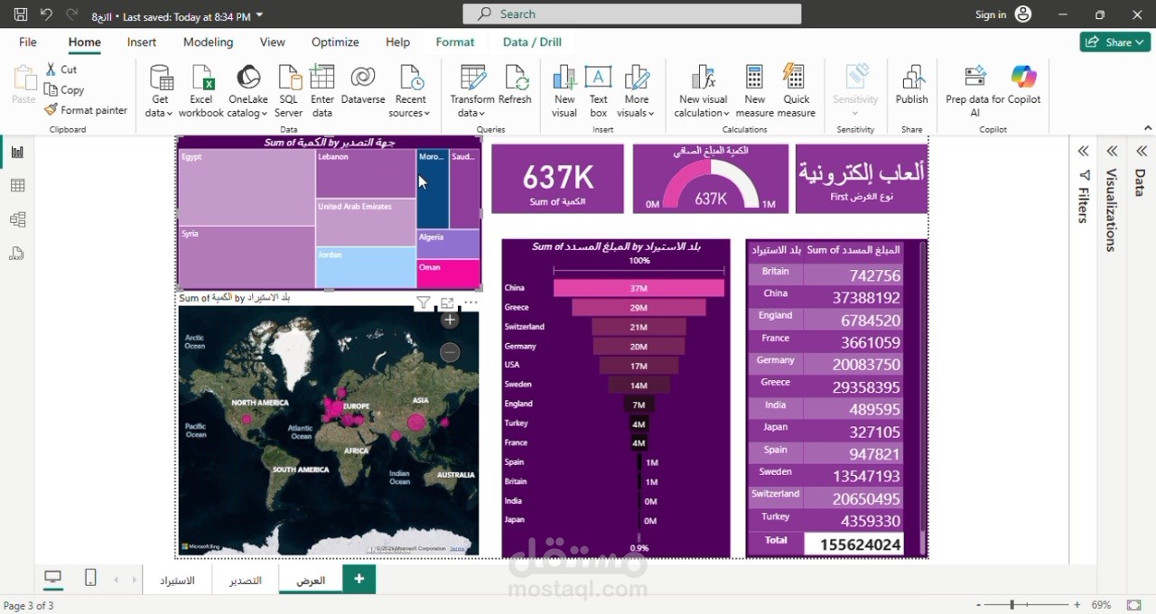
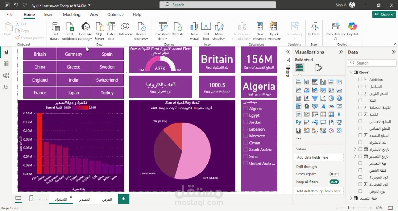
As part of a recent data analysis project, I developed a comprehensive and interactive dashboard using Microsoft Power BI — starting from well-structured Excel datasets.
Workflow Overview:
Step 1: Excel – Data Structuring & Cleaning
Organized raw trade data involving multiple countries.
Cleaned and validated the datasets for consistency and usability.
Step 2: Power BI – Data Modeling & Visualization
Built relationships between tables to enable dynamic insights.
Designed a multi-page, fully interactive dashboard featuring:
KPIs: Total quantity, amount paid, and average price.
Year-over-year analysis by country and product category.
Interactive slicers (filters) for country, year, quarter, and category.
Pie charts, bar charts, and map visuals to represent geographic and product distribution.
Goal:
To turn raw data into visual insights that support better decision-making and reveal patterns in trade performance.
️ Check out the short demo video below showcasing the dashboard in action.
Always open to connecting with professionals in data analytics, business intelligence, and finance. Feel free to reach out or share your feedback — I’d love to hear your thoughts!
#PowerBI #Excel #DataAnalysis #DashboardDesign #BusinessIntelligence #TradeAnalytics #DataVisualization #FinanceAnalytics #MicrosoftBI #ProfessionalGrowth