“End‑to‑End Sales Insights: From Tax to Fulfillment”
تفاصيل العمل

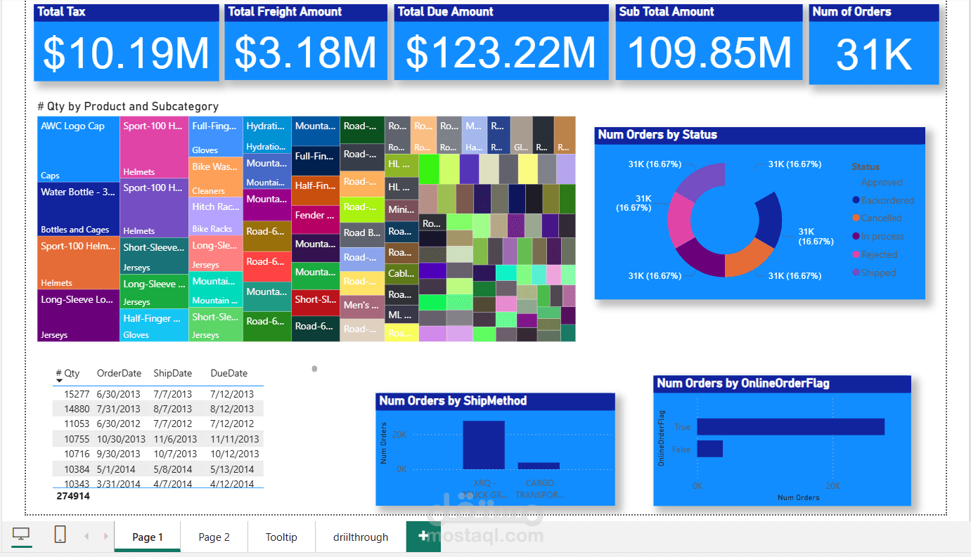
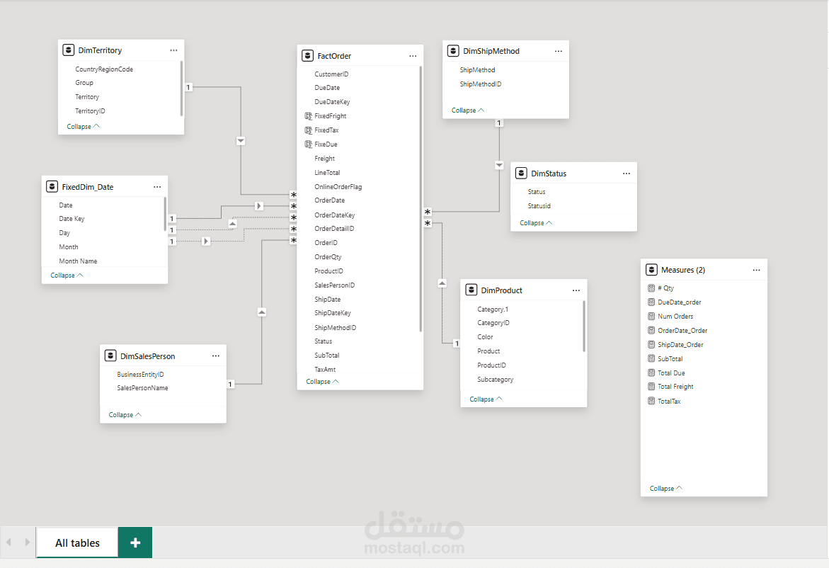
Power BI Sales Dashboard Overview
This dashboard presents a comprehensive summary of sales and order data, providing key performance indicators (KPIs) and visual insights into product performance, shipping methods, and order statuses.
Top KPIs (Cards):
At the top, we see five KPI cards highlighting key financial and operational metrics:
Total Tax: $10.19M
Total Freight Amount: $3.18M
Total Due Amount: $123.22M
Sub Total Amount: $109.85M
Number of Orders: 31K
These cards offer a quick overview of the company's financials and order volume.
? Treemap – Quantity by Product and Subcategory:
A colorful treemap displays the number of units sold, broken down by product and subcategory (e.g., Helmets, Jerseys, Water Bottles, Gloves).
Each rectangle represents a product.
The size of the box indicates the relative sales quantity.
? Heatmap (Matrix Chart):
The chart next to the treemap appears to be a heatmap showing product-related metrics—possibly sales quantity or frequency across different dimensions (e.g., products vs. time or customers).
The color intensity indicates higher or lower values.
Donut Chart – Number of Orders by Status:
This visual shows how orders are distributed across various statuses, such as:
Approved
Backordered
Cancelled
In Process
Rejected
Shipped
All segments are equal (31K orders, 16.67% each), which may suggest demo or placeholder data.
Order Table (Detailed Records):
A detailed table at the bottom left displays individual order records with:
Order number
Order date
Ship date
Due date
Quantity
Total number of records: 274,914 orders
Bar Chart – Orders by Ship Method:
This visual breaks down the number of orders by shipping method, such as:
XRQ - Truck Ground (largest volume)
Cargo Transport (smaller volume)
️ Bar Chart – Orders by Online Order Flag:
Displays the number of online vs. offline orders:
"True" (Online) = Majority of orders
"False" (Offline) = Fewer orders
️ Tabs (Pages):
The bottom shows multiple pages in the Power BI file:
Page 1 (current view)
Page 2
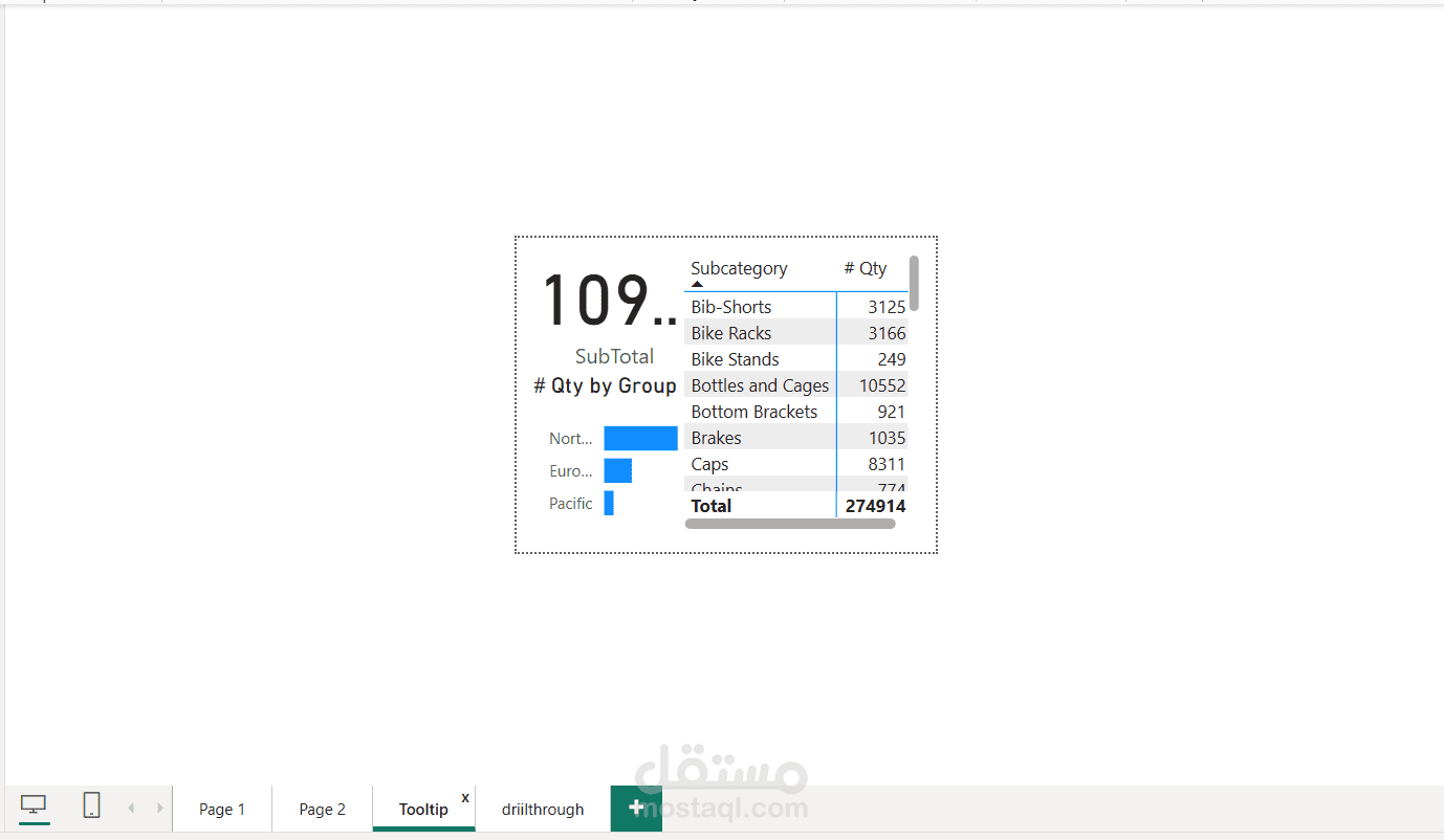
Tooltip
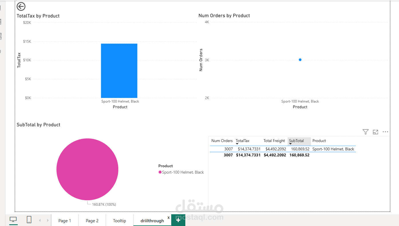
Drill through
These likely offer further analysis, deep dives, or interactive filtering.
Overall Impression:
Professional, well-structured layout
Clear visual hierarchy
Balanced use of color for KPIs and charts
Great for executive-level insights into sales operations