portfolio
تفاصيل العمل
الموقع الإلكتروني هو صفحة شخصية بسيطة وفعالة، مصممة باستخدام HTML و CSS، مع لمسات من JavaScript لتوفير تفاعل بسيط. يركز التصميم على عرض المعلومات الأساسية للمستخدم بطريقة واضحة وجذابة.
بنية HTML:
•
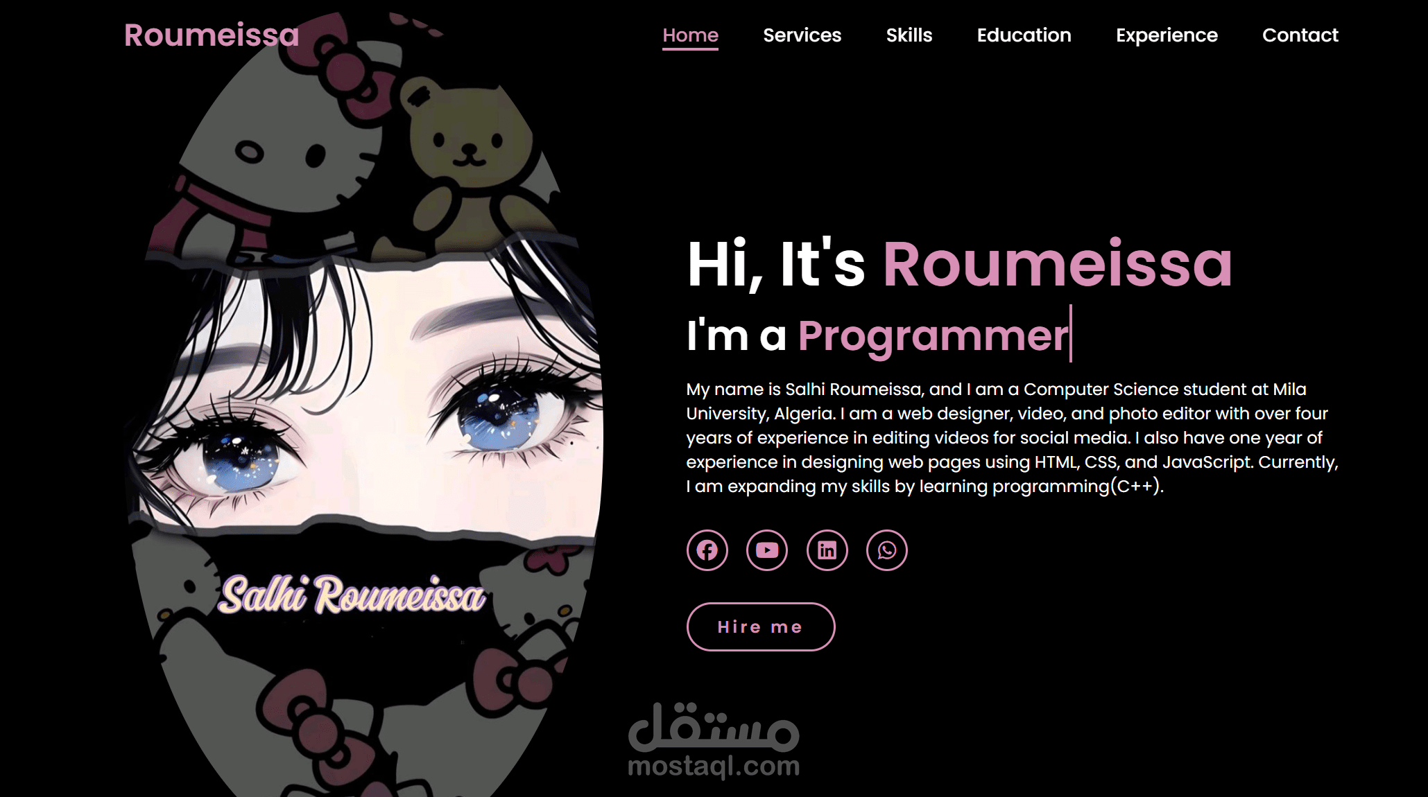
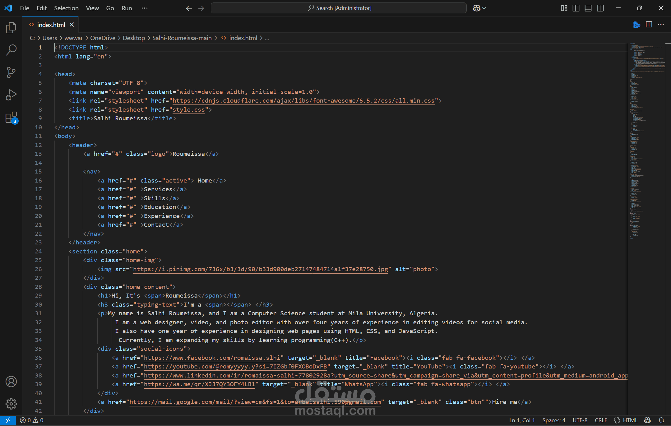
الرأس (Header): يحتوي على اسم المالك (Roumeissa) وقائمة تنقل (Home, Services, Skills, Education, Experience, Contact). هذه العناصر تشير إلى استخدام عناصر HTML دلالية مثل <header> و <nav> و <ul> و <li> و <a> لتنظيم المحتوى وتسهيل التنقل.
•
القسم الرئيسي (Main Section): يتضمن تحية (
Hi, It's Roumeissa") ومعلومات شخصية عن المالك، بما في ذلك نبذة عن خبراتها في تصميم الويب وتحرير الفيديو. هذا القسم يستخدم على الأرجح عناصر مثل <h1> و <h3> و <p> لتنظيم النصوص، وقد يحتوي على صورة شخصية أو عنصر مرئي جذاب.
•
روابط وسائل التواصل الاجتماعي: تظهر أيقونات وروابط لملفات تعريف المالك على منصات مثل Facebook و YouTube و LinkedIn و WhatsApp. يتم تحقيق ذلك عادةً باستخدام عناصر <a> داخل قائمة أو مجموعة من <div>، مع استخدام أيقونات (ربما من مكتبة أيقونات مثل Font Awesome أو صور SVG).
•
زر الإجراء (Call to Action): يوجد زر "Hire me" (وظفني) الذي يشجع الزوار على التواصل. هذا يتم تنفيذه باستخدام عنصر <button> أو <a> مع تنسيق زر.
تصميم CSS:
•
التصميم البسيط والواضح: يعتمد الموقع على تصميم نظيف وبسيط، مما يشير إلى استخدام CSS لتحديد التباعد (padding و margin) والخطوط (font-family, font-size, color) والألوان (background-color, color) بشكل فعال لضمان سهولة القراءة والتنقل.
•
التنسيق المرن (Flexbox/Grid): من المحتمل أن يكون التصميم قد استخدم Flexbox أو CSS Grid لتخطيط العناصر في الرأس والقسم الرئيسي، مما يضمن استجابة الموقع وتكيفه مع أحجام الشاشات المختلفة.
•
الأنماط البصرية: الألوان الداكنة في الخلفية والنصوص الفاتحة (ربما الأبيض أو الألوان الفاتحة الأخرى) تخلق تباينًا جيدًا. الأيقونات والزر "Hire me" لها أنماط مميزة (مثل الألوان والخلفيات) لجذب الانتباه.
•
التأثيرات التفاعلية (Hover Effects): من المتوقع أن تكون هناك تأثيرات عند تمرير مؤشر الماوس فوق روابط التنقل أو أزرار وسائل التواصل الاجتماعي أو زر "Hire me"، مما يعزز تجربة المستخدم. يتم تحقيق ذلك باستخدام خصائص CSS مثل :hover.
•
الاستجابة (Responsiveness): نظرًا لأن الموقع شخصي، فمن المهم أن يكون متجاوبًا (responsive) ليعمل بشكل جيد على الأجهزة المختلفة (سطح المكتب، الأجهزة اللوحية، الهواتف الذكية). يتم تحقيق ذلك باستخدام استعلامات الوسائط (Media Queries) في CSS لتعديل التخطيط والأنماط بناءً على حجم الشاشة.
باختصار، الموقع هو مثال جيد على كيفية استخدام HTML لبناء هيكل المحتوى و CSS لتصميمه وجعله جذابًا وسهل الاستخدام، مع التركيز على البساطة والوضوح لعرض المعلومات الشخصية والمهنية.
The website is a simple and effective personal page, designed using HTML and CSS, with touches of JavaScript for basic interactivity. The design focuses on presenting essential user information in a clear and attractive manner.
HTML Structure:
•
Header: Contains the owner's name (Roumeissa) and a navigation menu (Home, Services, Skills, Education, Experience, Contact). These elements indicate the use of semantic HTML elements such as <header>, <nav>, <ul>, <li>, and <a> to organize content and facilitate navigation.
•
Main Section: Includes a greeting ("Hi, It's Roumeissa") and personal information about the owner, including a summary of her experience in web design and video editing. This section likely uses elements such as <h1>, <h3>, and <p> to organize text, and may contain a personal image or an attractive visual element.
•
Social Media Links: Icons and links to the owner's profiles on platforms like Facebook, YouTube, LinkedIn, and WhatsApp are displayed. This is typically achieved using <a> elements within a list or a group of <div>s, with icons (possibly from an icon library like Font Awesome or SVG images).
•
Call to Action Button: There is a "Hire me" button that encourages visitors to get in touch. This is implemented using a <button> or <a> element with button styling.
CSS Design:
•
Simple and Clear Design: The website adopts a clean and simple design, indicating the effective use of CSS to define spacing (padding and margin), fonts (font-family, font-size, color), and colors (background-color, color) to ensure readability and ease of navigation.
•
Flexible Layout (Flexbox/Grid): The design likely utilized Flexbox or CSS Grid for laying out elements in the header and main section, ensuring the website's responsiveness and adaptability to different screen sizes.
•
Visual Styles: Dark background colors and light text (perhaps white or other light colors) create good contrast. The icons and the "Hire me" button have distinct styles (such as colors and backgrounds) to attract attention.
•
Interactive Effects (Hover Effects): Hover effects are expected on navigation links, social media buttons, or the "Hire me" button, enhancing the user experience. This is achieved using CSS properties like :hover.
•
Responsiveness: As it's a personal website, it's important for it to be responsive to work well on different devices (desktops, tablets, smartphones). This is achieved using Media Queries in CSS to adjust layout and styles based on screen size.
In summary, the website is a good example of how HTML is used to build content structure and CSS to design it and make it attractive and user-friendly, focusing on simplicity and clarity to present personal and professional information