modern dashboard interface for an analytics or e-commerce platform
تفاصيل العمل

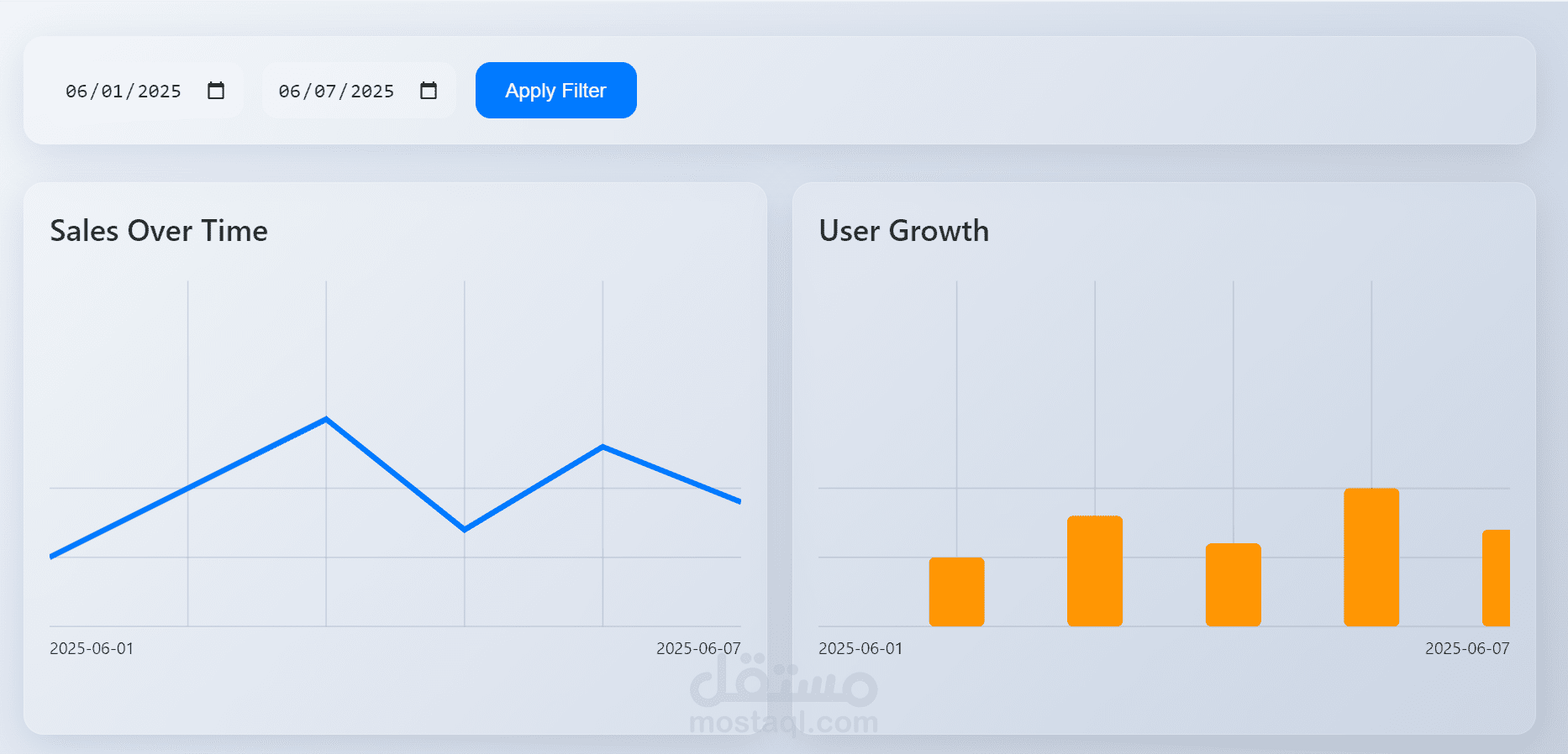
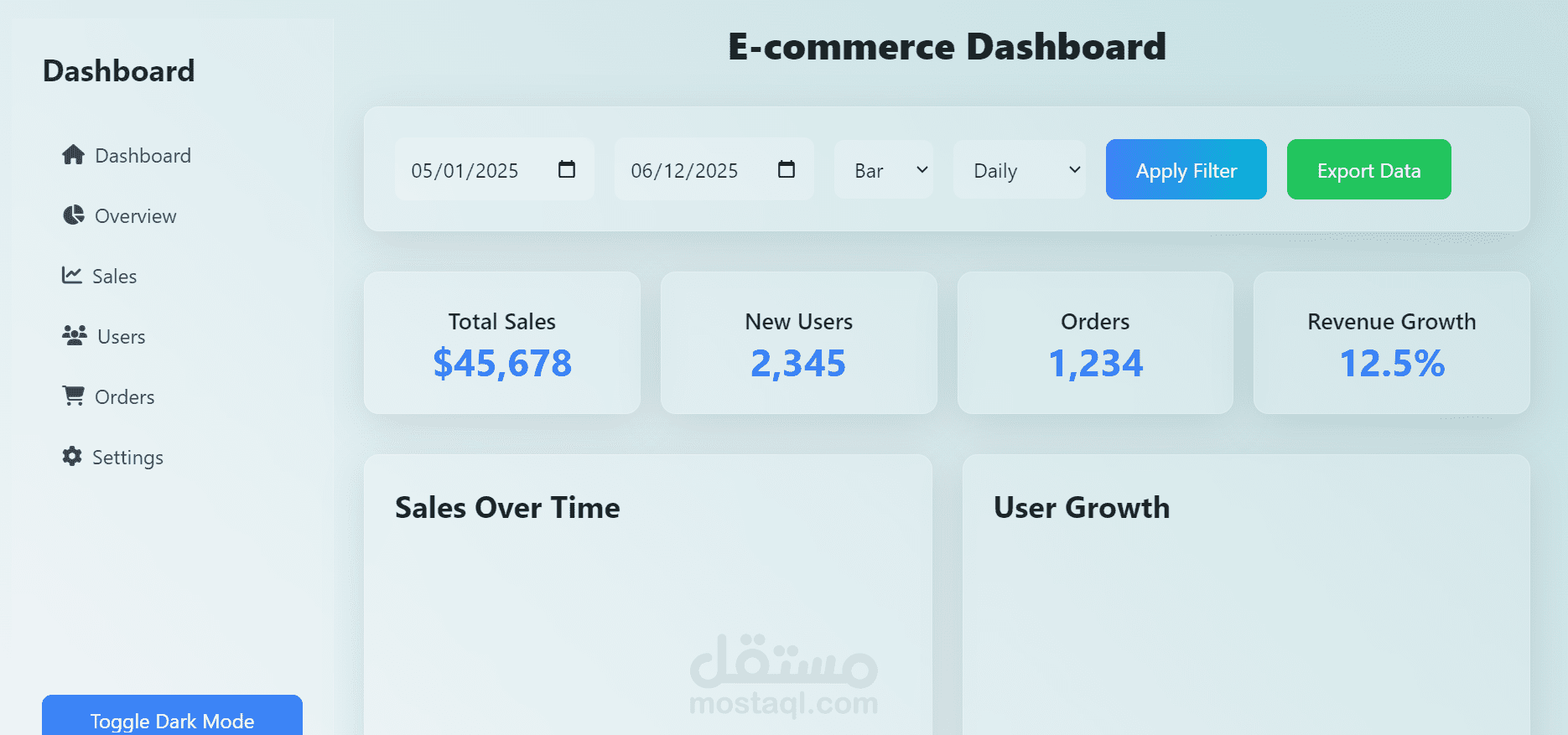
Dashboard Overview
This UI gives users a clean way to filter data by date and visualize key performance metrics.
UI Components
Date Filter Panel (Top Section)
Two date pickers (from: 06/01/2025, to: 06/07/2025)
Blue "Apply Filter" button to refresh the data based on the selected range
Clean, soft gray background with rounded corners and spacing gives it a modern, neumorphic feel.
Sales Over Time (Left Chart)
Line chart showing sales performance from June 1 to June 7, 2025
Blue line graph with visible fluctuations—indicates daily sales change
Could be used to track revenue, orders, or product-specific performance.
User Growth (Right Chart)
Bar chart with orange bars representing user activity/growth per day
Clearly spaced bars show day-by-day user engagement or sign-ups
Great for monitoring marketing impact or app usage.