The Airline Delay
تفاصيل العمل
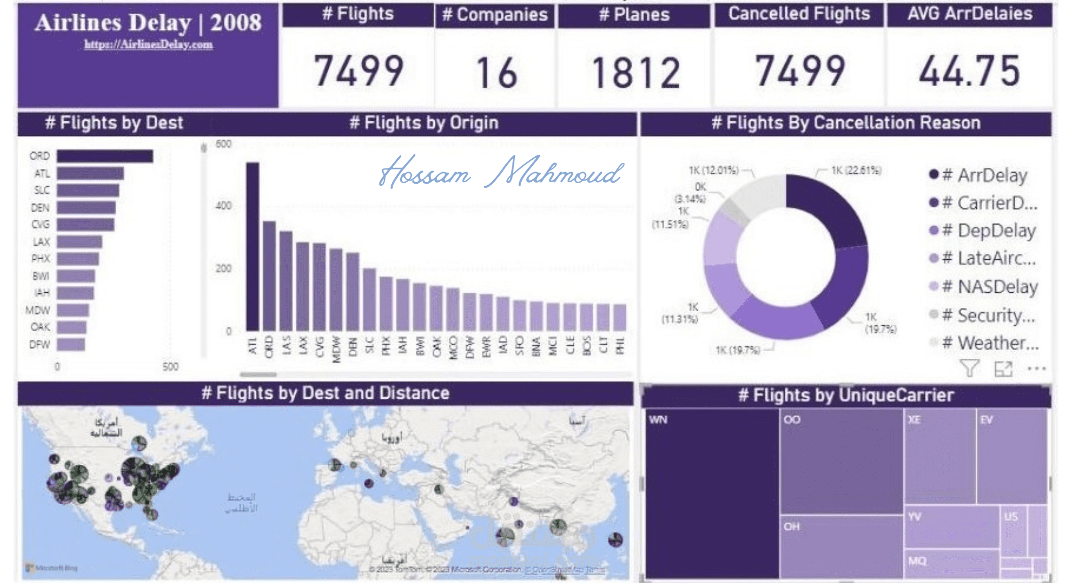
The Airline Delay 2008 dataset includes flight data from 2008, detailing departure/arrival times, carrier info, airports, and delay reasons. A Power BI dashboard can showcase:
Flight Delay Overview: Visualize total flights and delay percentages with charts.
Airline Delay Breakdown: Use visuals like bar charts to identify airlines with high/low delay rates.
Delay Causes: Highlight reasons (e.g., weather, carrier issues) using pie charts and drill-throughs.
Time Analysis: Show delays by month, day, or hour with line charts or heat maps.
Geospatial Analysis: Map delay hotspots across airports/regions.
Performance Metrics: Display KPIs like average delay time and on-time rates with cards or gauges.
Interactivity: Enable filters, slicers, and drill-downs for user exploration.
This dashboard effectively analyzes delays, highlights patterns, and demonstrates expertise in data visualization and analysis.