Attrition Dashboard Overview
تفاصيل العمل
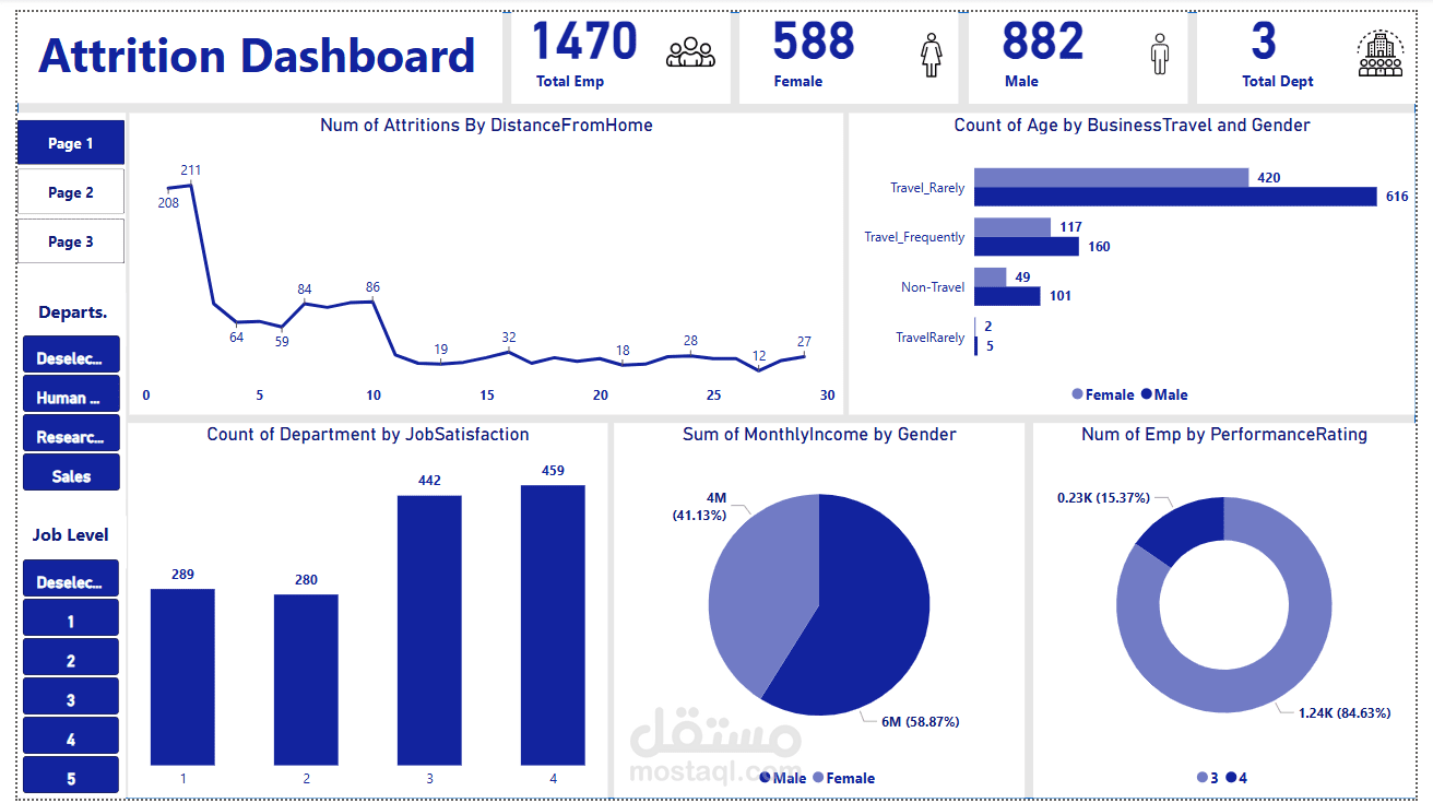

This Power BI dashboard provides insights into employee attrition, job satisfaction, income distribution, and performance ratings. The key metrics include:
Total Employees: 1,470
Gender Distribution: 588 females and 882 males
Total Departments: 3
Key Insights:
Attrition by Distance from Home:
The line chart shows the number of employees who left the company based on their commuting distance.
The highest attrition is seen among employees living 0-5 km from work.
Age Distribution by Business Travel and Gender:
Most employees travel rarely for business, with males having a higher count (616) than females (420).
Employees who travel frequently or do not travel at all have lower counts.
Job Satisfaction by Department:
Employees from different departments have varying satisfaction levels.
The highest satisfaction count is in category 4 (459 employees), while category 2 has the lowest (280 employees).
Monthly Income by Gender:
The total monthly income is divided between males (6M, 58.87%) and females (4M, 41.13%).
Males earn a higher cumulative income compared to females.
Employees by Performance Rating:
The pie chart indicates that 84.63% of employees received a performance rating of 4, while 15.37% received a rating of 3.
The dashboard allows further filtering by department and job level, providing a dynamic way to analyze employee attrition trends.