sales dashboard (Excel & SQL)
تفاصيل العمل


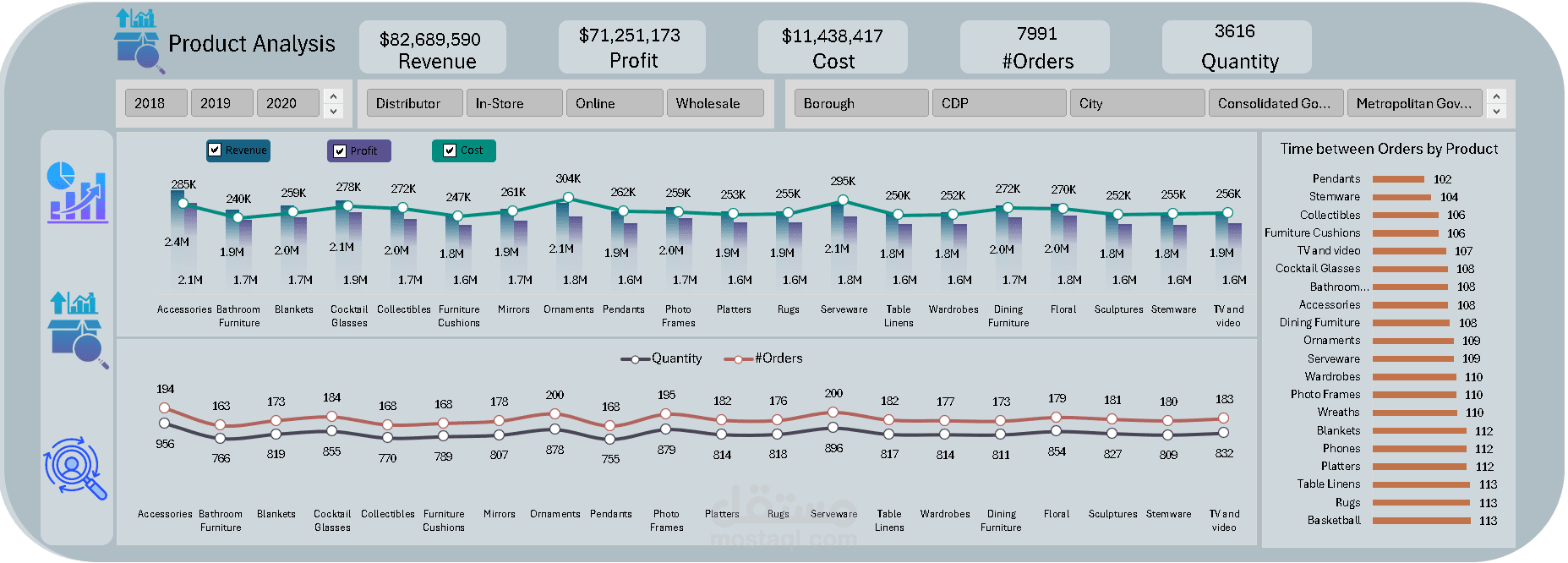
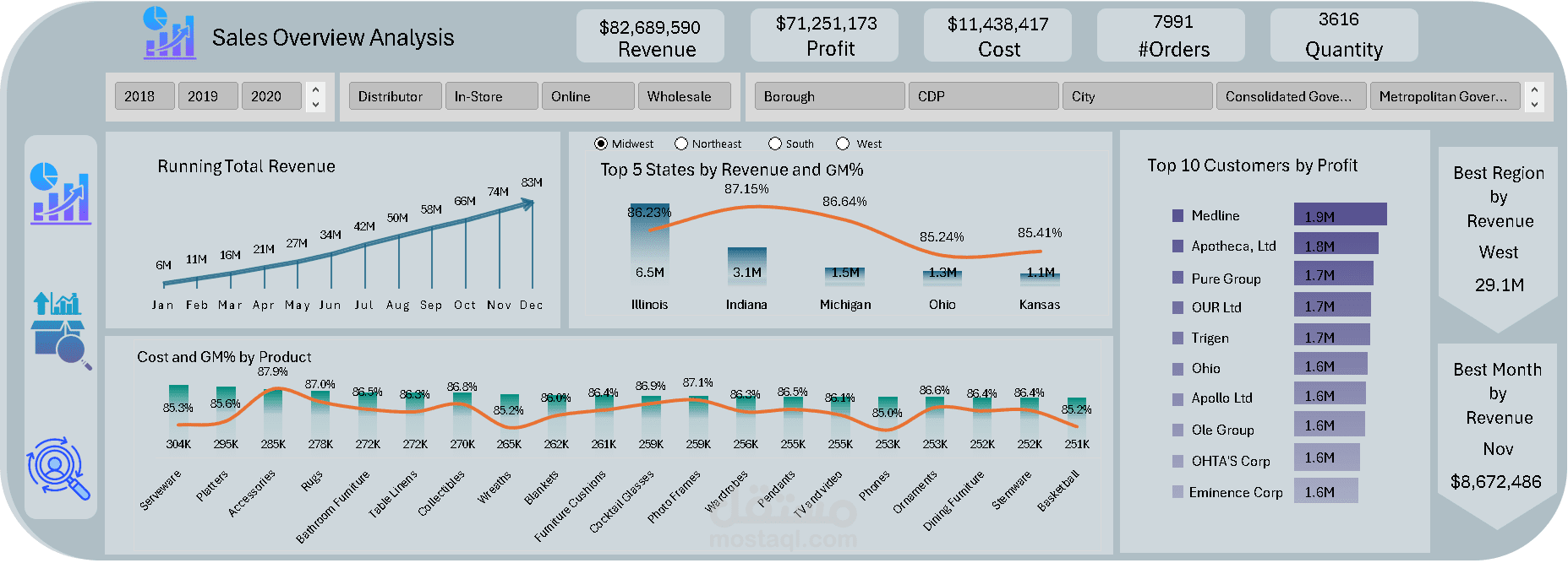
I made a Sales Project, where I used data analysis to find key information that helps improve our operations.
-The Journey Begins with Data Exploration:
I focused on finding important Key Performance Indicators (KPIs), such as:
• Revenue
• Profit
• Cost
• GM%
• AOV
• Number of Orders
• Number of Customers
• Revenue per Customer
• Purchase Frequency
-Creating a Dashboard Mockup:
Next, I created a simple and attractive dashboard mockup using Sketch to show these insights.
-Next Steps: Data Transformation & Analysis:
I used SQL to create views and then loaded them into Power Query then build a data model. I defined relationships in our data model and did some DAX calculations.
-Dynamic Dashboard Integration:
I successfully combined everything to make a dynamic, interactive dashboard that reveals important trends.
-Some Key Insights & Observations:
• The best quarter for revenue is Q3, especially in December.
• Revenue has remained steady over the years.
• Medline has the highest total profit, with a strong increase in 2020 compared to previous years, but saw drops in May, October, and November.
• We have a good GM% for all products.
• Pendants are the most popular, with the shortest time between orders.
• Medline is our top customer by purchase frequency and revenue.