Product Performance
تفاصيل العمل
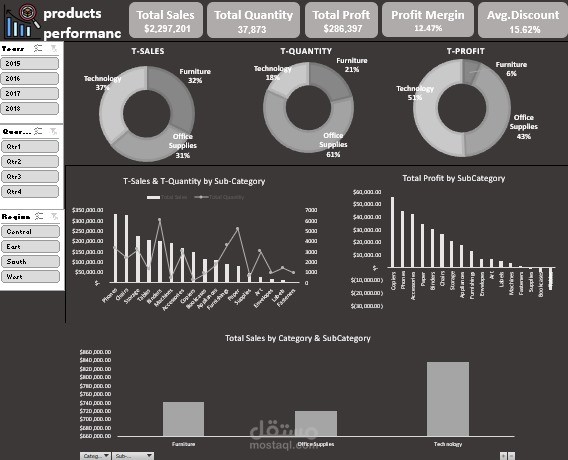
Performance Analysis Dashboard using Excel
I created an interactive dashboard using Pivot Table and Pivot Chart, with added Slicers to enhance interactivity and allow easy data filtering.
Additionally, I used the Collapsing feature in the last chart to improve clarity and focus on details.
Key Performance Metrics:
Total Sales: $2,297,201
Total Quantity: 37,873
Total Profit: $286,397
Profit Margin: 12.47%
Average Discount: 15.62%
Key Insights:
1️⃣ From the first chart:
The Technology category has the highest sales and profit.
The Office Supplies category has the highest quantity sold.
2️⃣ From the second chart:
The top-selling product: Phones.
The product with the highest quantity sold: Binders.
The most profitable product: Copiers.
These insights can help in making strategic decisions to boost performance and maximize profits.