sales report
تفاصيل العمل
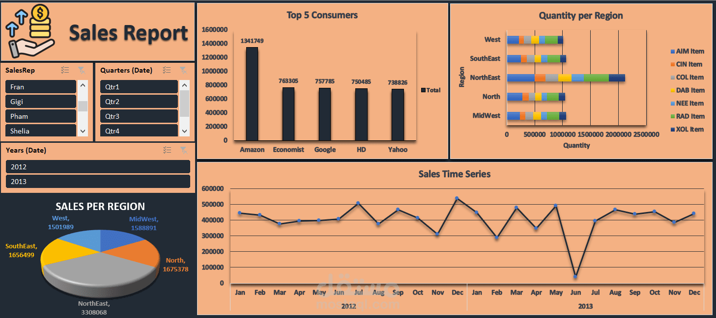
I’m excited to share this Sales Report Dashboard, crafted entirely using Excel and Pivot Tables. This is one of my early steps into the world of data visualization, and I’m thrilled to see the insights come to life!
Here’s what this dashboard highlights:
Top Performers
Top 5 Consumers: Amazon leads with a total of 1,341,749.
Regional Insights
Sales Per Region:
Northeast: 3,308,068
Southeast: 1,654,699
Midwest: 1,588,891
Time Series Analysis
Sales trends for 2012 and 2013, helping identify seasonality and performance spikes.
Category Performance
Quantity distribution by item type across regions for better inventory and sales strategies.
Tools Used: Excel and Pivot Tables.
This dashboard helped me explore storytelling with data, and I’m eager to expand these skills further.
