Mealify
تفاصيل العمل


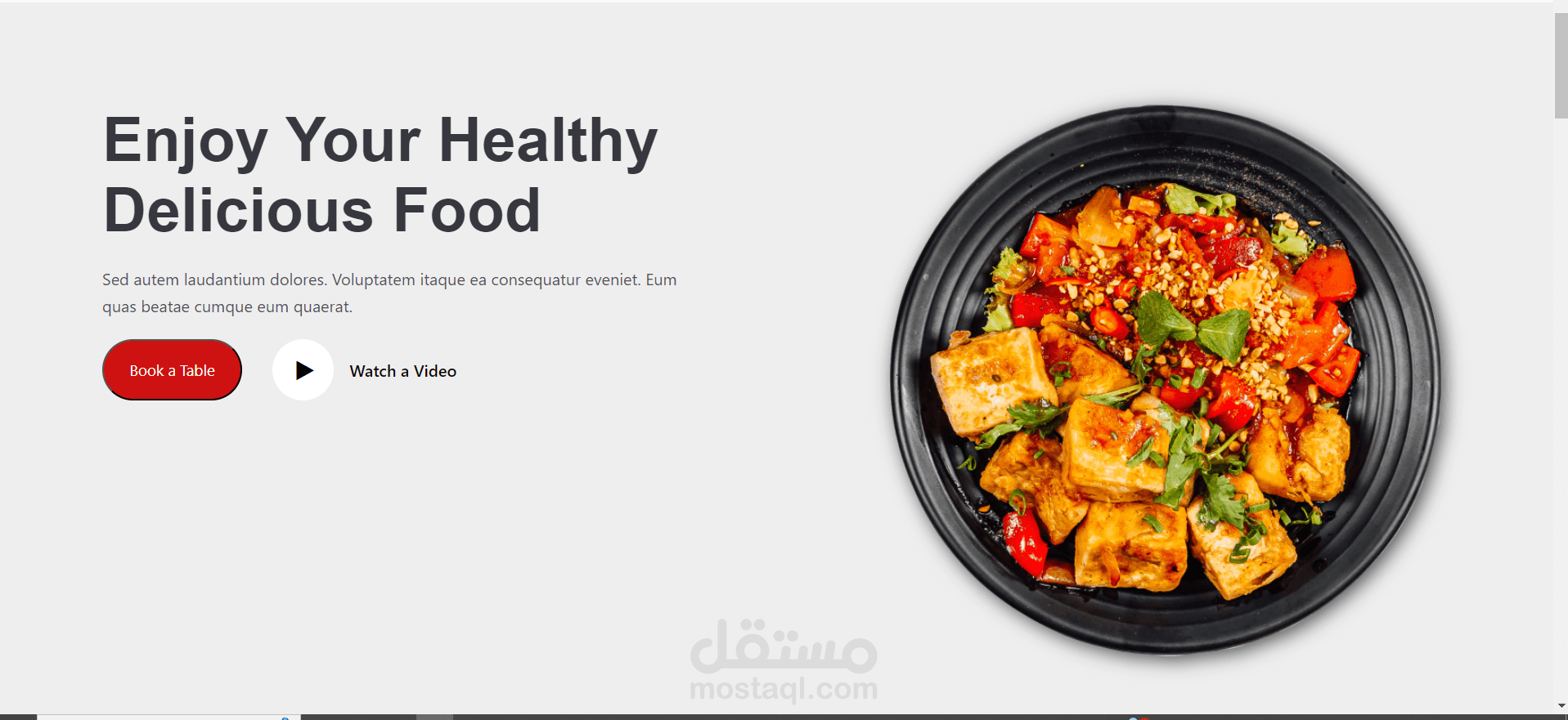
Mealify, a vibrant and engaging webpage designed to showcase the best in healthy and delicious dining. Developed using HTML, CSS, JavaScript, and Bootstrap, Mealify is a modern, responsive site that provides a seamless user experience across all devices. Here’s an overview of what you can explore on Mealify:
Design and Layout
Mealify features a clean, user-friendly design that is both visually appealing and easy to navigate. The use of Bootstrap ensures that the layout is responsive, making it look great on desktops, tablets, and mobile devices. The site is divided into several sections, each serving a distinct purpose to enhance the user experience.
Key Sections
Stylish Navbar:
The navigation bar is fixed at the top, allowing easy access to all sections: Home, Chefs, Gallery, and Contact.
The Mealify logo is prominently displayed, reinforcing brand identity.
Home Section:
Features a captivating headline: "Enjoy Your Healthy Delicious Food."
Includes a brief description and call-to-action buttons for booking a table or watching a video.
Accompanied by a high-quality image to entice visitors.
Chefs Section:
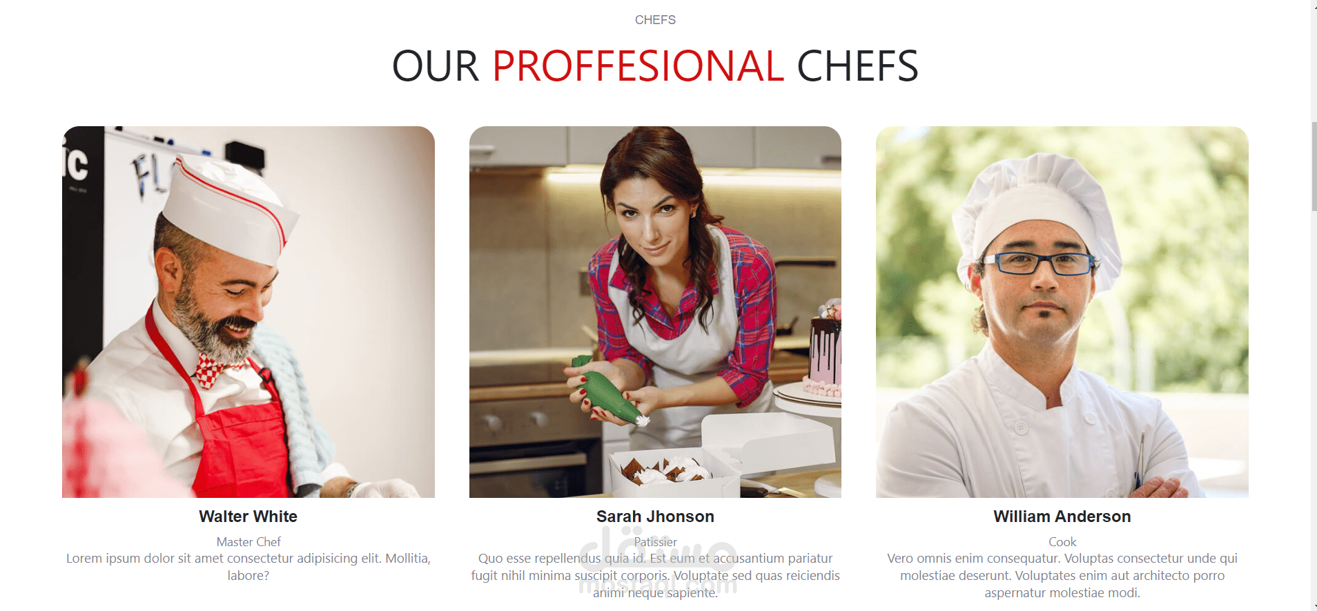
Showcases our professional chefs with their images, names, titles, and brief bios.
Each chef has social media links, encouraging visitors to connect and follow.
Gallery Section:
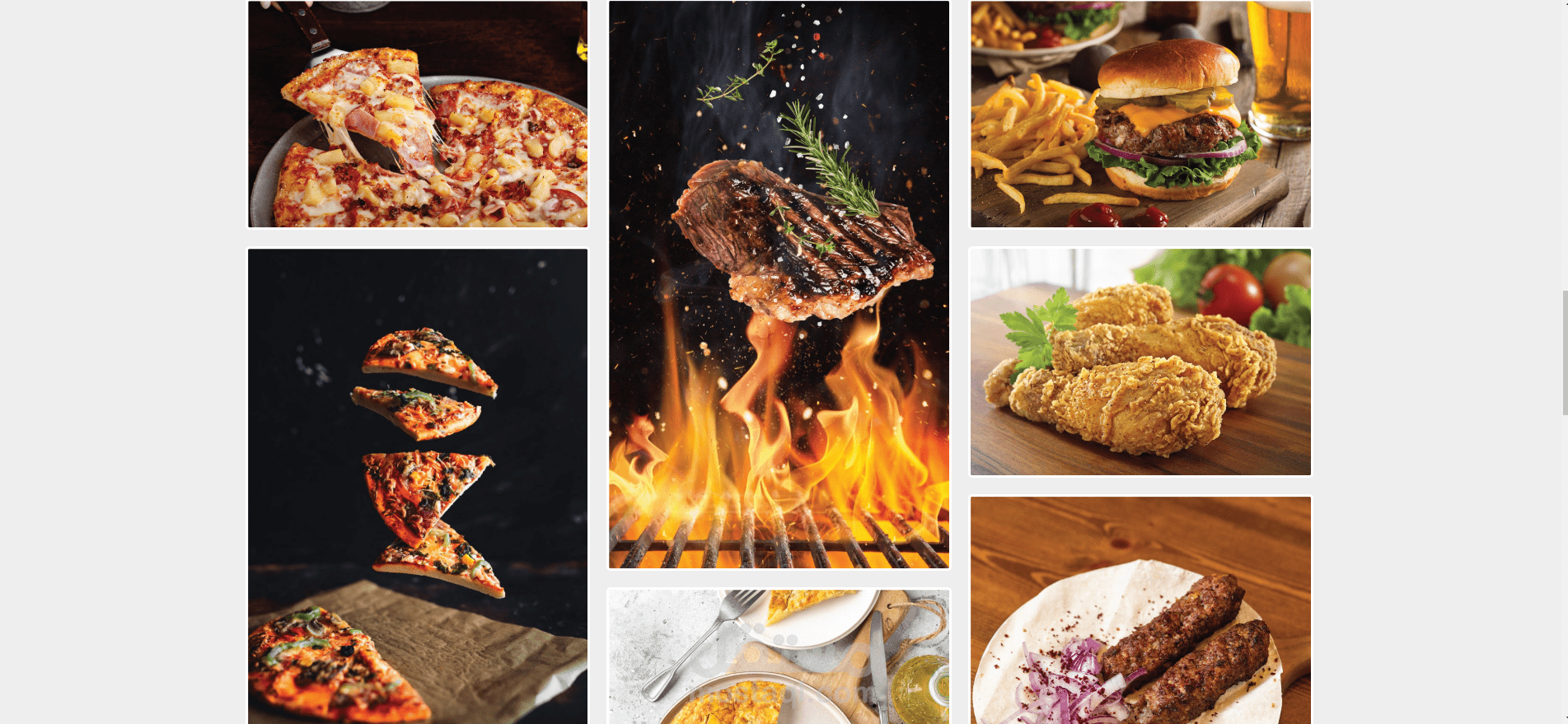
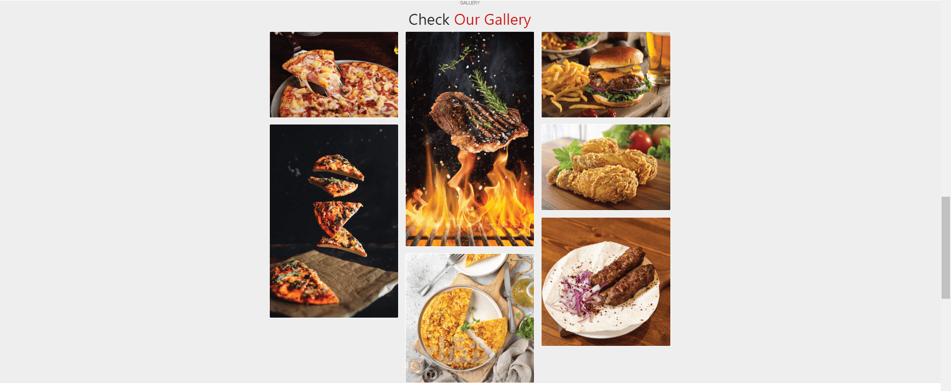
Displays an array of mouth-watering food images in a photo gallery.
Each image includes a description and overlay effect for better visual engagement.
Contact Section:
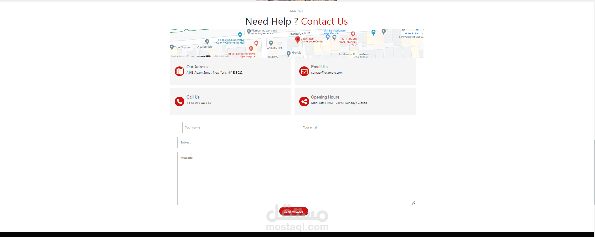
Provides detailed contact information including address, email, and phone number.
Embedded Google Map for easy location access.
A contact form for visitors to send messages directly through the site.
Footer:
Contains additional information about Mealify and social media links.
Quick links to other pages such as Menu, Promo, About Us, Contact, Testimonials, and Our Partners.
Newsletter subscription form for visitors to stay updated with the latest news and offers.
Technologies Used
HTML5: For structuring content and ensuring semantic clarity.
CSS3: For styling, including custom styles and Bootstrap for responsive design.
JavaScript: To add interactive elements and enhance user experience.
Bootstrap: To create a responsive and mobile-first layout easily.
Visual Appeal
Mealify’s design is crafted to be both aesthetically pleasing and functional. The use of high-quality images, a consistent color scheme, and thoughtful typography ensures that visitors have an enjoyable and memorable browsing experience.
User Experience
Navigation is intuitive, with clear calls to action encouraging users to explore different sections of the site. The responsive design guarantees that the site performs well on various devices, providing an optimal user experience for all visitors.
Conclusion
Mealify is more than just a webpage; it’s a culinary journey designed to connect food lovers with the best in healthy and delicious dining. Whether you’re looking to book a table, learn about our chefs, or simply browse our gallery, Mealify offers something for everyone. Explore Mealify today and discover the joy of healthy, delicious food!