Bezel
تفاصيل العمل
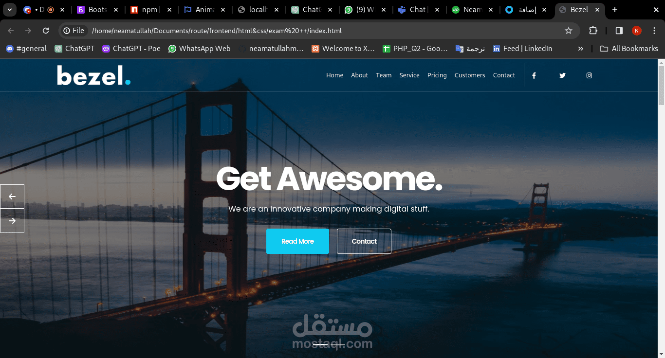
Responsive Design: The website is designed to be fully responsive across various devices and screen sizes, ensuring optimal viewing and interaction experiences for users on desktops, laptops, tablets, and smartphones.
Technologies Used:
HTML5: Used for structuring the content and layout of web pages.
CSS3: Used for styling the HTML elements and enhancing the visual presentation.
Bootstrap: Utilized for building responsive and mobile-first web components, including navigation bars, grids, cards, forms, and buttons.