FIFA World cup - Power BI
تفاصيل العمل
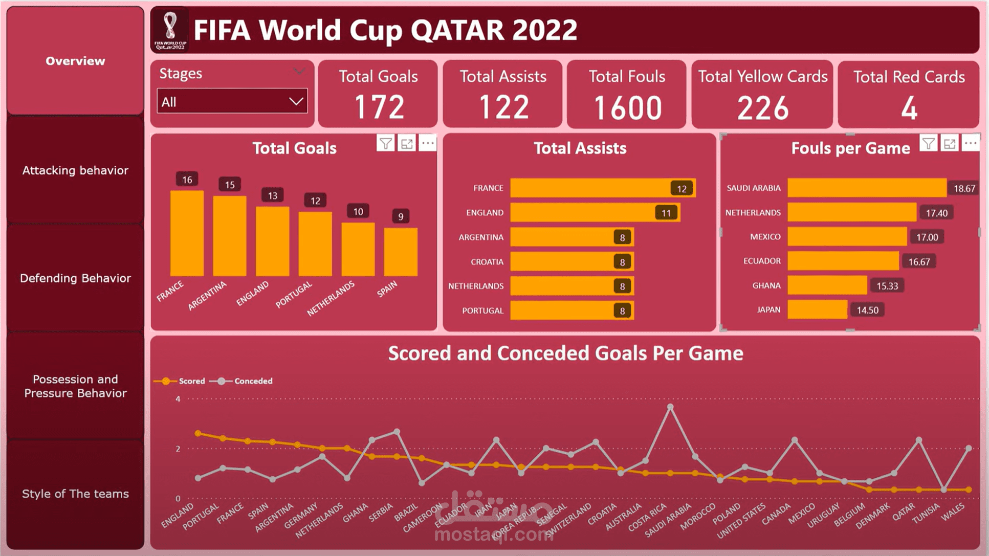
Check out my first attempt on Power BI, which analyzes the teams that participated in the 2022 FIFA World Cup. This dashboard is divided into five sections and includes a custom tooltip, all using a dataset from Kaggle.
The first section provides an overview of tournament statistics, including goals, assists, fouls, yellow cards, and red cards. The stage slicer allows you to view stats for different stages of the tournament.
The second section shows the attacking behavior of each team per game, providing statistics for goals and assists. You can also see the number of shots needed to score a goal for each team per game, allowing you to analyze their scoring efficiency. Additionally, the dashboard includes information on defensive line breaks, comparing number of completed attempts with the percentage of success.
The third section focuses on defensive behavior per game, visualizing the teams that achieved clean sheets and those that had a high number of conceded goals per game. You can also compare the performance of goalkeepers and defensive lines for each team per game to determine the root of defensive problems.
The fourth section analyzes possession and pressure behavior per game, identifying the teams that possessed the ball the most and examining the relationship between defensive pressure and possession. You can also analyze the passing ability of each team, comparing the total passes with the completed ones and the percentage of success. Another visual shows which teams lose the ball most frequently under pressure, using the forced turnover measure.
The fifth section explores each team's style of play per game, analyzing which teams tend to ask for the ball between the attack and midfield lines and those that tend to ask for the ball behind the defensive line. The dashboard also includes a scatter plot comparing the performance of the midfield and attack lines using measures like total attempts, shots on goal (mostly made by the attack lines), and total attempts of defensive line breaks (mostly made by the midfield line).
The custom tooltip uses a donut chart to display the four channels in the final third of the pitch each team tends to start its attack from.
Overall, this Power BI project provides a comprehensive overview of the 2022 FIFA World Cup, allowing you to analyze teams performance from multiple angles.
