Power BI Dashboard
تفاصيل العمل
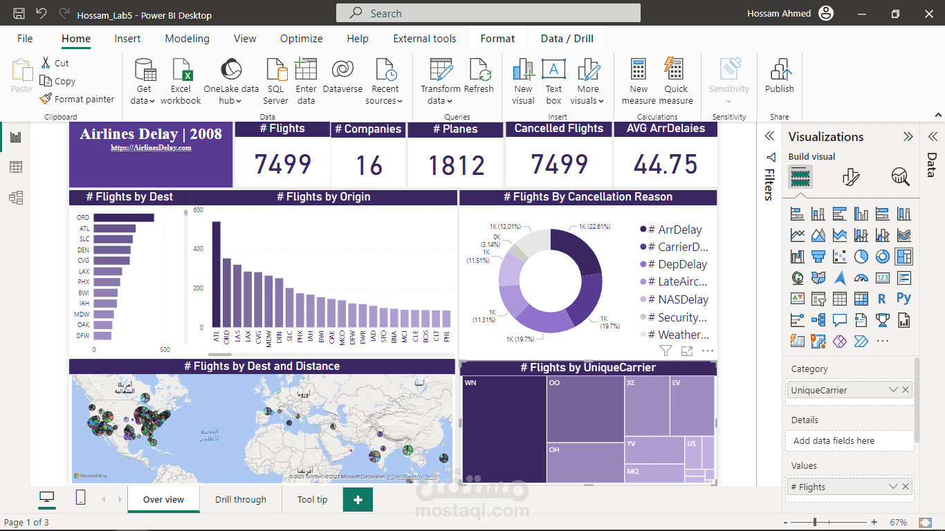
The Airline Delay 2008 dataset is a comprehensive collection of flight data from various airlines in the year 2008. It contains detailed information about flights, including departure and arrival times, carrier details, origin and destination airports, and reasons for delays. This dataset serves as a valuable resource for analyzing and understanding flight delays and their causes during that period.
To showcase your Power BI dashboard based on the Airline Delay 2008 dataset, you can highlight the following key features and insights:
Overview of Flight Delays: Provide an overview of the number of flights and the percentage of delayed flights in the dataset. Present visually compelling charts or graphs that illustrate the overall delay patterns for different airlines or airports. This will give viewers a quick snapshot of the data and emphasize the significance of the issue.
Delay Analysis by Airlines: Present a breakdown of delays by different airlines operating in 2008. Use interactive visuals, such as stacked bar charts or tree maps, to show the relative delay frequencies of each airline. This will help viewers identify which airlines had the highest or lowest delay rates and make informed decisions based on that information.
Delay Causes: Investigate the primary causes of flight delays, such as weather conditions, carrier-related issues, security concerns, or air traffic congestion. Utilize visuals like pie charts or donuts charts to represent the distribution of delay reasons. Additionally, consider incorporating a drill-through feature to allow users to explore specific delay causes in more detail.
Time Analysis: Analyze flight delays based on different time dimensions, such as months, days of the week, or specific hours of the day. Use line charts or heat maps to showcase temporal patterns and identify peak delay periods. This information can be valuable for airlines and airports to optimize their schedules and improve operational efficiency.
Geographical Analysis: Enhance the dashboard with geospatial visuals to demonstrate delay patterns across different airports or regions. Use maps or bubble charts to visualize the volume of delayed flights and identify geographical hotpots for delays. This can help stakeholders understand the impact of delays in specific areas and make informed decisions regarding route planning or resource allocation.
Performance Metrics: Include key performance indicators (KPIs) related to flight delays, such as average delay time, on-time performance rates, or cancellation rates. Present these metrics using gauges or cards to provide a quick overview of an airline's performance. Comparative analysis between airlines can also be helpful for viewers to assess their options.
Interactive Filtering and Drill-Down: Enable users to interact with the dashboard by incorporating slicers, filters, or cross-highlighting capabilities. This allows viewers to explore the data from different perspectives, such as specific airlines, airports, or time periods.
In summary, your Power BI dashboard based on the Airline Delay 2008 dataset will provide a comprehensive view of flight delays, analyzing key metrics, causes, and temporal patterns. By presenting visually appealing and interactive visuals, you can effectively convey the significance of your work and demonstrate your ability to derive insights from complex datasets. This dashboard will serve as a compelling example of your expertise in data analysis and visualization, enticing potential clients to choose you as their preferred professional for future projects.