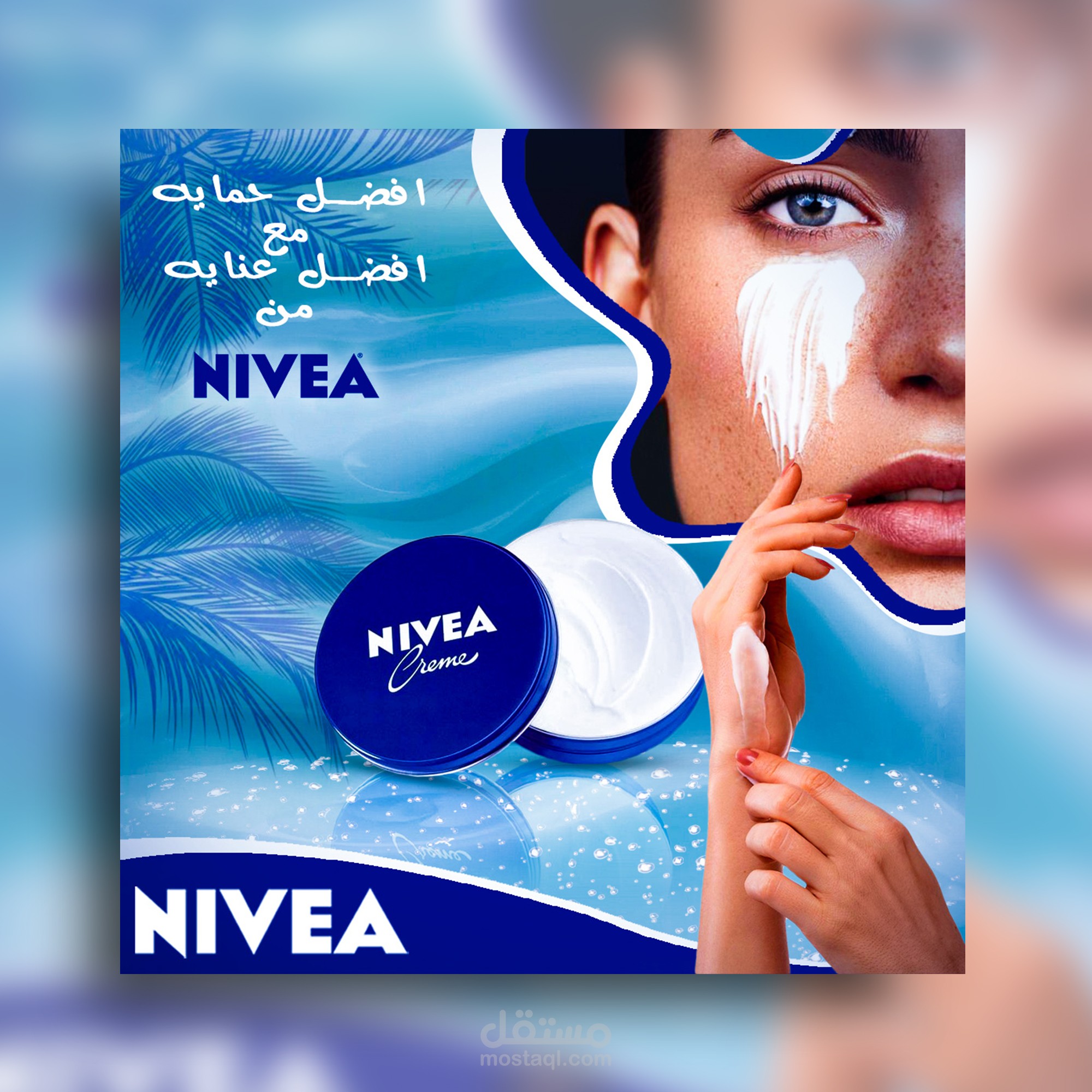
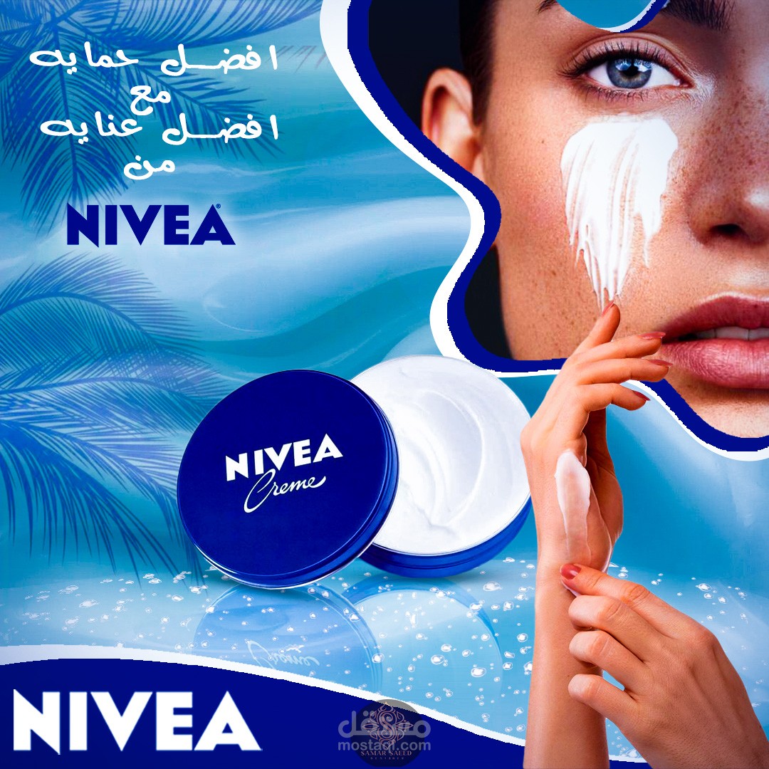
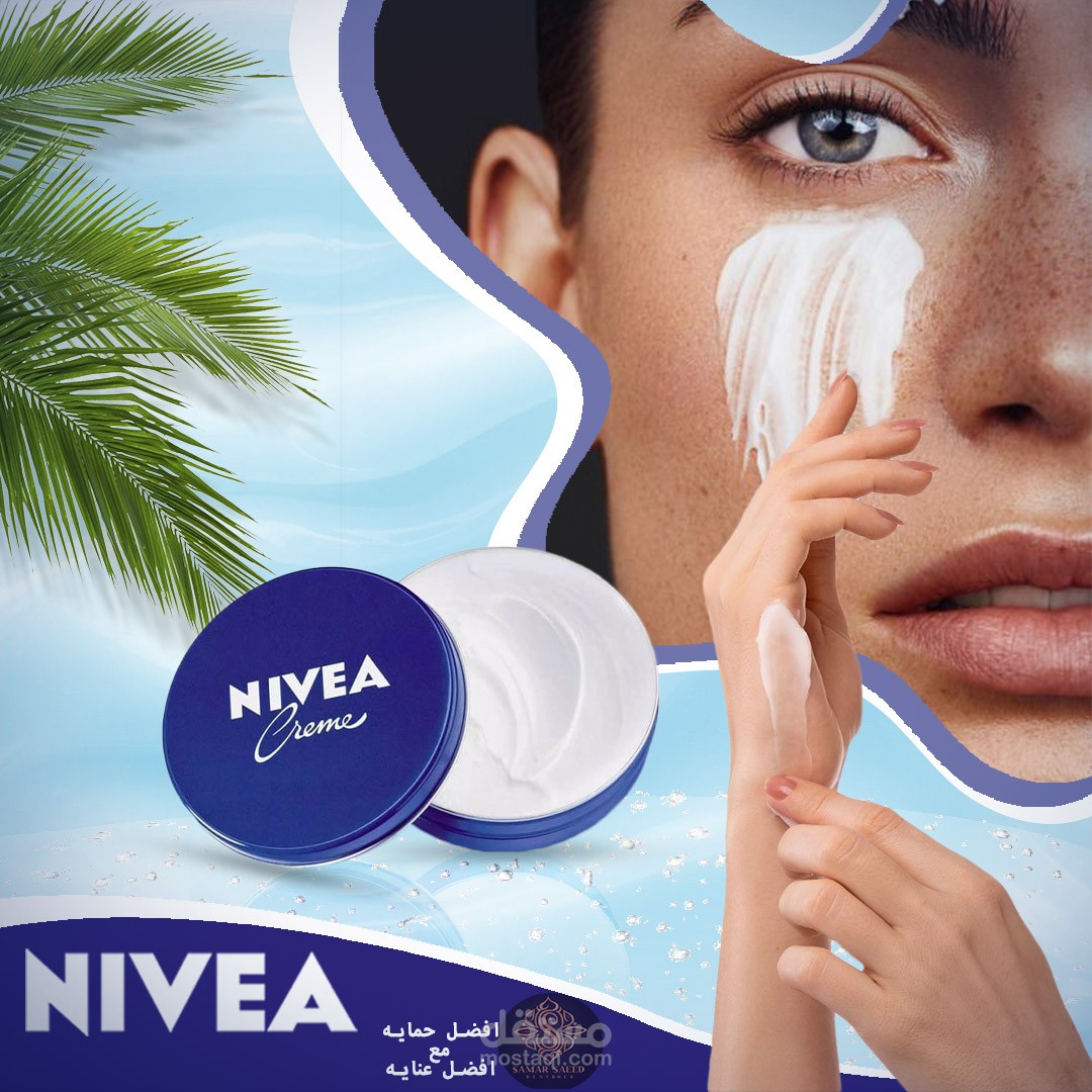
This ad is designed for Nivea cream
تفاصيل العمل
This ad is designed for Nivea cream,
In this we used the merging method for some of the elements that make up the design.
Some phrases were also placed for the advertisement, such as the name of the company (Nivea).
We also used shades of blue in its shades to create a background that matches the color of the advertisement and gives an impression of comfort and confidence to the customer.
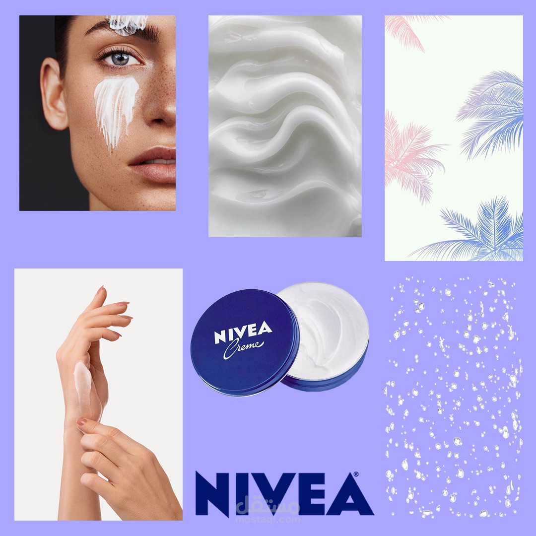
This project is designed using a combination of project related elements
We used this set of elements in the design


