تصميم هوية بصرية
تفاصيل العمل
CONCEPT:
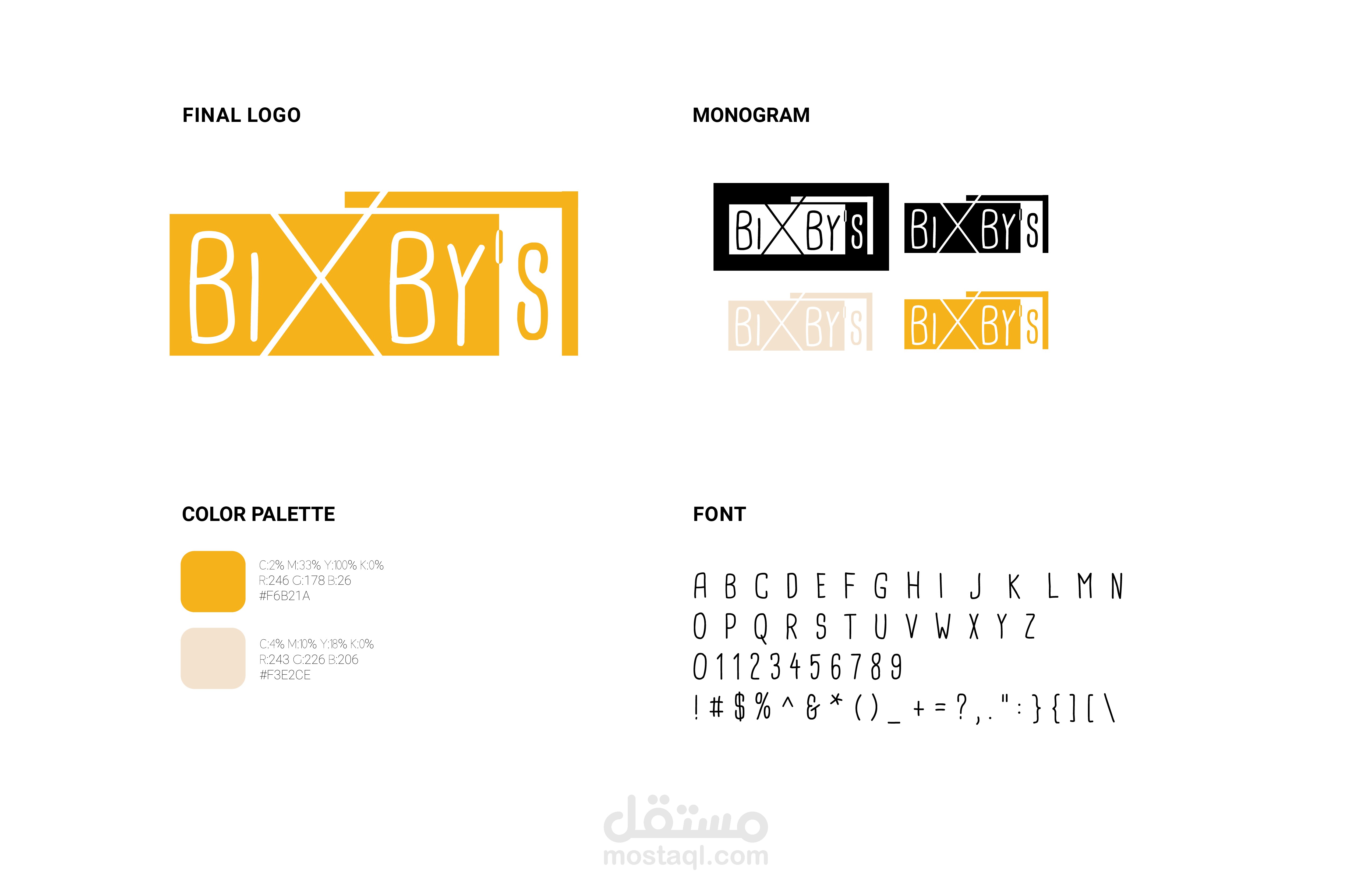
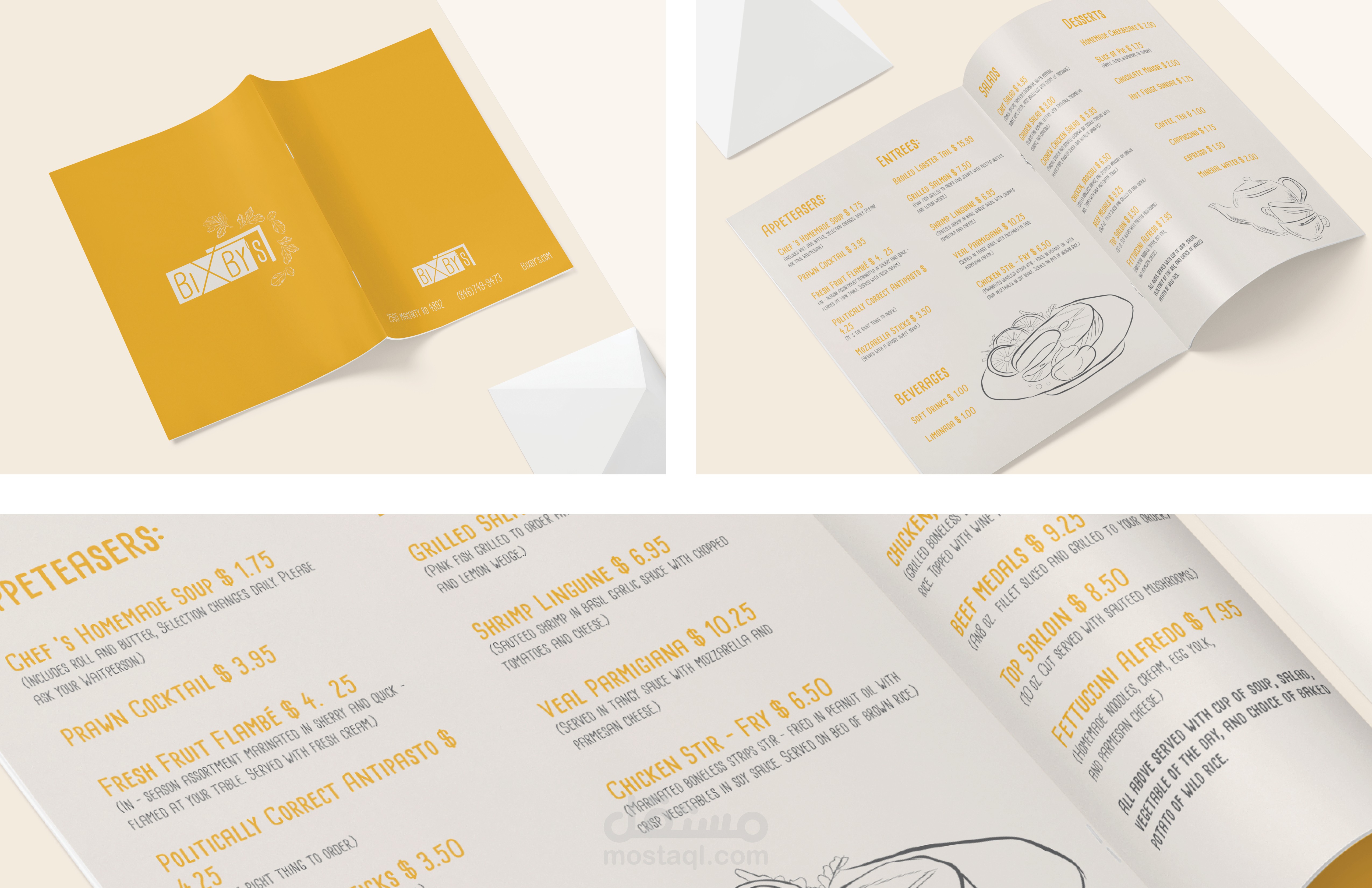
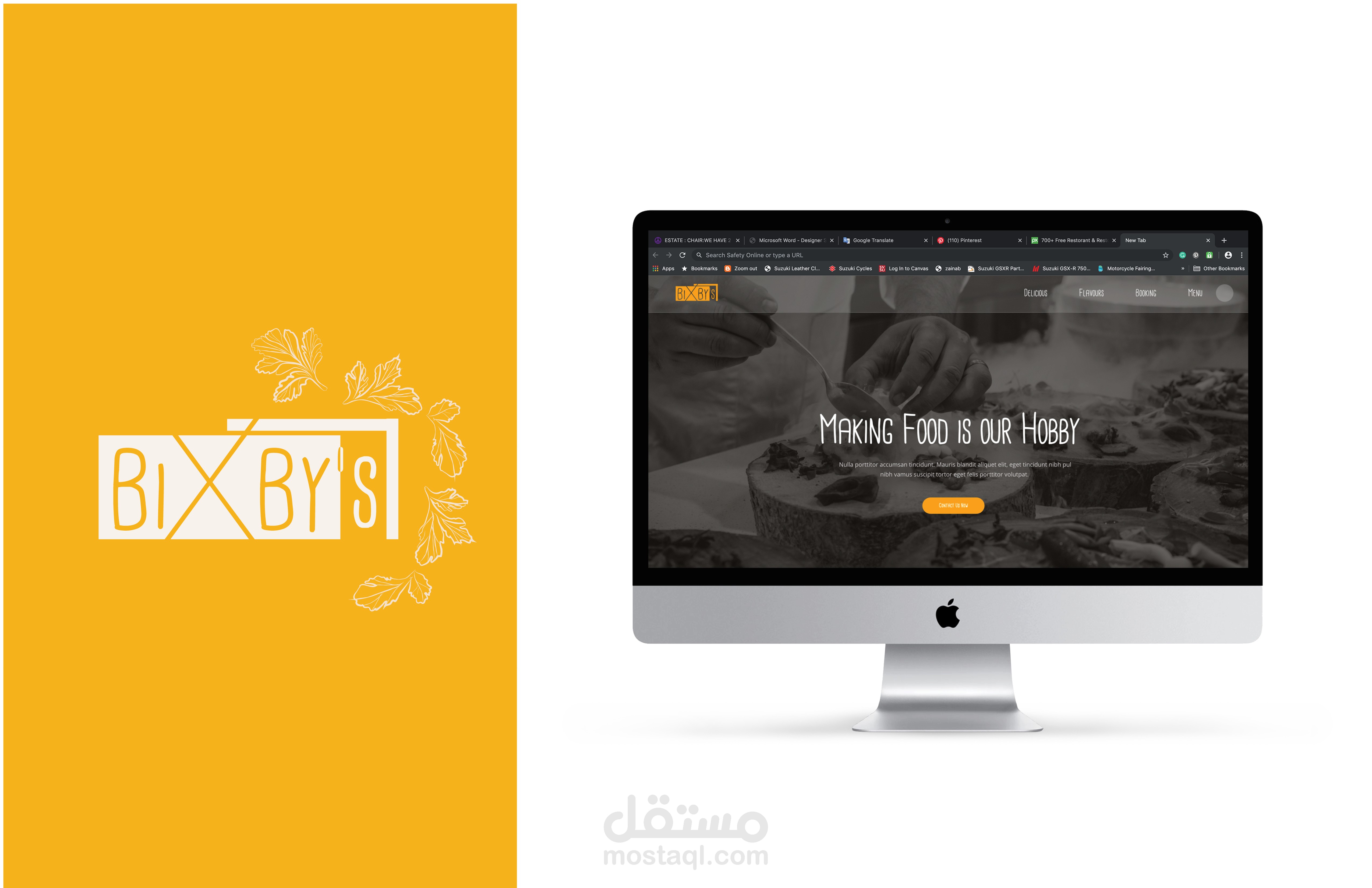
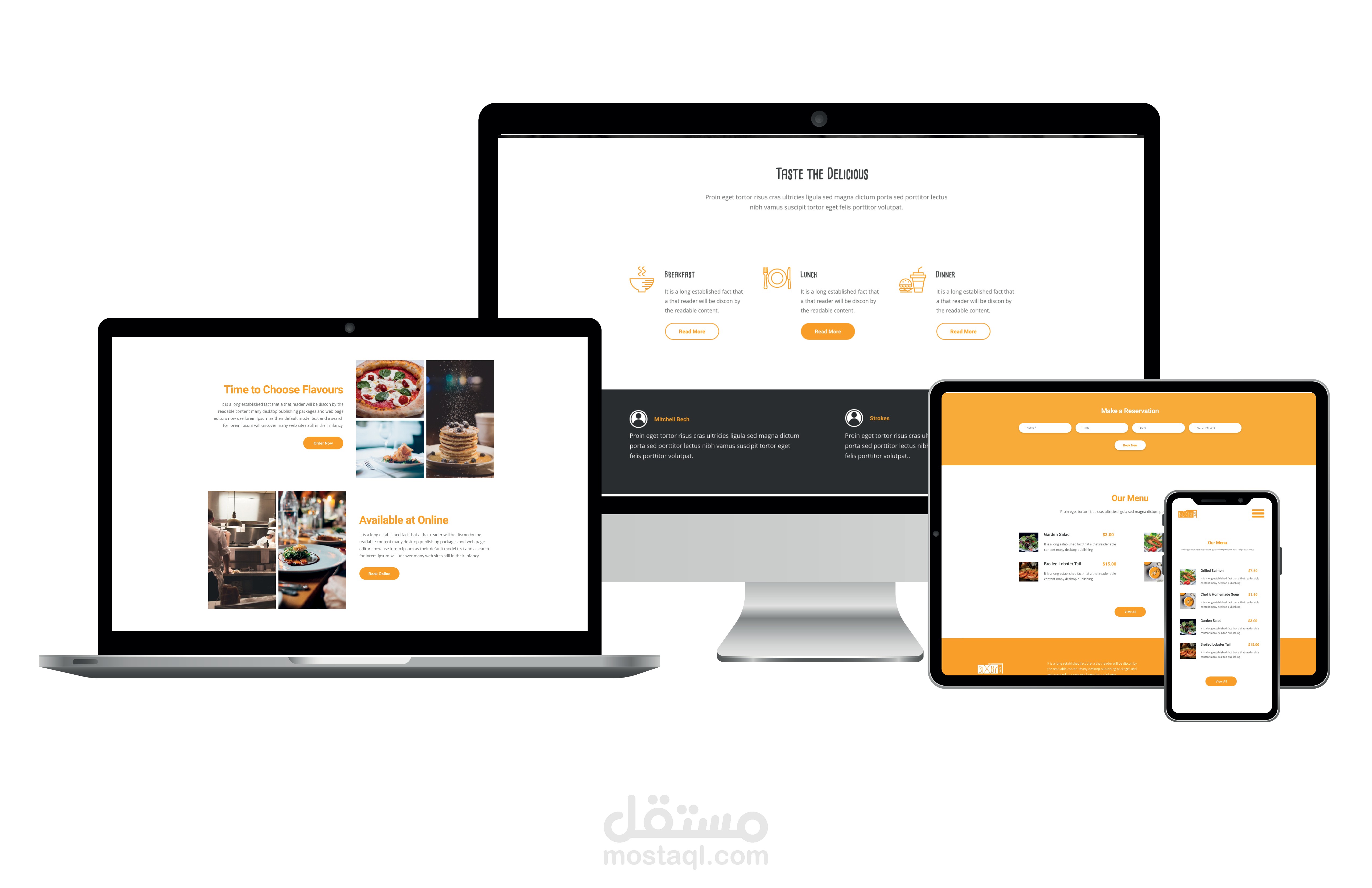
This project was to create the logo and branding for a Bixby’s restorant. Their target market of middle class families. I chose to use bold bright colors to represent this fun destination. I used Cardenio Modern font it simple handwriting. Menu design with simple illustration and organized text. Clean, simple hierarchy with titles and choices in menu. web site design done to show the services, menu, restaurant hours, I designed the web to fit in multiple screen such as computers, laptop, tablet, phones. easy to use by different ages.
Description:
Logo design
Menu design
Web design
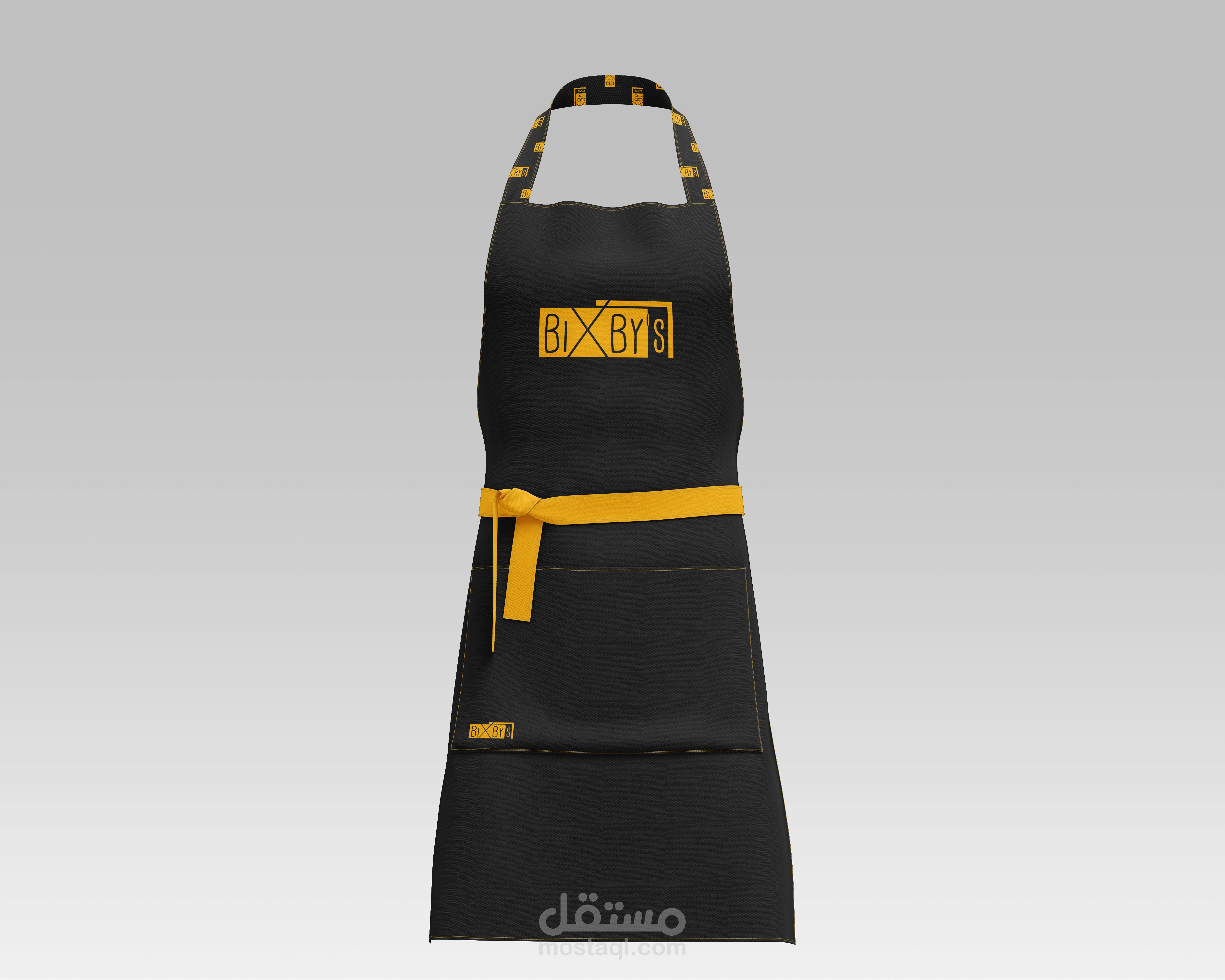
Chief, waiter clothe
CLIENT:
Bixby’s Restaurant
SOFTWARE:
Illustrator, Photoshop, Indesign, Adobe XD
