Camboose Bakery and Confectionery Brand Identity design
تفاصيل العمل
Camboose Brand Identity Design
Camboose is a bakery and confectionery, its identity comes from solid and
.consistent high quality bread as bread is necessary for almost all people
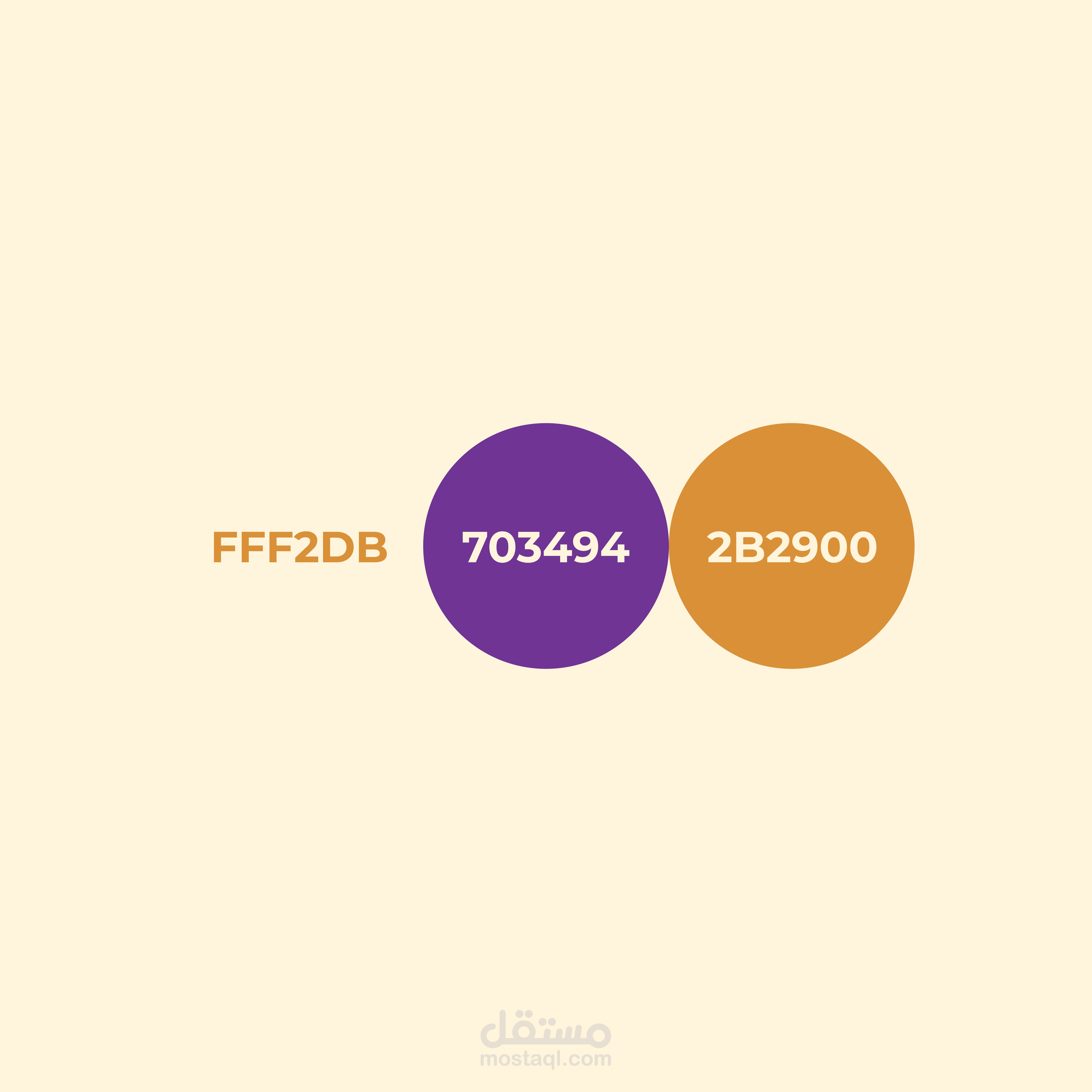
.Colors have been picked to have the vibes of the bakery and its bakings
They also reflect a sense of responsability from the bakery to its
.customers to provide them with needed yet high quality bread
Montserrat typeface is a very strong typeface which is needed
for this brand identity and is also one of my favourite fonts
for its simplicity and dominance.
Keywords: Quality - Strength - Safety

