Shaimaa Shabbara Medical Translator
تفاصيل العمل

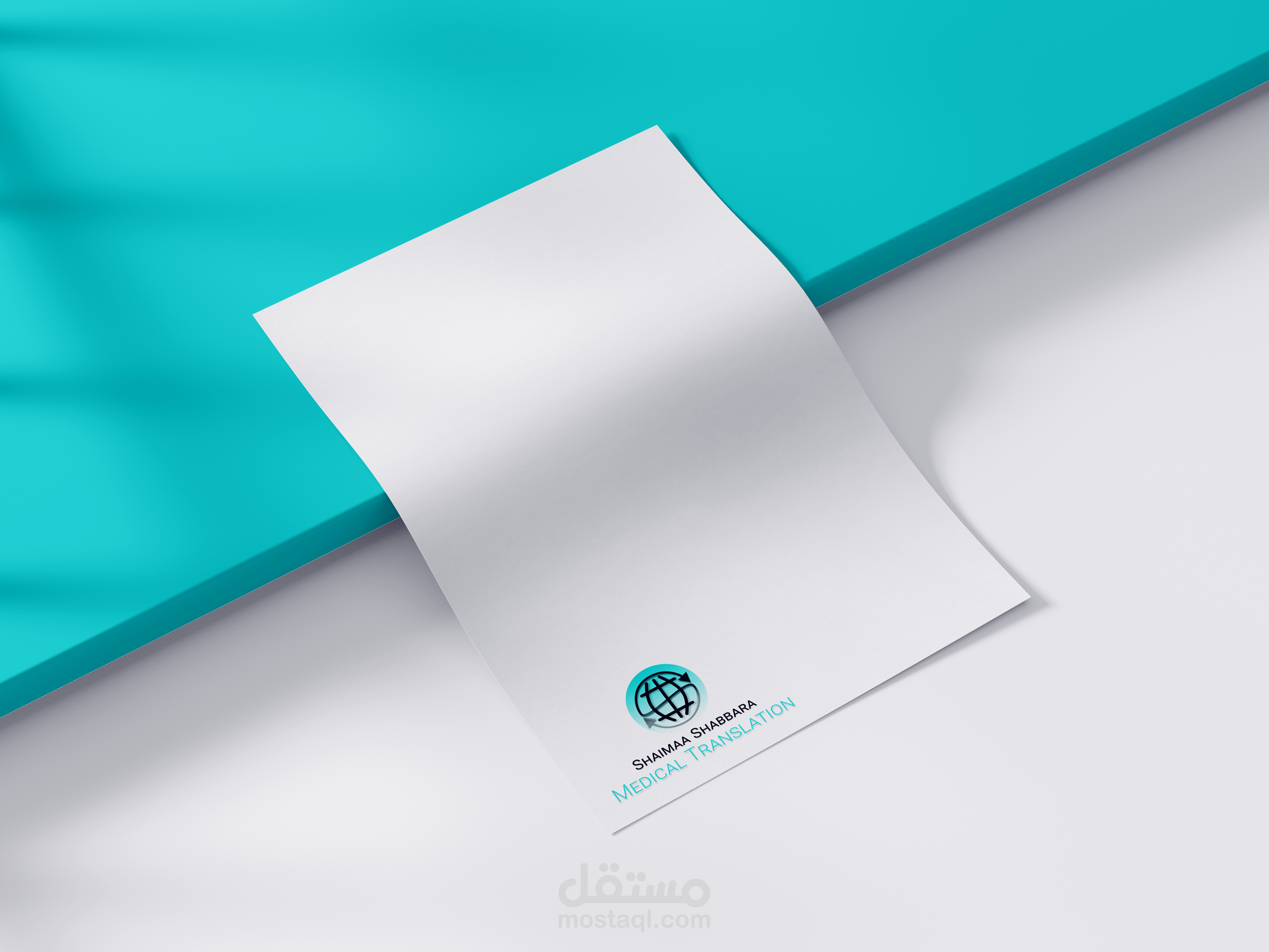


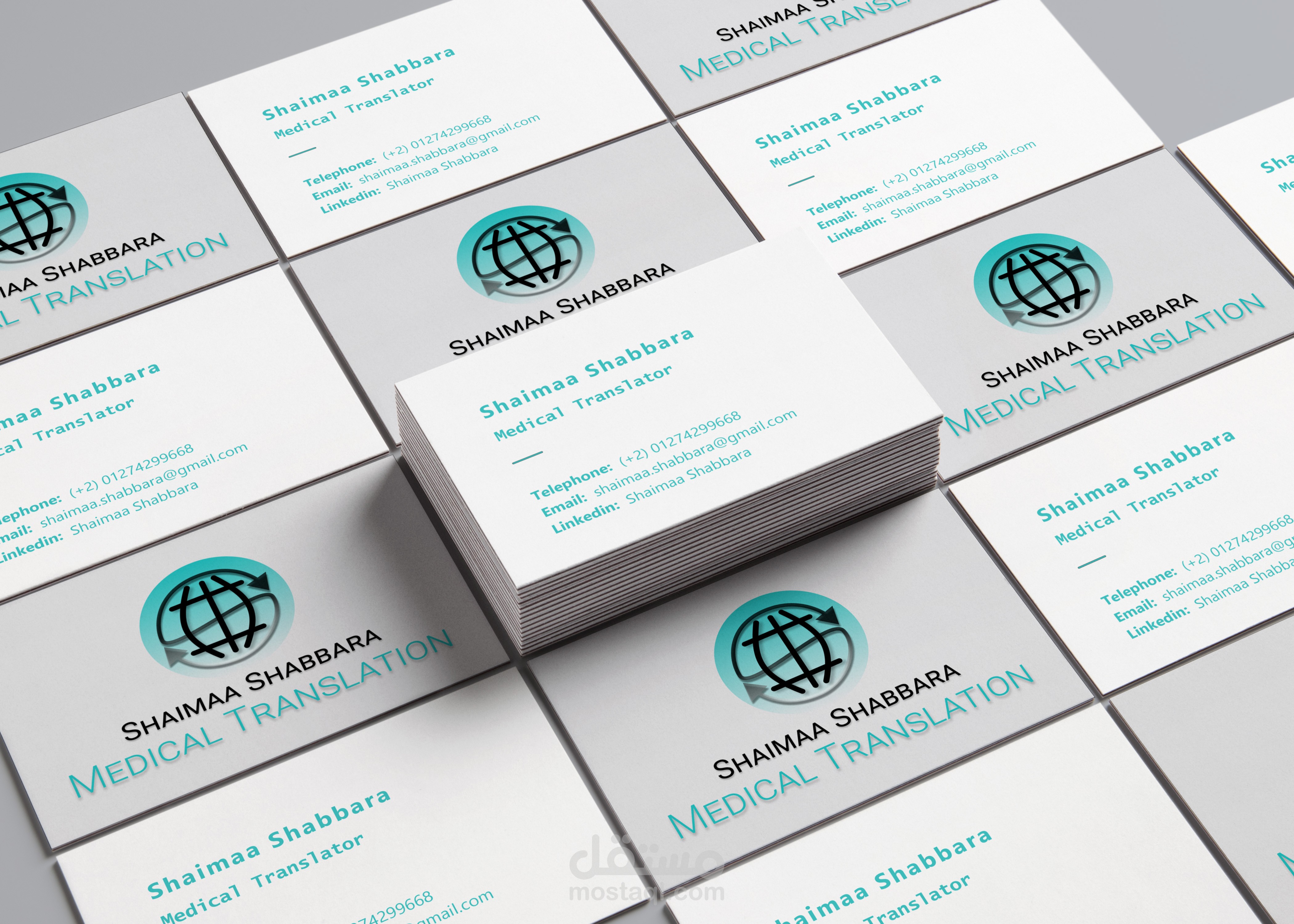
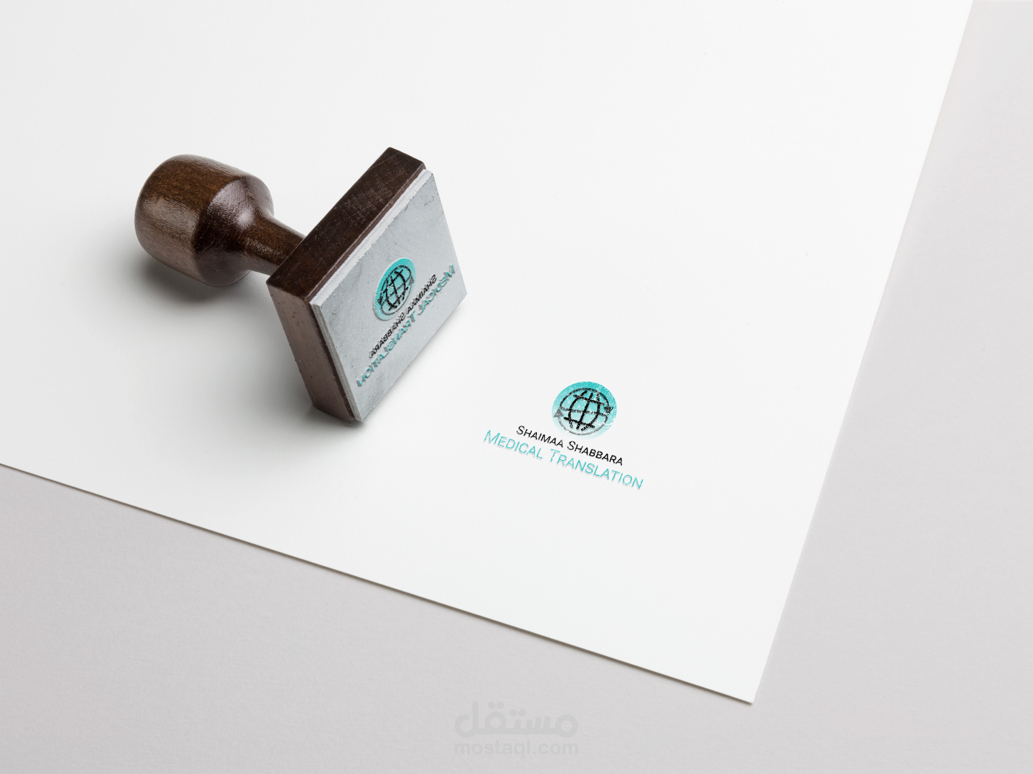
Shaimaa Shabbara is a freelance medical translator. Her identity is represented by her logo, so it should be attractive and eye-catching.
Her logo is not only a symbol, but also a way she markets herself. Therefore, I tried to create a novel idea that combines the first letter of her name (letter S), the translation world Icon and the arrows. The elements were mixed in a simple form to convey multiple meanings related to the translation service, the medical sector and her identity.
Another thing that should be mentioned is the choice of colors, this greenish-blue color that Always refers to the medical sector, as we can see in the tools for the medical staff such as gowns and masks.