CREPDE: Brand Identity for a Waffle & Crêpe Shop
تفاصيل العمل
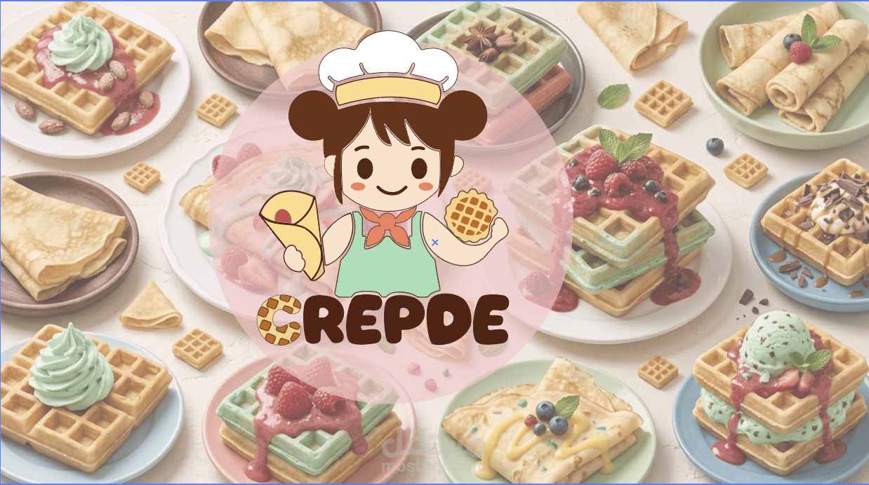
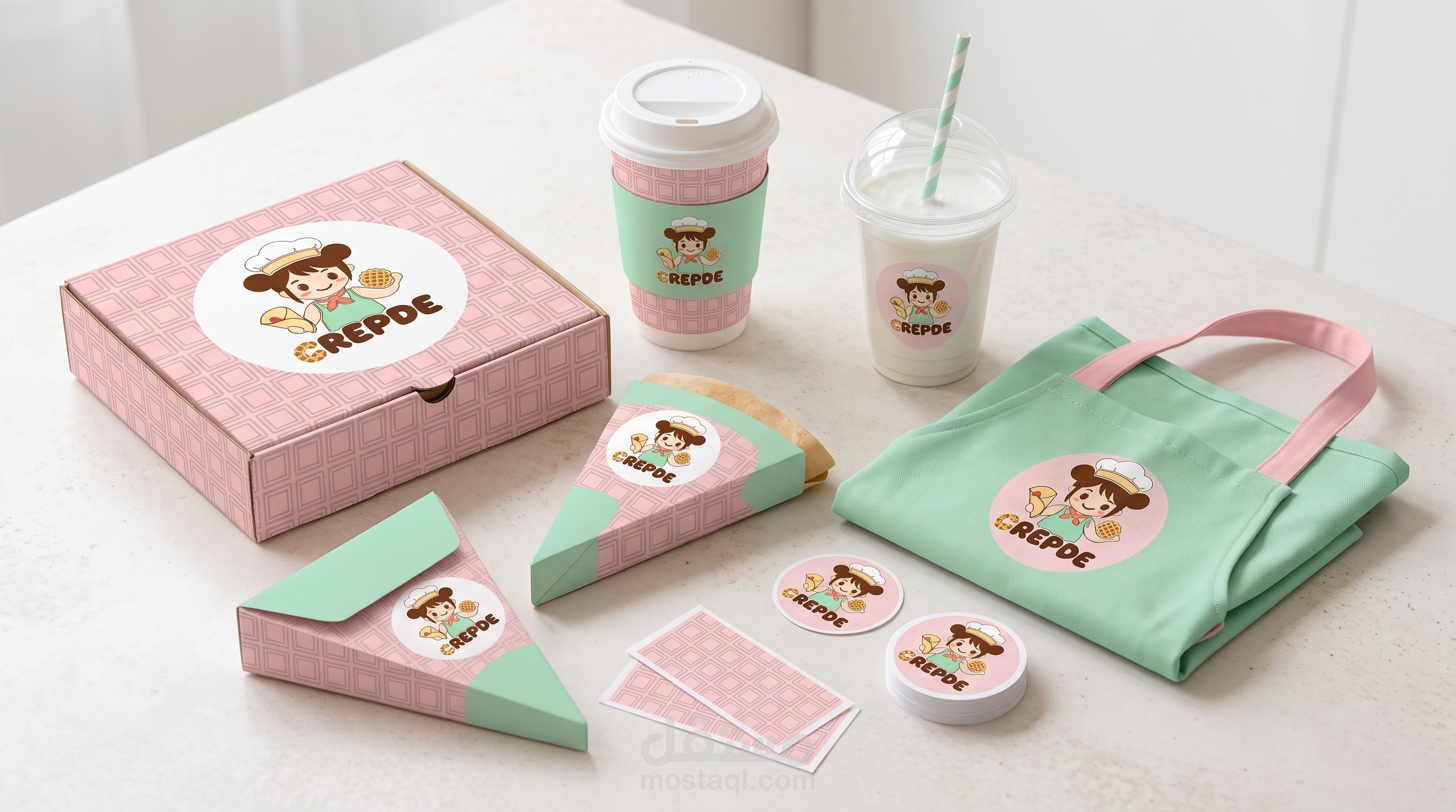
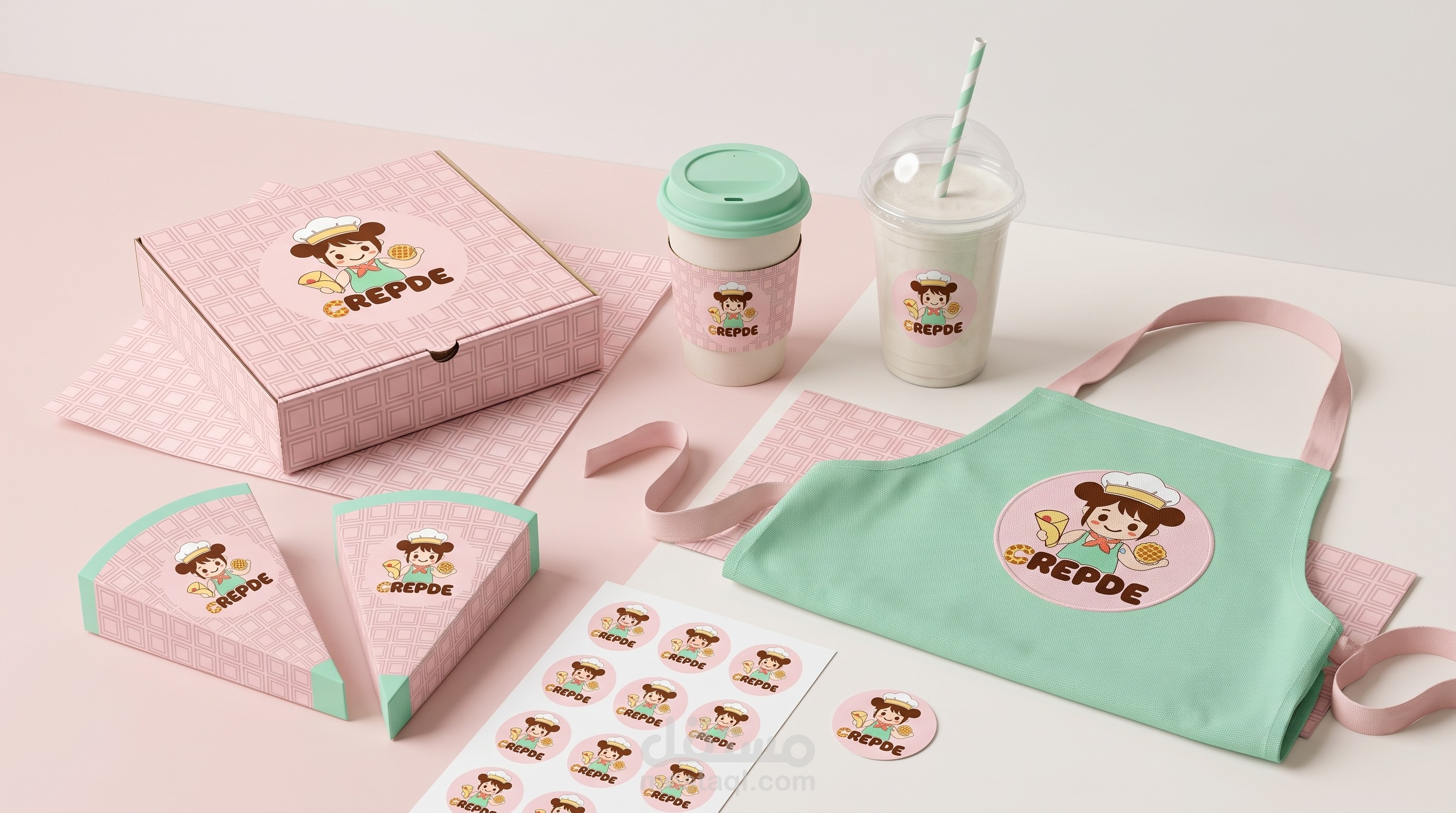
CREPDE is a dessert shop built around two favorites: waffles and crêpes. This project builds a brand identity around its existing chef-girl logo, keeping the original logo and colors untouched. The big idea is “Fold & Press”. The crêpe is folded, the waffle is pressed, and both become a little gift made to be shared. That idea shapes the tagline, “Fold. Press. Enjoy.”, and the friendly voice of the brand. What’s inside: – Brand concept and tagline – Typography: a custom Matcha Word wordmark, with Baloo 2 for headlines and Nunito for body text – Logo guidelines: clear space, minimum size, approved backgrounds and common mistakes – Color palette taken from the logo: Choco, Butter, Mint, Coral and Waffle – Three logo concepts (ink, night and slate) using the crêpe and waffle elements as patterns and corner details – Brand applications and tone of voice Thanks for watching!