FLARE HOT SAUCE | Creative Advertising Campaign
تفاصيل العمل
FLARE HOT SAUCE – Creative Advertising Campaign
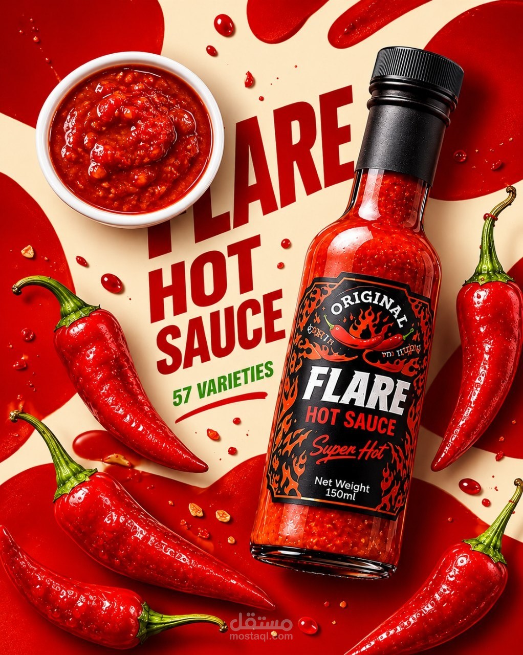
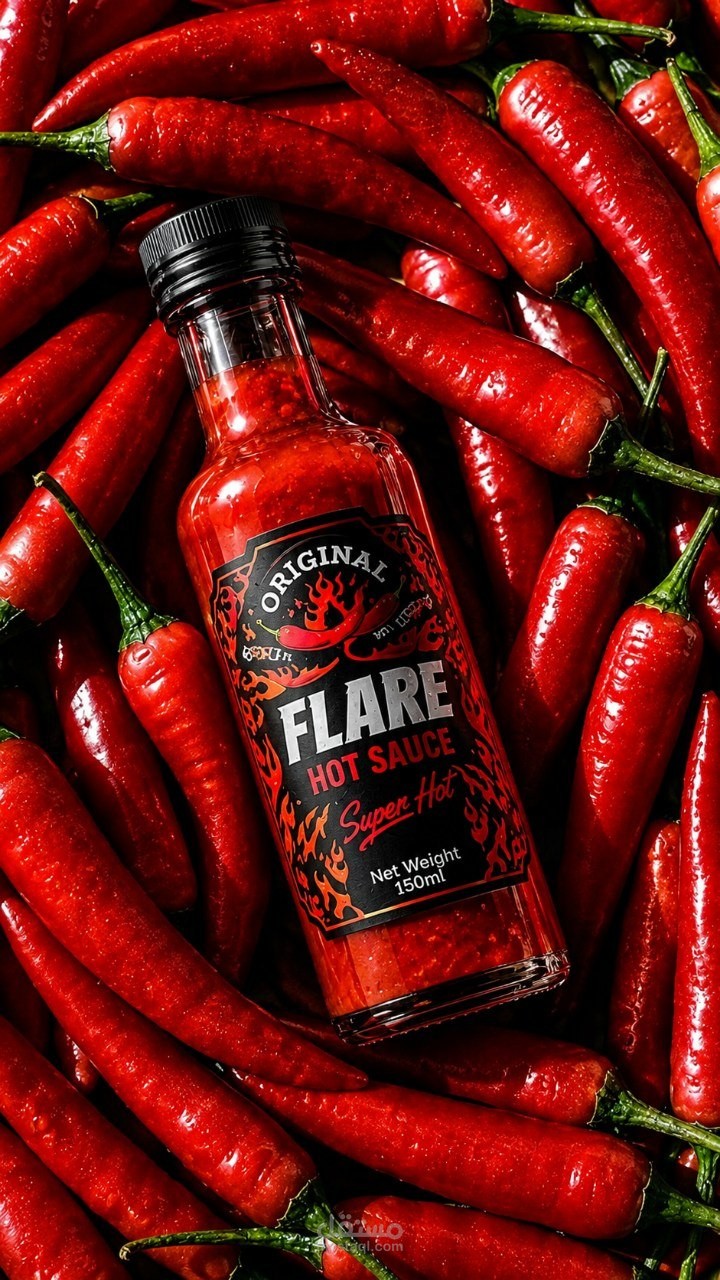
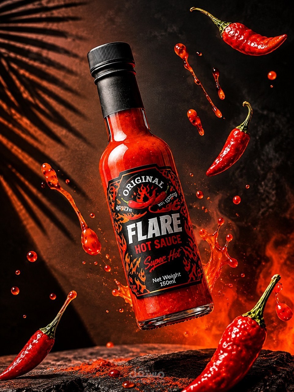
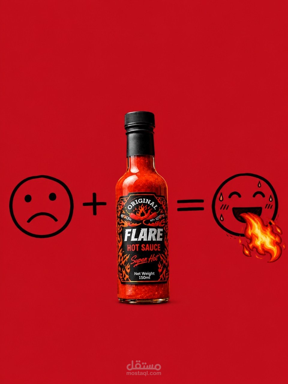
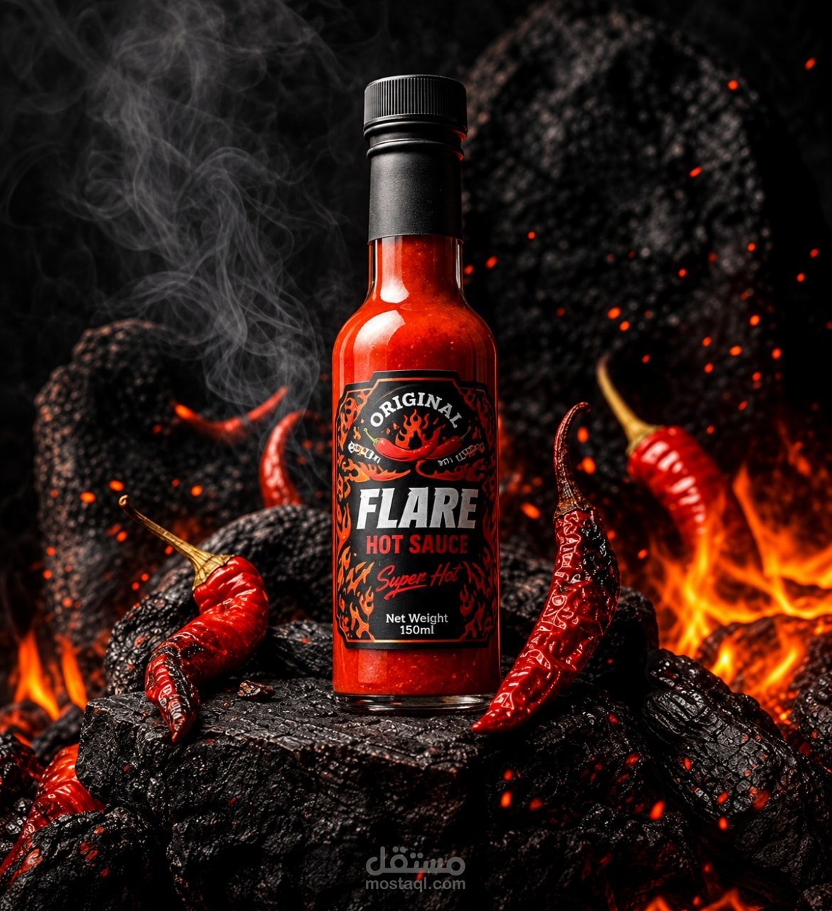
FLARE is a bold and energetic hot sauce advertising concept designed to capture the intensity of heat and the excitement of spicy flavors.
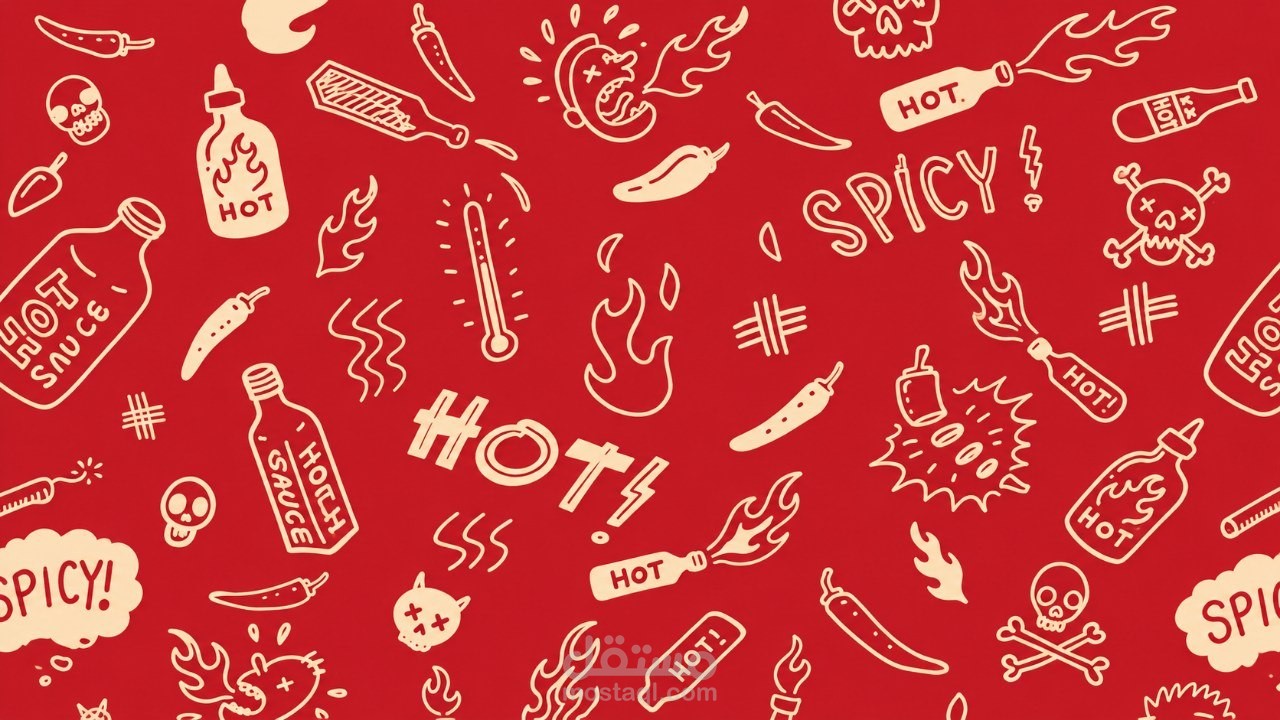
The visual direction combines powerful red tones, warm beige backgrounds, dramatic lighting, and dynamic product compositions to create a striking and memorable advertising experience.
Red was chosen to communicate heat, passion, and intensity, while beige provides visual balance and allows the product to stand out.
The overall style focuses on bold typography, strong visual hierarchy, and creative product presentation to reflect the personality of the brand.
Design Concept: Bold Flavor. Unforgettable Fire.
---
الترجمة العربية
FLARE هو مفهوم إعلاني جريء وحيوي لمنتج صوص حار، يهدف إلى التعبير عن قوة الحرارة والإحساس المميز بالنكهات الحارة.
يعتمد الاتجاه البصري على درجات الأحمر القوية، والخلفيات البيج الدافئة، والإضاءة الدرامية، والتكوينات البصرية الديناميكية للمنتج، لخلق تجربة إعلانية لافتة وسهلة التذكر.
تم اختيار اللون الأحمر للتعبير عن الحرارة والشغف والقوة، بينما يحقق اللون البيج توازنًا بصريًا ويساعد على إبراز المنتج.
يركز الأسلوب التصميمي على الخطوط الجريئة، والتسلسل البصري الواضح، والعرض الإبداعي للمنتج، بما يعكس شخصية العلامة التجارية.
الفكرة التصميمية: نكهة جريئة.. ونار لا تُنسى.