Cyber Infra: Corporate Identity and Brand Communication System
تفاصيل العمل

Project Overview
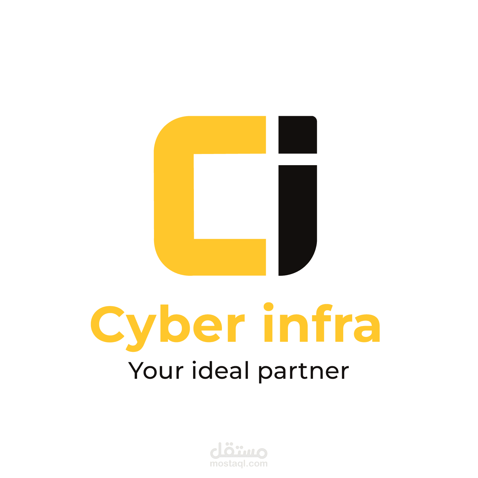
Cyber Infra is an IT services company based in Birkhadem, Algiers. It offers consulting, cybersecurity, network and telecom, virtualization, storage and infrastructure installation, mainly for businesses. The identity had to show technical reliability while staying approachable, in line with the tagline “Your ideal partner.” The core of the brand is a compact “Ci” monogram. A thick, rounded yellow “C” holds a slanted “i” whose dot is cut as a sharp diagonal. The pairing suggests an enclosing structure (the infrastructure) supporting a single active element (the service or the expert). The brand uses only two colors, a warm industrial yellow (
#FFC72C) and a near-black (
#120F0D). This high-contrast pairing reads as precise, energetic and confident. The diagonal of the “i” and the soft rounded corners of the “C” set the visual language for every other piece: slanted parallelograms, rounded containers and dynamic angled cuts recur across the stationery, the corporate document and the promotional material. Two logo arrangements were presented, a stacked wordmark and a horizontal lockup. This gave the client a choice of layout while keeping the same symbol and colors.
Key Features
A symbol built on two shapes: The “Ci” mark works from just two basic forms, so it stays legible and recognizable from social media avatars down to badge and email-signature sizes. It also works on its own without the wordmark.
A tightly controlled two-color palette: Yellow and near-black are set as fixed hex values. Grayscale photography and white space are used as neutral support, so yellow stays the one signal color for headings, highlights and calls to action.
One typeface family: A single geometric sans serif runs through the whole system. Weight, color and size create the hierarchy, for example bold headings with yellow emphasis words, small all-caps tracked labels and well-spaced body text.
Recognizable graphic devices: Slanted rounded panels, organic flowing shapes, chevron arrows, dot grids and circular image frames give the brand a dynamic graphic vocabulary. Each format draws on it differently.
A structured company profile: The ten-page brochure moves clearly from cover, team and overview/vision/mission through core services, differentiators and customer focus to a contact page with a QR code. Asymmetric layouts, cropped grayscale photography and yellow content blocks keep a dense corporate text readable and varied.
Practical stationery: The business card, staff badge and email signature give contact details a clear order and pair each line with an icon. The badge’s back carries numbered terms and conditions. Together they show the identity in everyday operational use.
Social and digital formats: Square post series, a product promotion and a Facebook cover adapt the system to marketing. Product photography sits in circular frames, pill-shaped buttons mark actions, and the cover uses a hexagonal pattern on a yellow-to-black gradient to suggest networked technology.
Design and Execution Process
The work began with defining the brand’s character: an IT partner that needed to look technically credible but not cold. The monogram was developed by reducing the company initials to the fewest possible forms, then refining the curve of the “C,” the angle of the “i” and the spacing between them until the mark held together as one unit. With the symbol in place, the palette was locked to two precise hex values and a single typeface family was chosen, so every later piece could be consistent without heavy rules. The recurring graphic devices were then taken directly from the logo’s geometry, including the diagonal cut, the rounded corners and the solid color fields. That way the wider visual language comes from the mark itself rather than being added on top. These elements were next applied by format. The stationery focused on fitting information into small spaces with a clear order. The company profile needed a flexible editorial grid that could hold long service descriptions alongside photography. The social media templates relied on bold composition and clear calls to action for fast viewing on screen. Throughout, color balance, alignment and contrast were checked across formats so that each application reads as part of one identity, and all files were prepared at the right sizes for their intended print or digital use.