Bonjour Croissant — Logo Redesign & Brand Guidelines
تفاصيل العمل
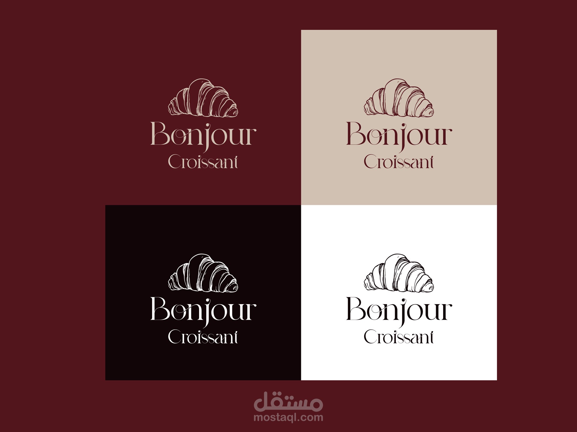
From a generic clipart badge to a mark that tells the croissant story.
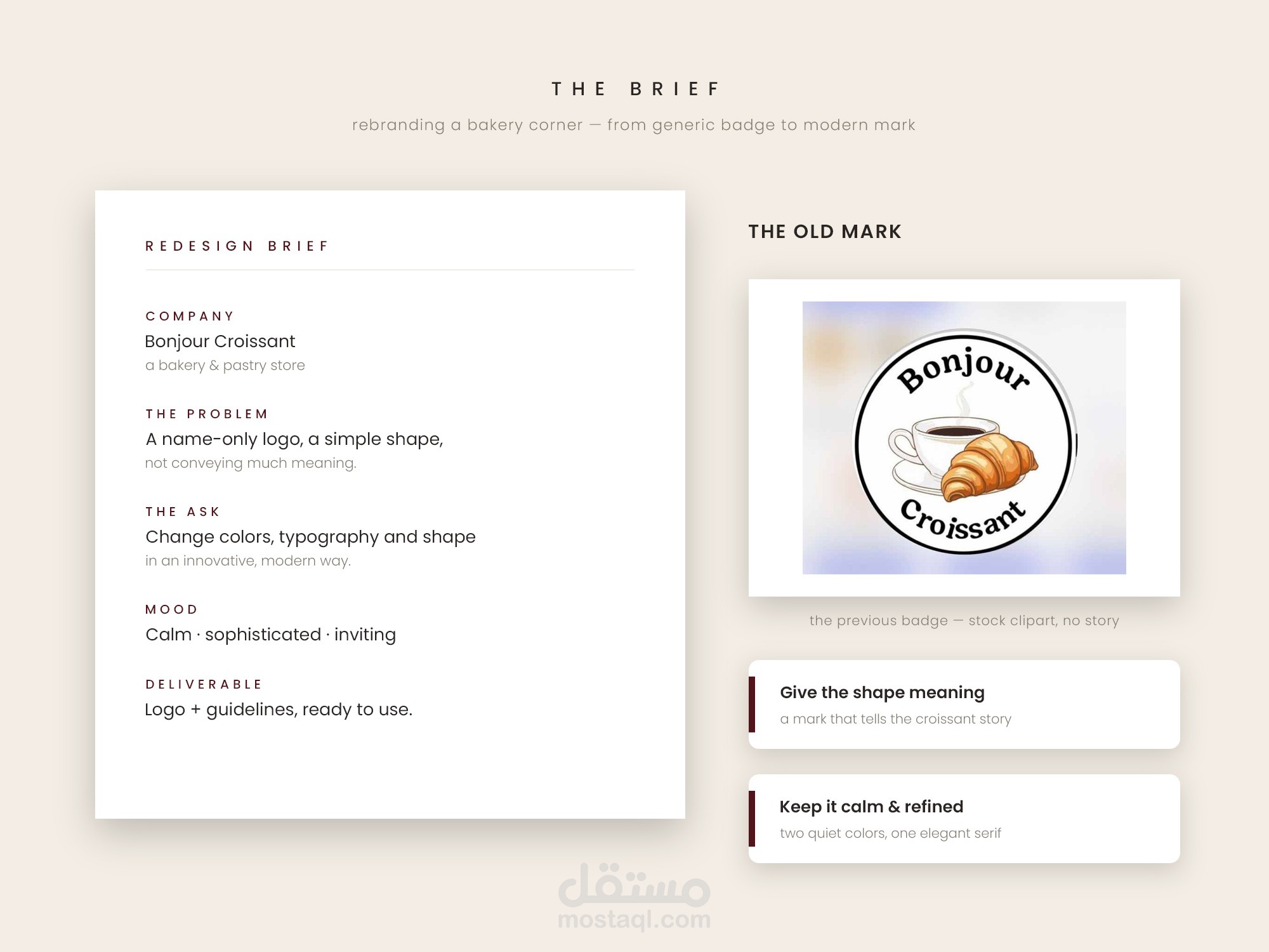
Bonjour Croissant is a bakery & pastry store whose old logo carried only
the name — a simple shape that didn't convey much meaning. The redesign
brief asked for new colors, typography and shape, in an innovative and
modern way: calm, sophisticated, inviting.
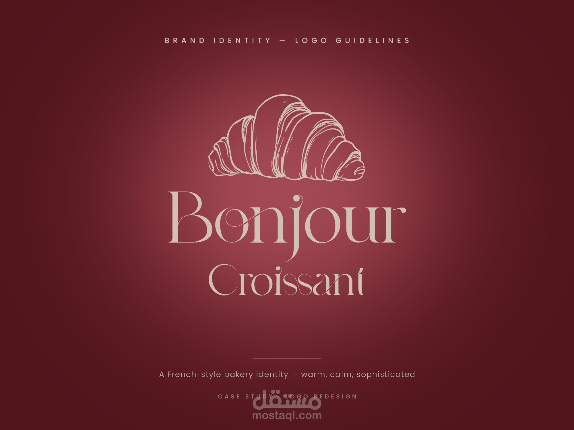
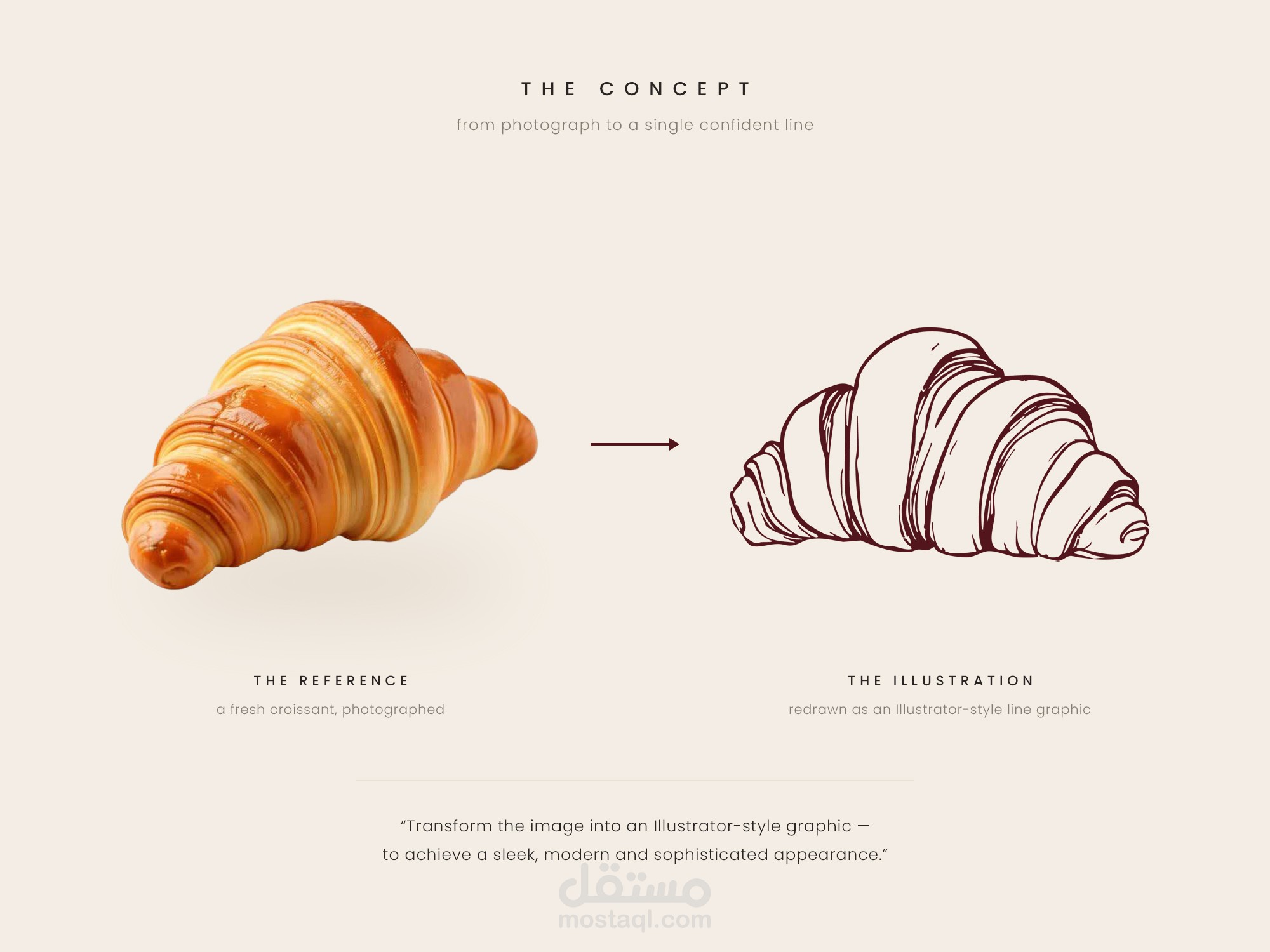
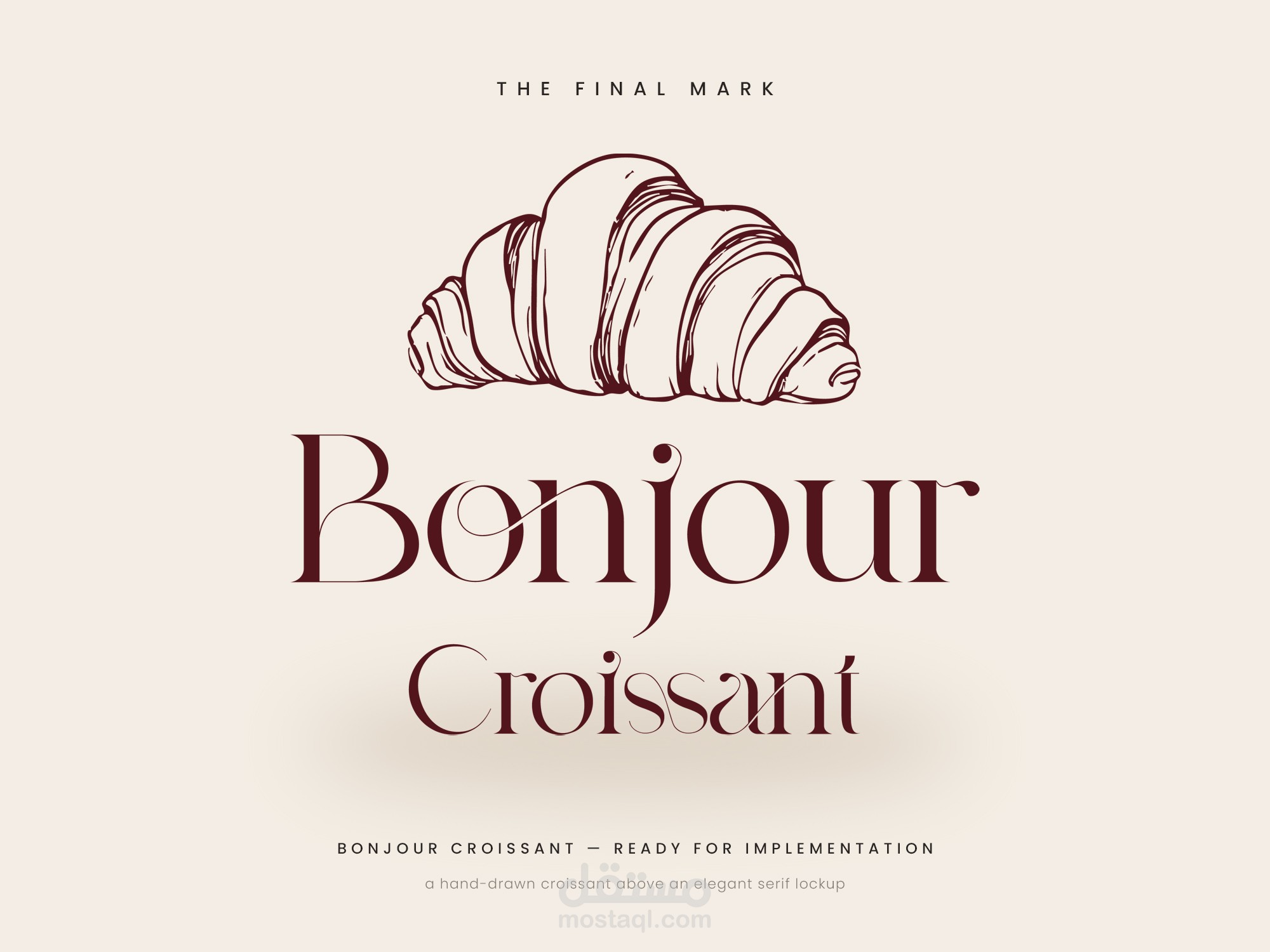
The answer starts with a photograph of a fresh croissant, redrawn as a
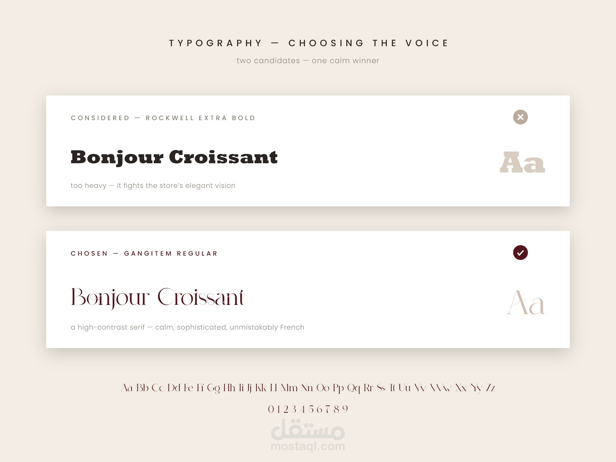
single confident Illustrator-style line. Beneath it, the name is set in
Gangitem Regular — a high-contrast serif chosen over Rockwell Extra Bold
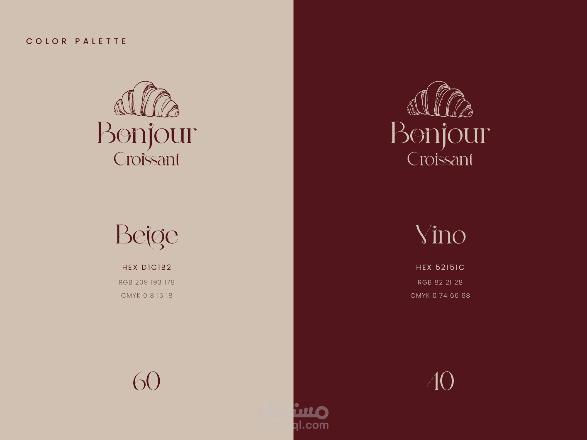
for its quiet elegance. Two colors carry the identity: warm Beige D1C1B2
and deep Vino 52151C.
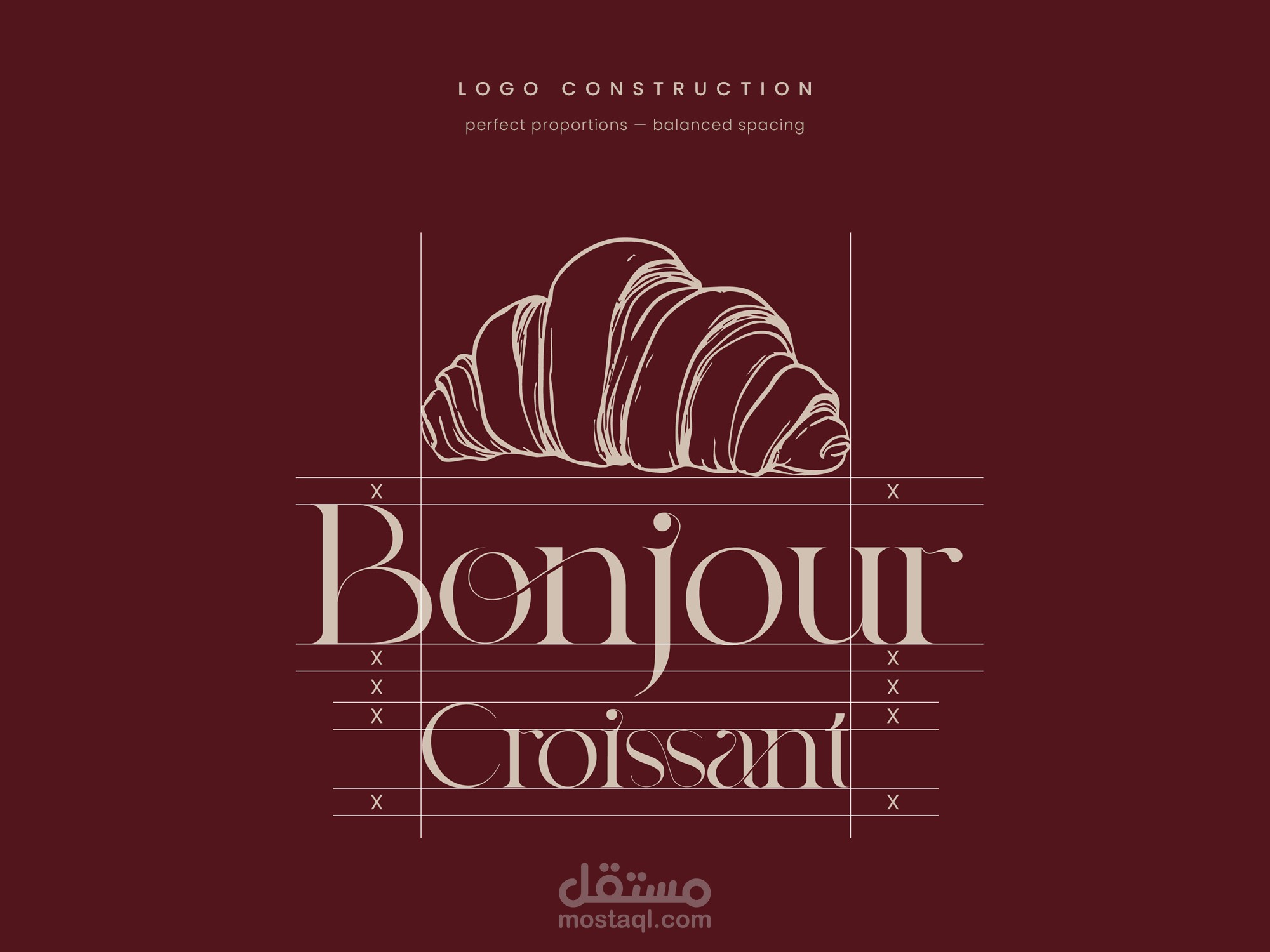
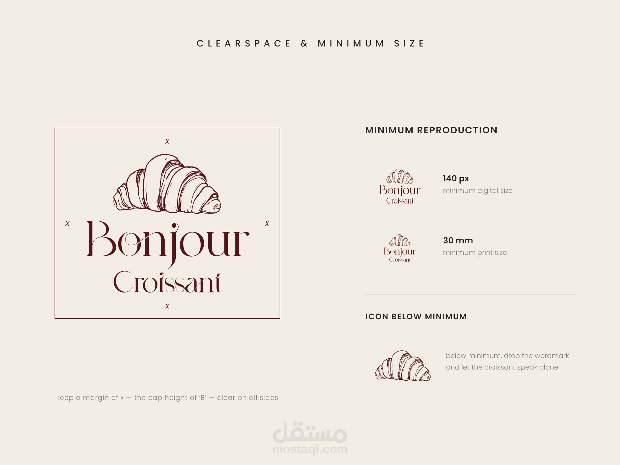
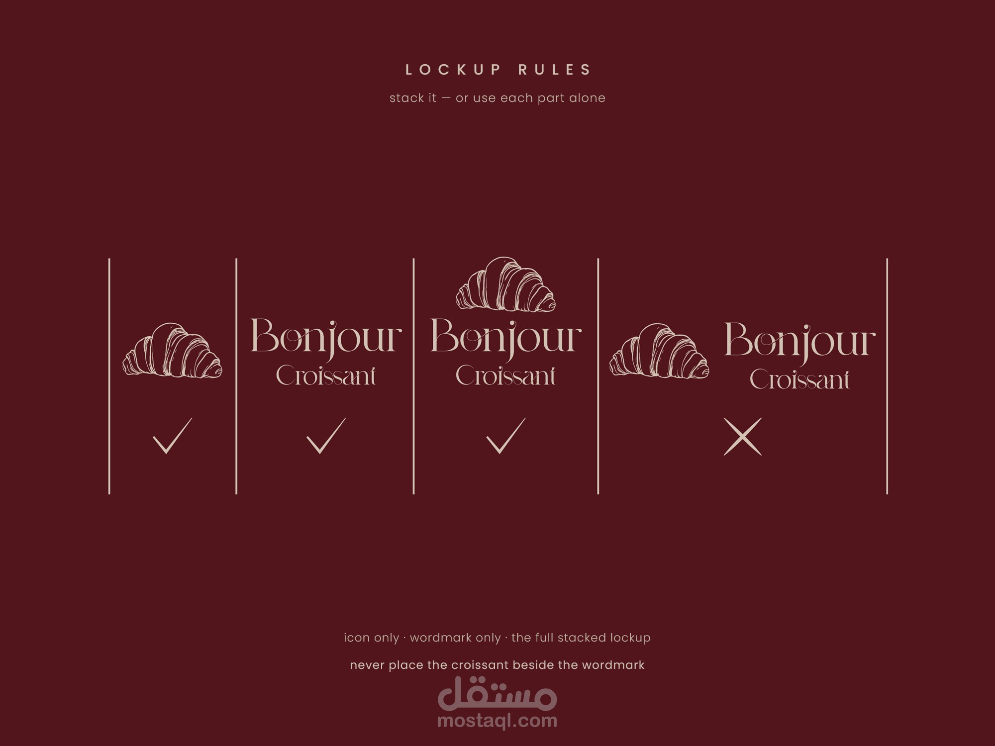
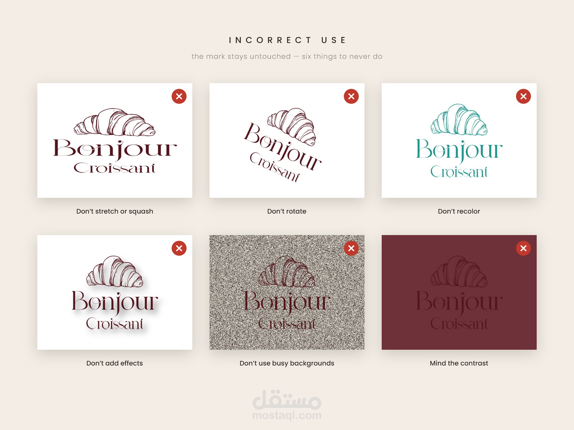
The full guideline covers the concept, typography selection, construction
grid, clearspace, colorways, lockup rules, correct & incorrect use — and
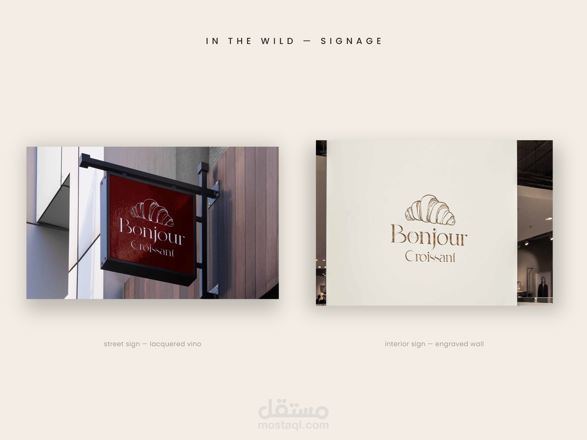
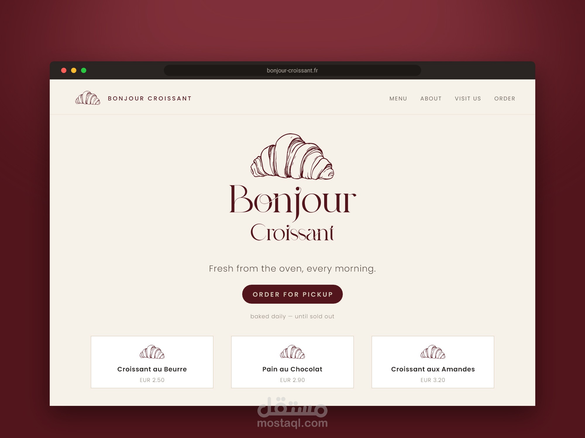
the identity in the wild: embossed print, street signage and the web.
Tools — Adobe Illustrator & Adobe Photoshop.