Veltra
تفاصيل العمل
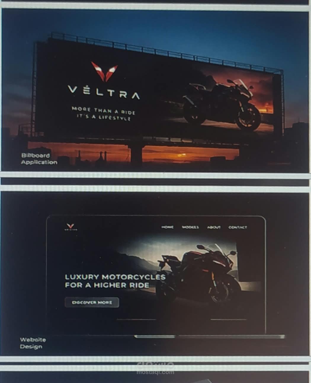
Here is a detailed description of the brand identity presentation for VÉLTRA in English, followed by a comprehensive SWOT Analysis.
Overview & Description of the Work
This presentation is a Brand Identity & Style Guide for a luxury motorcycle brand named VÉLTRA. The design showcases a high-end, sleek, and aggressive aesthetic tailored for premium riders.
Brand Concept & Vision:
Brand Name: VÉLTRA
Tagline: "More Than A Ride, It's A Lifestyle"
Positioning: High-performance luxury motorcycles combining style, speed, and status.
Logo Design & Symbolism:
Main Logo: A sharp, geometric "V" shape resembling wings or the front aerodynamic visor of a superbike.
Logo Variations: Presented in solid white, outlined red, and dark variations for versatile usage across different materials and backgrounds.
Color Palette:
Black (#000000) & Dark Gray (#2E2E2E): Represents elegance, mystery, power, and luxury.
Light Gray (#D9D9D9): Used for subtle contrast and readability.
Red (#E63946): Symbolizes passion, speed, adrenaline, and high energy.
Gold (#D4AF37): Enhances the premium luxury appeal.
Typography:
Primary Font: Montserrat.
Characteristics: Clean, geometric sans-serif font that gives a modern, technical, and bold look.
Brand Applications:
Outdoors & Billboards: High-impact highway advertisements featuring bold imagery and the core slogan.
Digital UI/UX: A sleek website interface highlighting product specs and luxury lifestyle imagery.
Social Media & Marketing: Cohesive promotional templates for digital platforms.