Zeta —Social Media Advertising Design
تفاصيل العمل
Overview
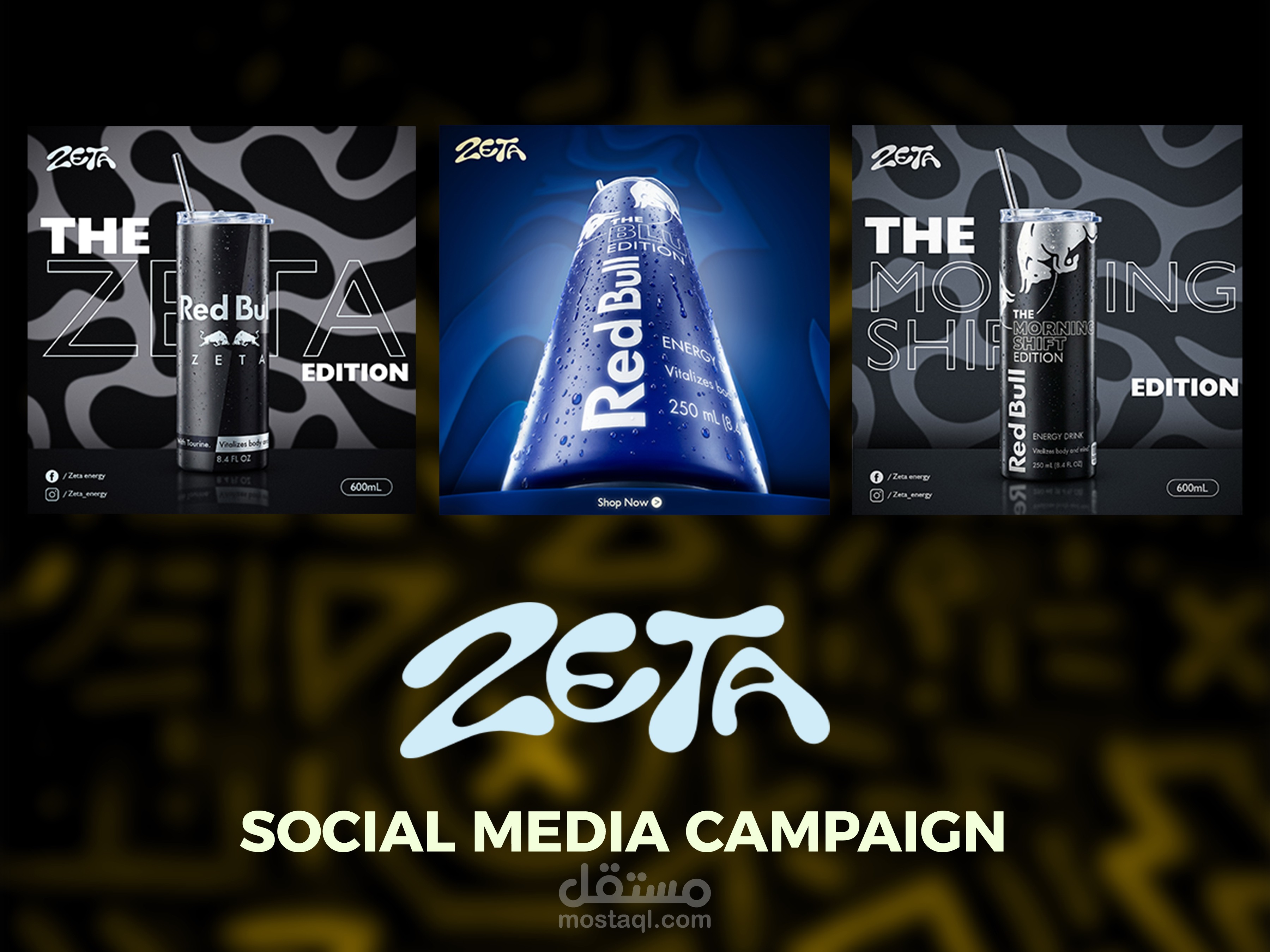
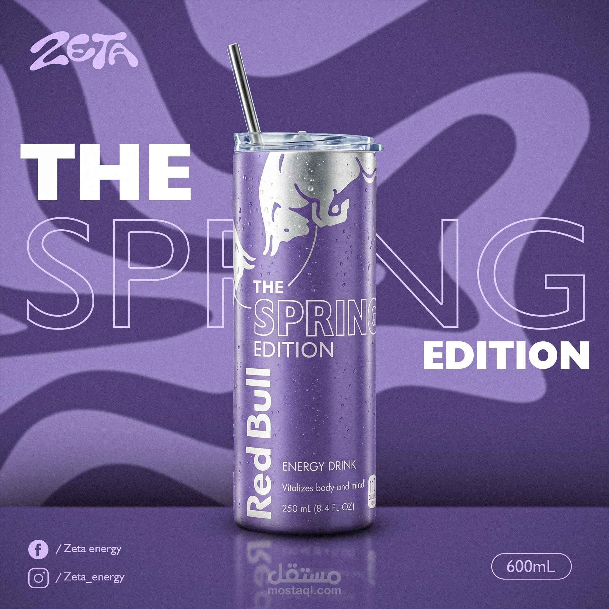
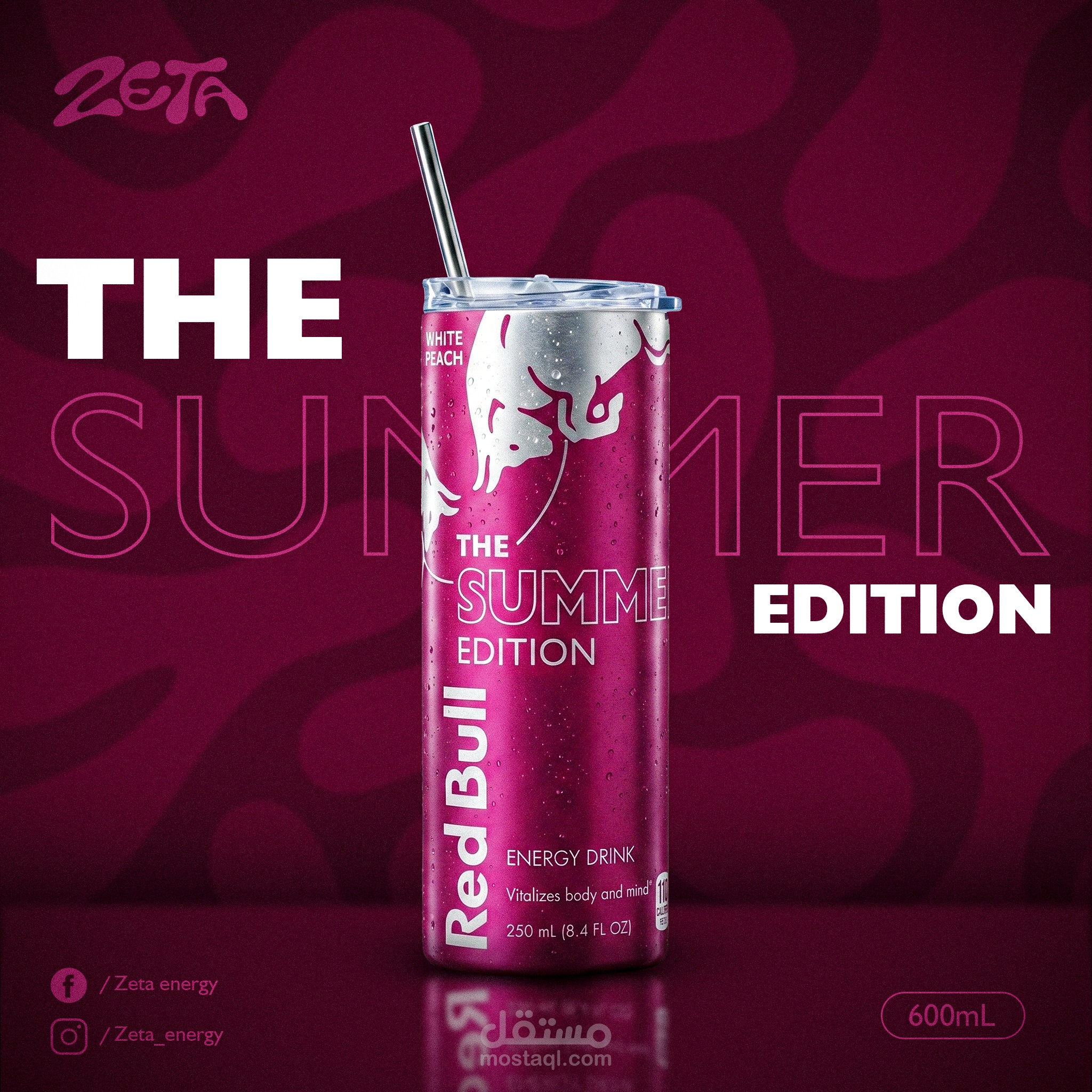
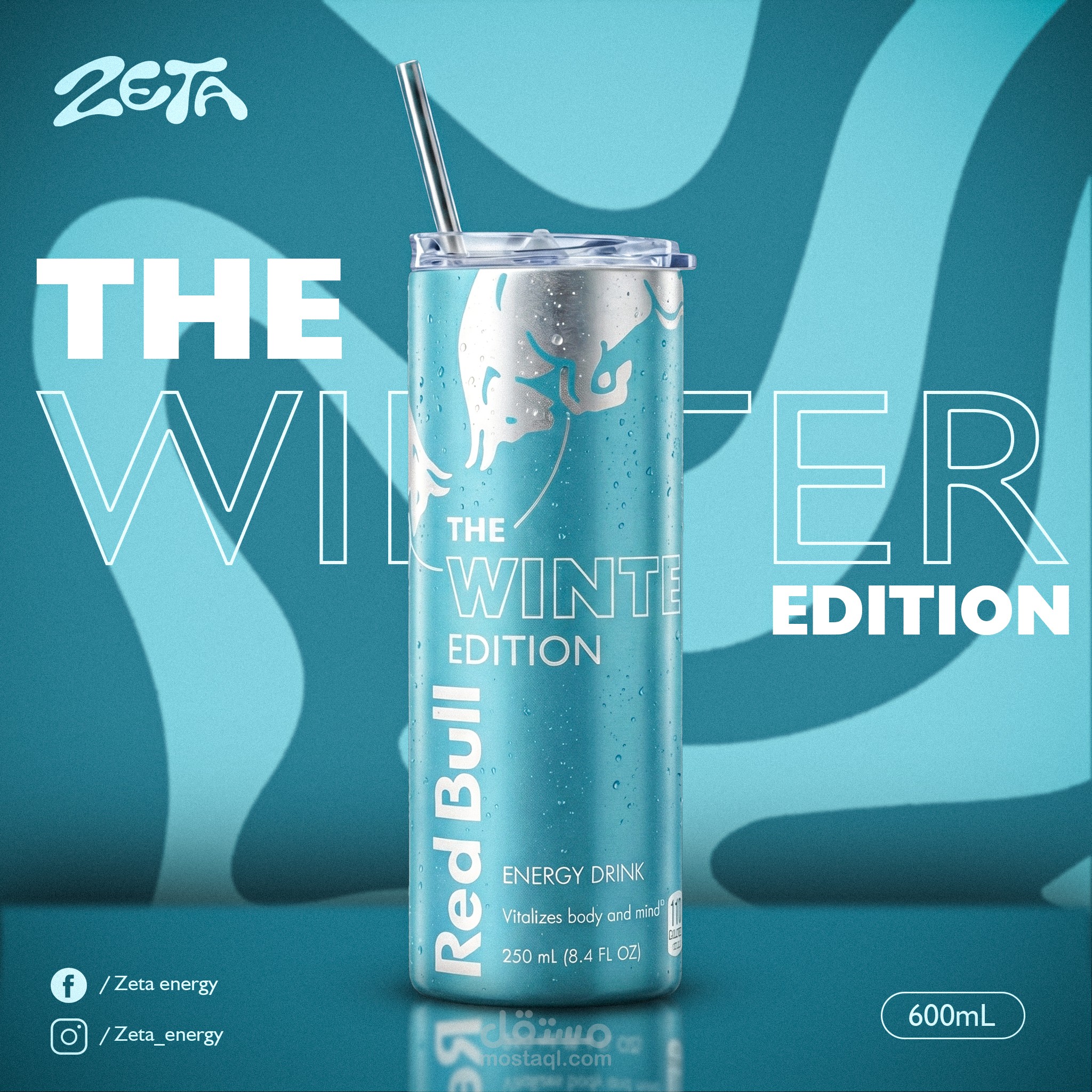
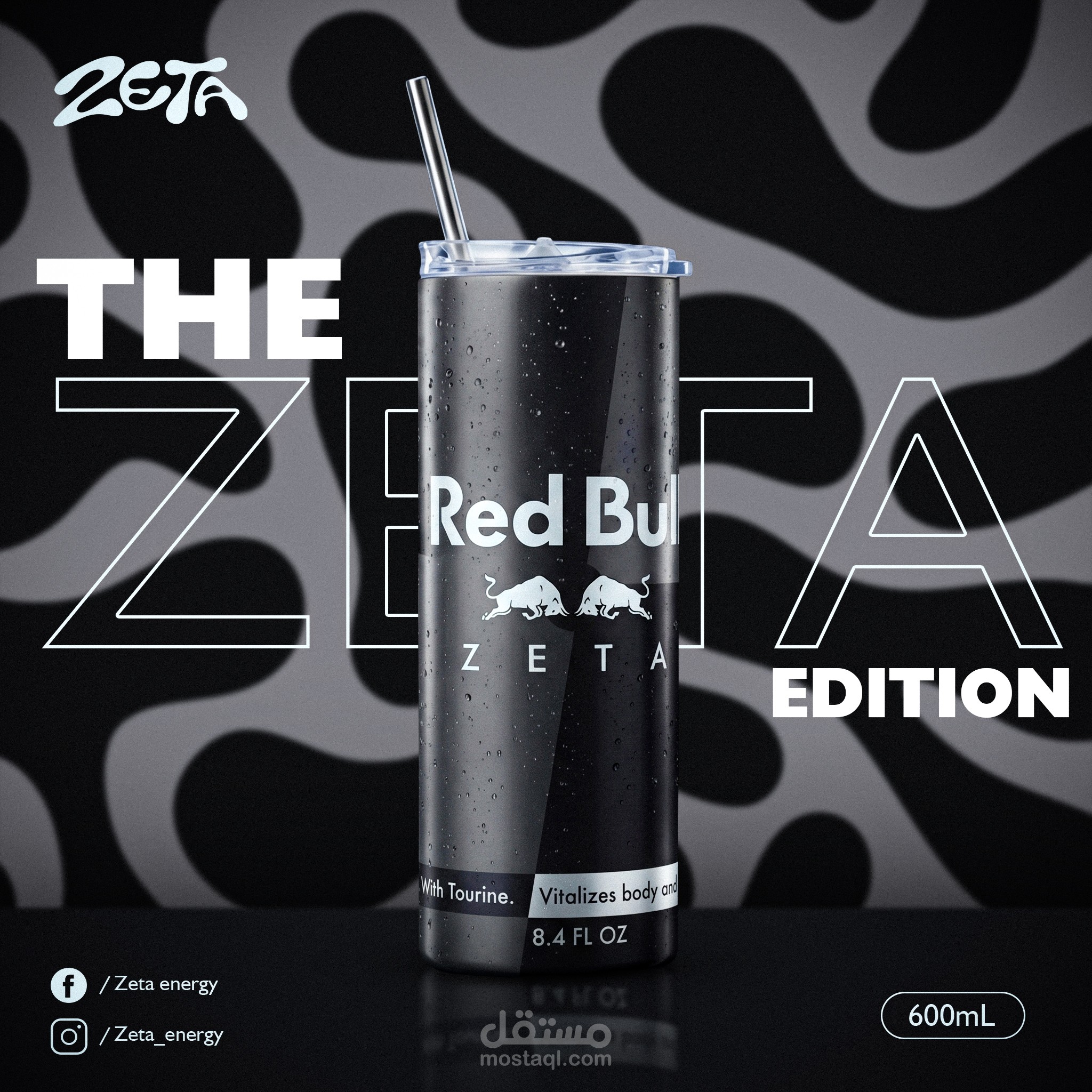
Zeta is an energy drink brand that needed a distinctive social media presence in a crowded, competitive market.
The Challenge
Create a campaign that grabs attention at first glance, differentiates each product edition, and still feels like one cohesive brand.
The Solution
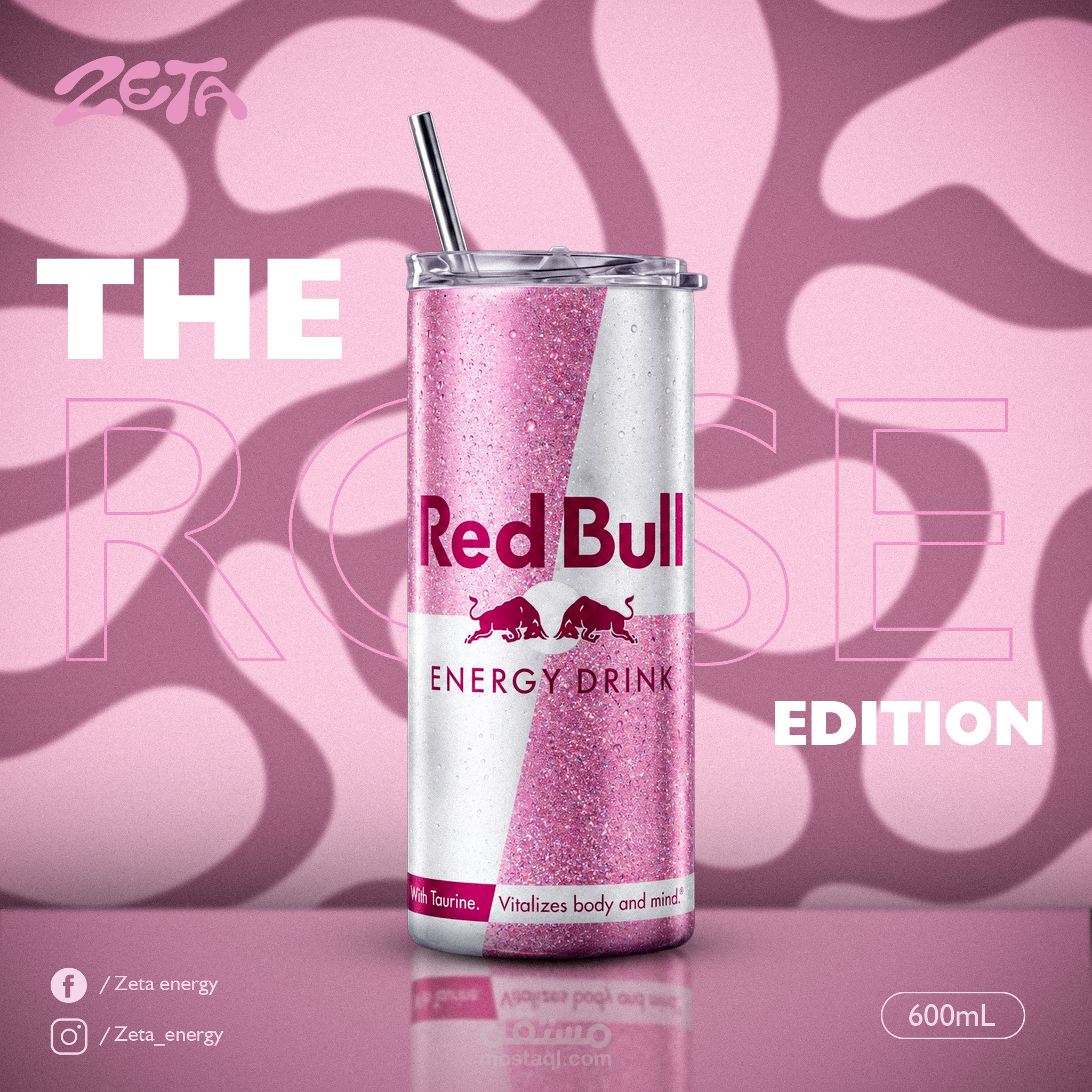
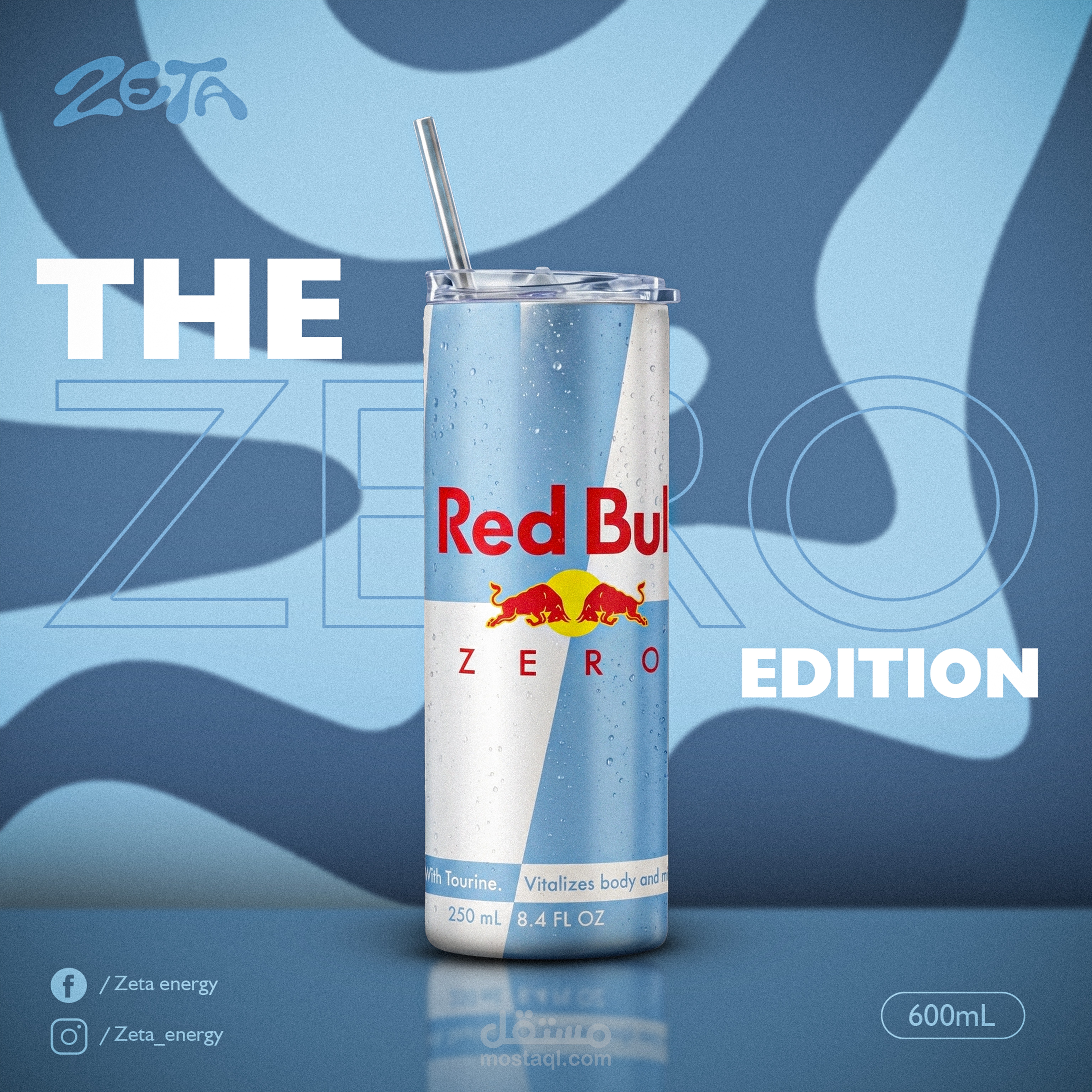
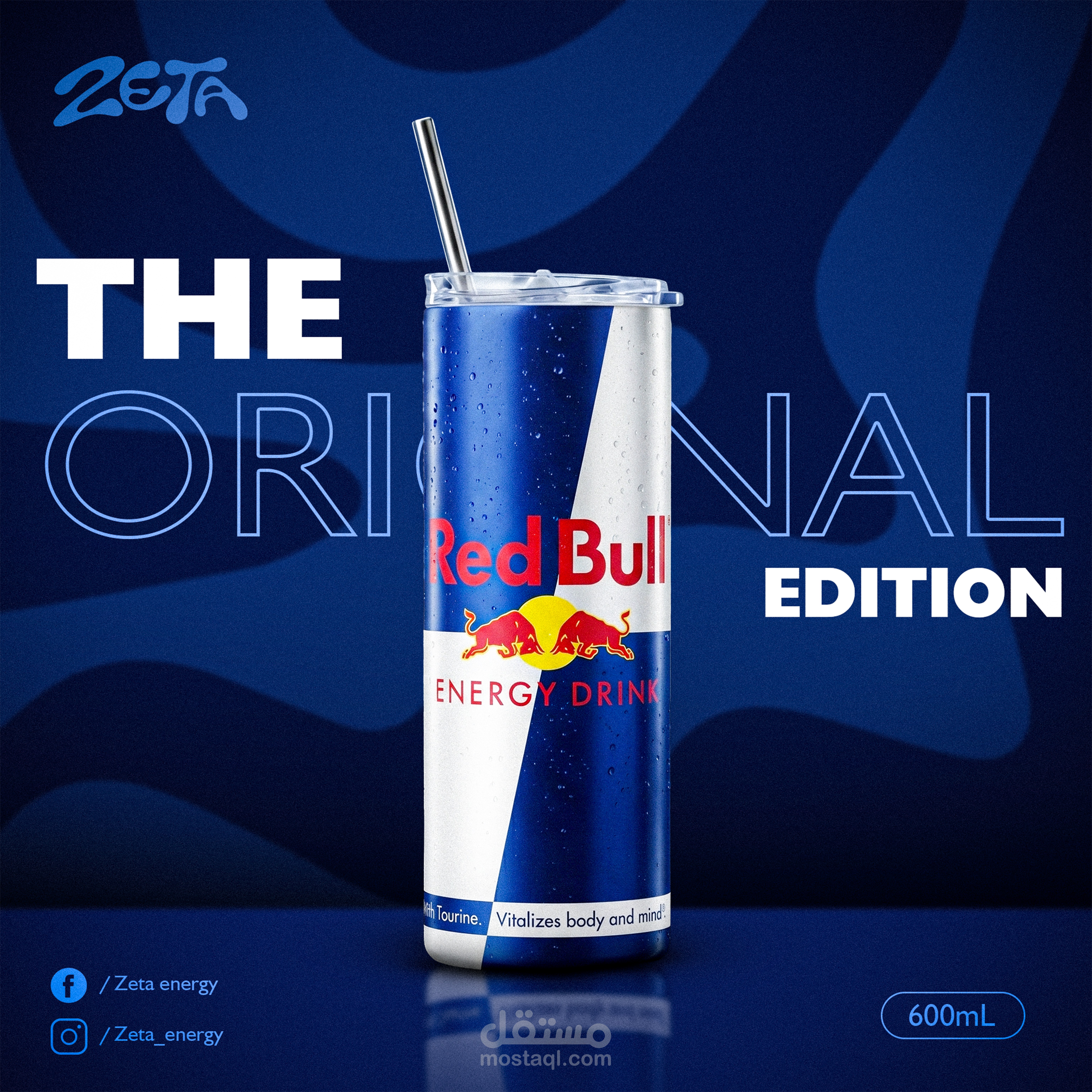
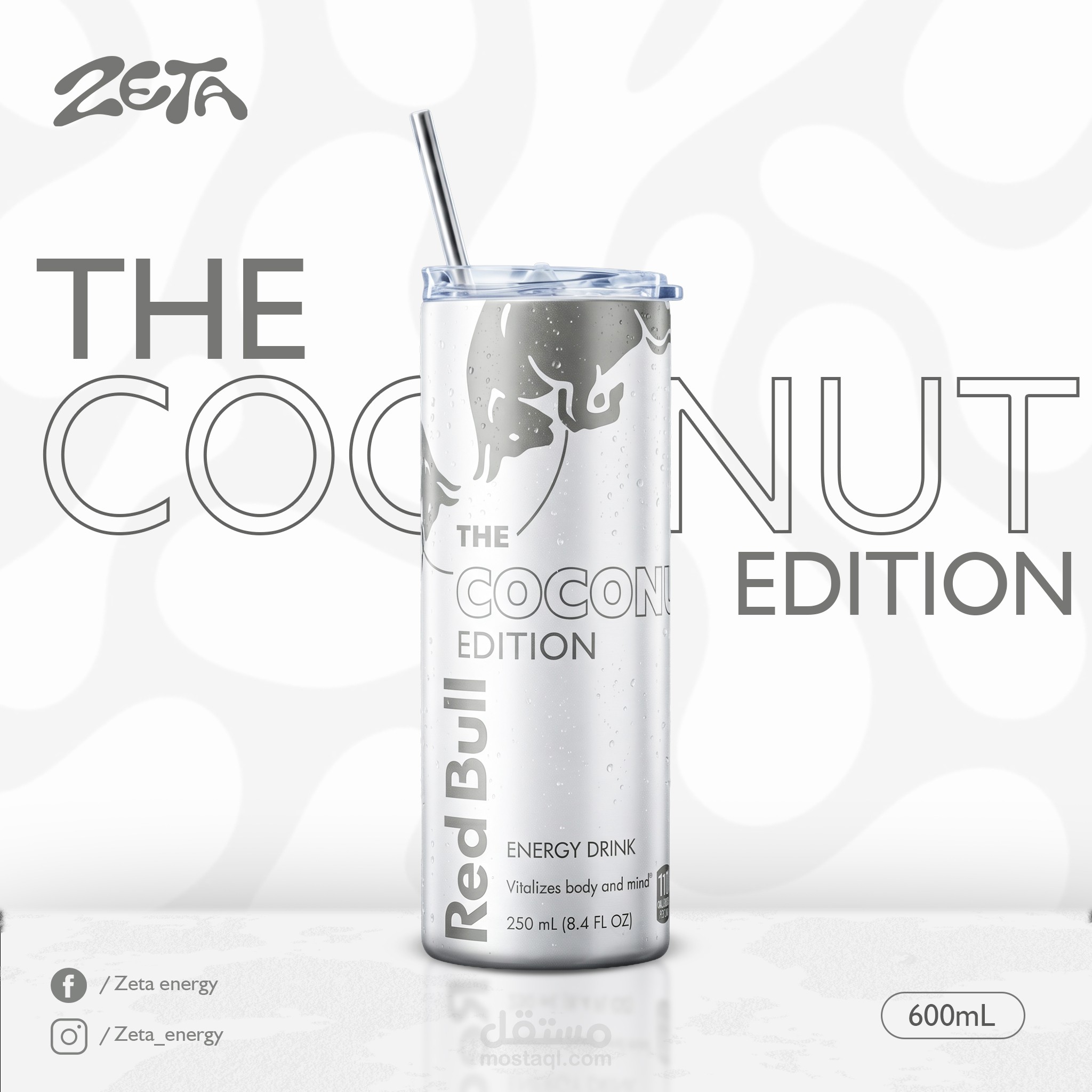
Unified identity: Zeta's fluid wordmark paired with a recurring organic pattern ties every post together.
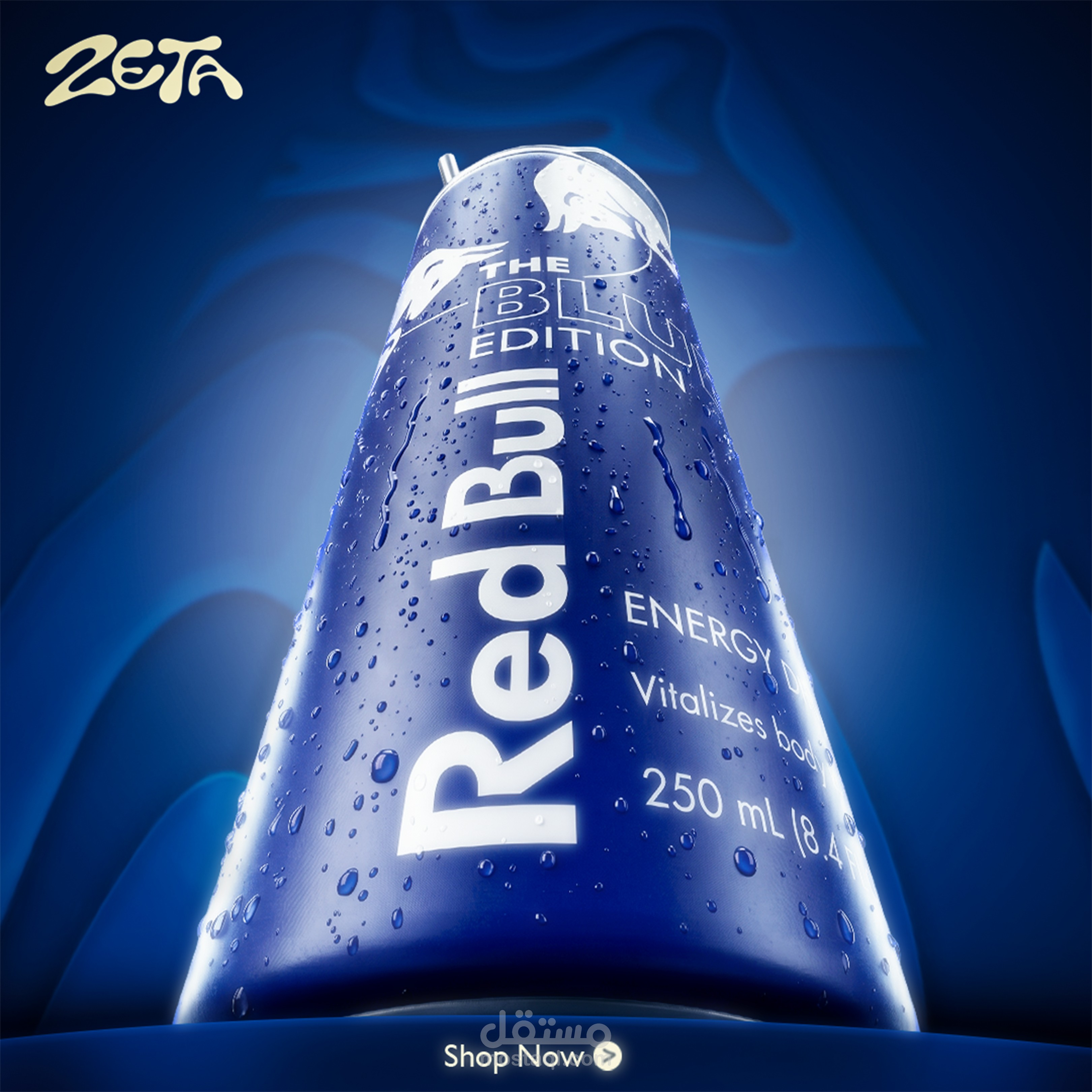
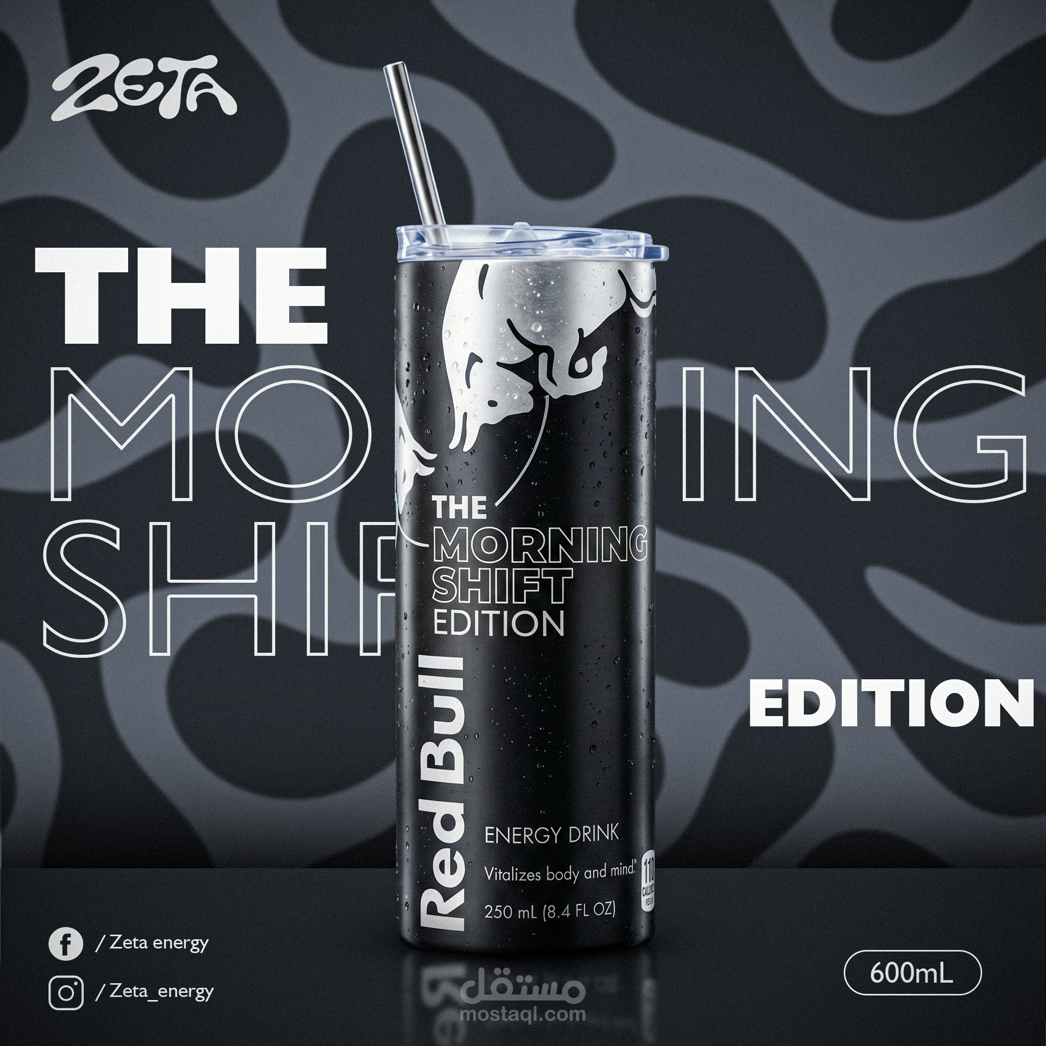
Distinct editions: Each edition has its own mood. The Zeta Edition and The Morning Shift use a monochrome black-and-grey palette, while The Blue Edition goes electric blue.
Bold typography: Oversized outlined and solid type layers with the product to create depth.
Product detail: Water droplets and dramatic lighting give a cold, refreshing feel.
Conversion elements: Pack size, social handles, and a Shop Now button.
Tools: Photoshop, Illustrator (adjust to what you actually used)
Role: Art direction, graphic design, and image retouching (adjust to your actual role)